In this documentation, we will discuss the customization of the Charts block, brought to you by Zoloblocks.
Inserting The Block into the Editor
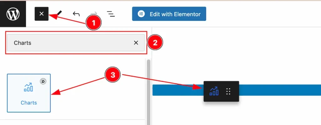
- Click the Toggle Block Inserter icon and a sidebar will appear on the left side, All the blocks will be visible here.
- Search the Charts Block Name inside the search Box. otherwise, select the Charts blocks ( with Zoloblocks logo T.R corner).
- Then Drag and Drop it on the page.
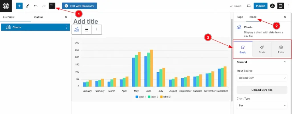
After Inserting the blocks, Follow this.
- Click on the Document Overviewer button and the Blocks list view will appear.
- After on the right side, Click on the Block.
- Here show all the control tabs( Basic, Style, Extra ) of a block.
Basic Tab Customization
The Basic tab controller displayed here offers the flexibility to adjust the layout of blocks according to your preferences.
General Section
Go to Basic > General
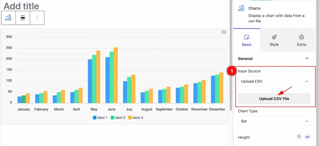
1. Input Source: This option lets you select the Input Source for the Charts block. you will get two input sources here. First, you can upload the CSV file that we showed you in the first screenshot, and second, you can input CSV manually. Please see the below screenshot-
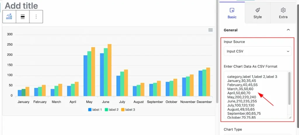
you can choose one of them for your work.
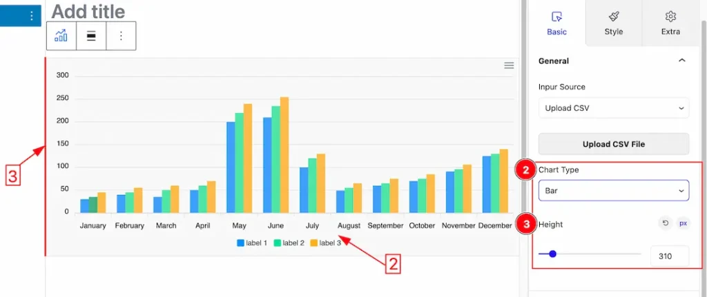
2. Chart Type: This option lets you select the Chart Type for your Chart block. Here you will get these ( Line, Area, Bar, Pie, and Donut )chart options and you can choose one of them that you like. Here we select the Bar chart.
3. Height: you can set the chart’s height as your working demand.
Additional Options Section
Go to Basic > Additional Options
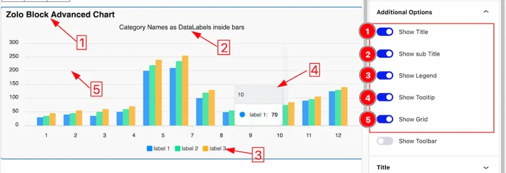
1. Show Title: Enable or Disable the Title switcher button to show or hide the Title on the Chart.
2. Show Sub Title: Enable or Disable the Sub Title switcher button to show or hide the Sub Title on the Chart.
3. Show Legend: Enable or Disable the Legend switcher button to show or hide the Legend on the Chart.
4. Show Tooltip: Enable or Disable the Tooltip switcher button to show or hide the Tooltip on the Chart.
5. Show Grid: Enable or Disable the Grid switcher button to show or hide the Grid on the Chart.
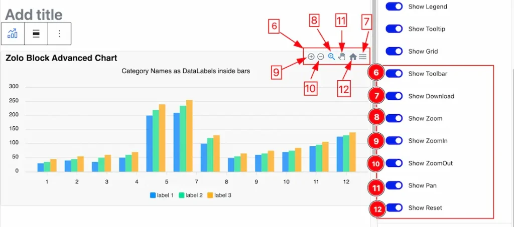
6. Show Toolbar: Enable or Disable the Tollbar switcher button to show or hide the Toolbar on the Chart. If you enable the Toolbar switcher button, more Toolbar switcher buttons will appear as shown below.
7. Show Download: Enable or Disable the Download switcher button to show or hide the Download option on the Chart. if you enable the download switcher button then you can download the Chart as SVG, PNG, and CSV files.
8. Show Zoom: Enable or Disable the Zoom switcher button to show or hide the Zoom Icon on the Chart. When you enable the switcher button and drag the charts left or right then your chart will zoom in and Zoom out with it.
9. Show ZoomIn: Enable or Disable the ZoomIn switcher button to show or hide the ZoomIn Icon on the Chart. This option lets you Zoom In your charts. Show the zoom-in icon which zooms in 50% from the visible chart area.
10. Show ZoomOut: Enable or Disable the ZoomOut switcher button to show or hide the ZoomOut Icon on the Chart. This option lets you zoom out your charts. Show the zoom-out icon which zooms out 50% from the visible chart area.
11. Show Pan: Enable or Disable the Pan switcher button to show or hide the Panning Icon on the Chart.
12. Show Reset: Enable or Disable the Reset switcher button to show or hide the Reset Icon on the Chart. This option lets you reset the Chart State.
Title Section
Go to Basic > Title
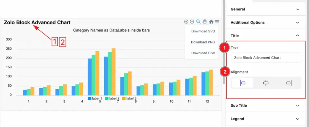
1. Title: This option lets you change the Title Text.
2. Alignment: This option lets you change the Alignment of the Title. you can set the Title Alignment as Left, Right, and Center.
Sub Title Section
Go to Basic > Sub Title
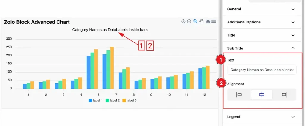
1. Sub Title: This option lets you change the Sub Title Text.
2. Alignment: This option lets you change the Alignment of the Sub Title. you can set the Title Alignment as Left, Right, and Center.
Legend Section
Go to Basic > Legend
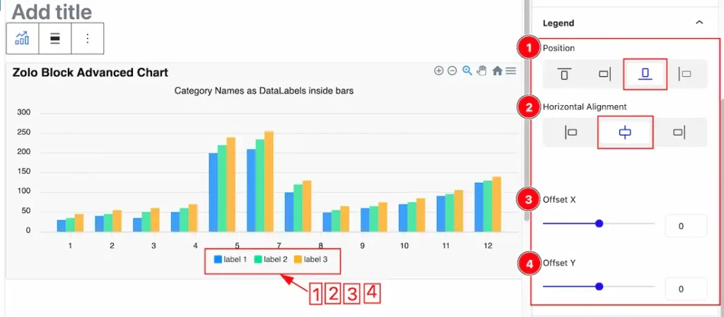
1. Position: you can set the Lengend position as Top, Right, Bottom, and Left. Here we set the Legend Position Bottom.
2. Horizontal Alignment: This option lets you change the Horizontal Alignment of the Legend. you can set the Legend Horizontal Alignment as Left, Right, and Center.
3. Offset X: This option lets you change the Legent position along the X axis.
4. Offset Y: This option lets you change the Legent position along the Y axis.
Tooltip Section
Go to Basic > Tooltip
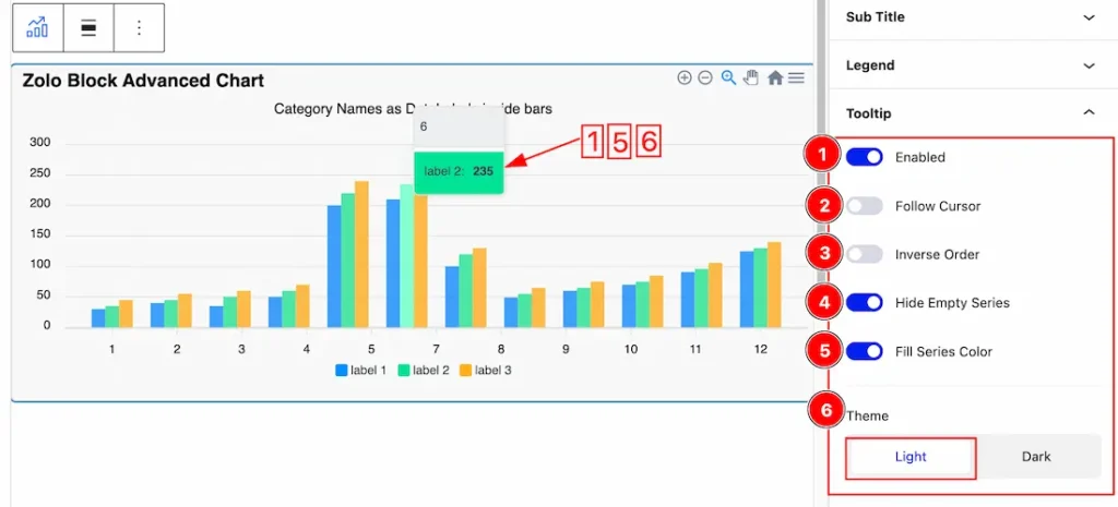
1. Enabled: Enable or Disable the Enabled switcher button to show or hide the Tooltip on the Chart. Show the tooltip when a user hovers over the chart area.
2. Follow Cursor: Follow the user’s cursor position instead of putting the tooltip on actual data points.
3. Inverse Order: In multiple series, when having a shared tooltip, inverse the order of the series (for better comparison in stacked charts).
4. Hide Empty Series: In multiple series, hide those series that have zero values or null data for a particular category.
5. Fill Series Color: When enabled, fill the tooltip background with the corresponding series color.
6. Theme: The Theme option lets you change the Tooltip Background to Light and Dark.
Grid Section
Go to Basic > Grid
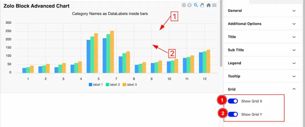
1. Show Grid X: Enable or Disable the Grid X switcher button to show or hide the X-axis Grid Line on the Chart.
2. Show Grid Y: Enable or Disable the Grid Y switcher button to show or hide the Y-axis Grid Line on the Chart.
Work with The Style Tab
Charts Section
Go to Style > Charts
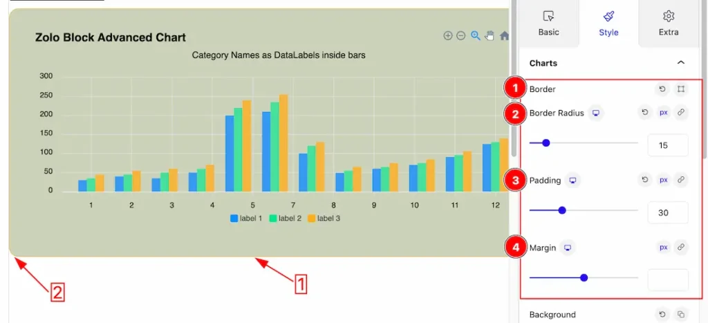
1. Border: you can set the Border Color and Border Type to None, Solid, and Custom. We choose here the Border Type Solid.
2. Border Radius: Customizes the border corners for roundness.
3. Padding: Add spaces around an object to increase the inner area. Padding allows you to control the internal space within an element.
4. Margin: Adjusts the position of an object over the canvas.
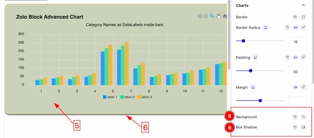
5. Background: This option lets you change the Background Color of the Charts. You can change the color of the Charts background to classic or gradient. Here we choose the Background type Classic. If you want, you also can set an image as the Background.
6. Box Shadow: The Box Shadow property is used to create the shadow around the image. It takes Four values: Horizontal offset (X), Vertical offset (Y), blur, and Spread to customize the Box shadow.
- Box Shadow Color: This lets you change the Box Shadow color.
- Position: you can set the Box Shadow position Outer and Inner. Here we set the Box Shadow position Outer.
Colors Section
Go to Style > Colors
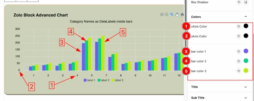
1. X-Axis Color: This option lets you change the X-Axis Color.
2. Y-Axis Color: This option lets you change the Y-Axis Color.
3. Bar Color 1: This option lets you change the Bar Color 1.
4. Bar Color 2: This option lets you change the Bar Color 2.
5. Bar Color 3: This option lets you change the Bar Color 3.
Title Section
Go to Style > Title
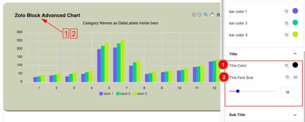
1. Title Color: This option lets you change the Title Color.
2. Title Font Size: This option lets you change the Title Font Size.
Sub Title Section
Go to Style > Sub Title
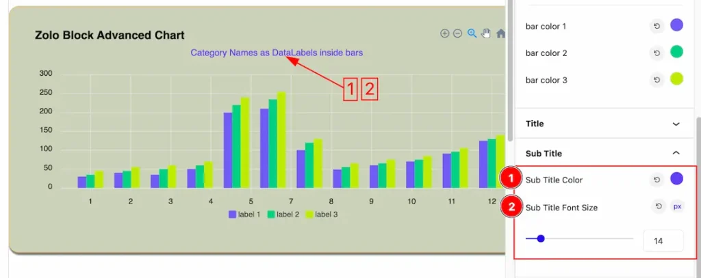
1. Sub Title Color: This option lets you change the Sub Title Color.
2. Sub Title Font Size: This option lets you change the Sub Title Font Size.
Legend Color Section
Go to Style > Legend Color
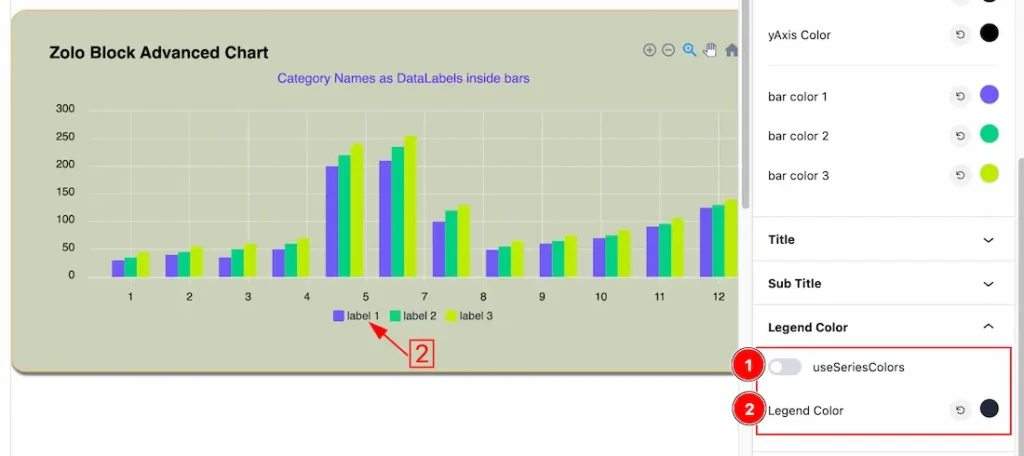
1. Use Series Colors: When you enable the Use Series Colors switcher button, the Legend color will be replaced with the series color.
2. Legend Color: This option lets you change the Legend color.
Extra Tab Controls
The extra tabs provide the controls of any blocks. You can make different visual layouts by following these Controls.
Click to learn more>>.
Video Assist
The Video will come soon. Please visit the demo page for examples.
Thanks for being with us.
