This documentation provides comprehensive insights into the Call To Action Blocks developed by Zoloblocks.
Adding a block to the editor
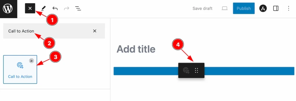
- Click the Toggle Block Inserter icon and a sidebar will appear on the left side, All the blocks will be visible here.
- Search the block ” Call to action ” and then appears the block.
- Select the Call to action blocks ( with zoloblocks logo T.R corner).
- Then Drag and Drop it on the page.
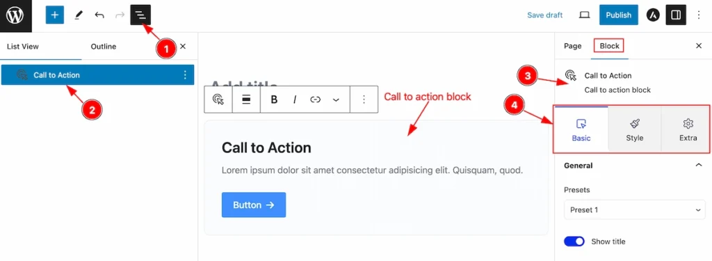
After Inserting the blocks, The Call To Action Blocks will appear. Follow this work with controls,
- Click on the Document Overviewer button
- Then Blocks list view will appear.
- After on the right side, the description of the selected block appears.
- Here show all the control tabs( Basic, Style, Extra ) of a block.
Basic Tab
The Basic tab controller displayed here offers the flexibility to adjust the layout of blocks according to your preferences.
General Section
Go to Basic > General
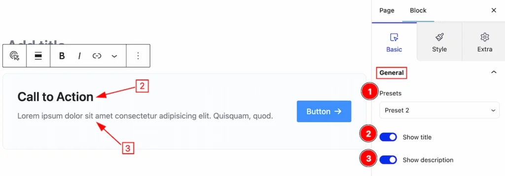
In this section, you can set the general controls of accordion,
- Presets: Presets are pre-defined configurations that allow users to quickly apply a specific style. Select any provided presets you prefer.
- Show Title: Enable the switcher to show Title.
- Show Description: Enable this to show the description of the Call to action.
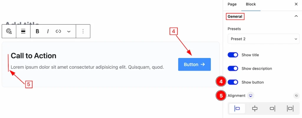
- Show Button: Enable this switcher to show the Button.
- Alignment: Set the content alignment ( Left, Center, Right, Justify).
Content Section
Go to Basic > Content
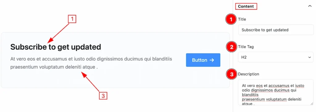
In this section, You can set content for the Call To Action.
- Title: Set the Title for the call to action.
- Title Tag: Set any HTML Tag for Title ( H1, H2, H3, H4, H5, H6, p, span ). The title tag is essential for both user experience and search engine optimization (SEO).
- Description: Set the Description.
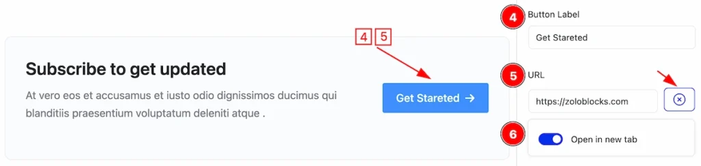
- Button Label: Set the label of the button.
- URL: set the URL of this button, which will navigate to the new link.
- Open in new tab: Enable the switcher, It will help to open a new tab of the Browser.
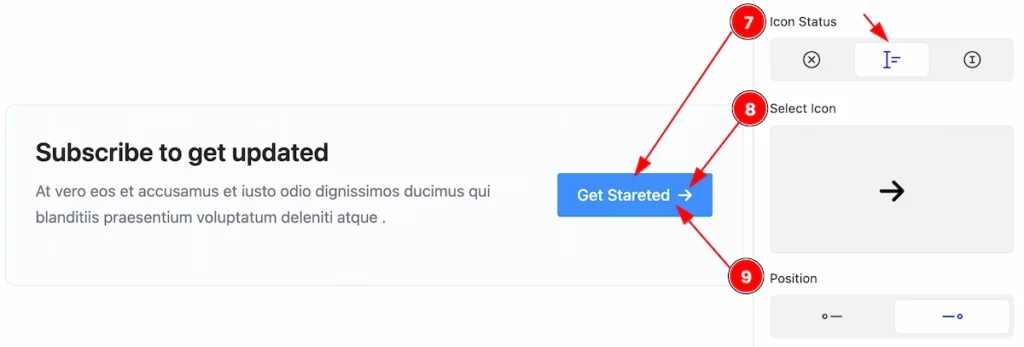
- Icon Status: Set the Icon status ( No Icon, Icon & Text, Icon Only ). Here select the Icon & Text.
- Select Icon: Select any Icon from the Icon library.
- Position: Set the position of the Icon along with the Text. ( Left or Right).
Style Tab
This tab provides the controls of the Single Accordion Items. The changes will apply only to relevant items. Let’s Explore all the controls.
Flex Direction Section
Go to Style > Flex Direction
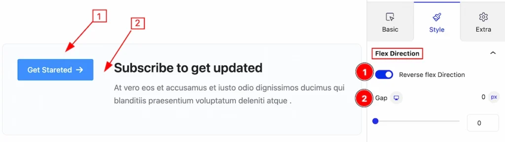
This section provides the controls of Call to Action Direction,
- Reverse Flex Direction: Enable the switcher to change the direction of the Button position reverse.
- Gap: Set the gap for the spacing between the content and the Button.
Title Section
Go to Style > Title
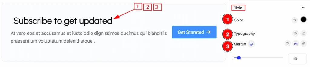
In this section, you can set the Title more stylish,
- Color: Set the color for the Title.
- Typography: Set the typography for the Title.
- Margin: Set margin for making space around the Title.
Description Section
Go to Style > Description
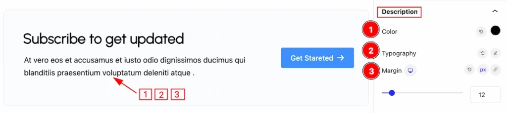
This section refers to change the description typography.
- Color: Set the color for the description.
- Typography: Set the typography for the Typography.
- Margin: Set margin for making space around the description.
Button Section
Go to Style > Button
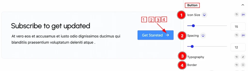
In this section, You can control the basic customization,
- Icon Size: Set the icon size.
- Spacing: Set the Spacing from the Icon.
- Typography: Set the typography of this button.
- Border: Set the border of the button.
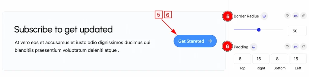
- Border Radius: Make the border corner rounded.
- Padding: Set the padding of the button.
Normal State Button
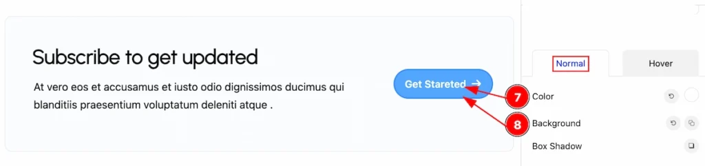
- Color: Set the color of the button label.
- Background: Set the background of the Button.
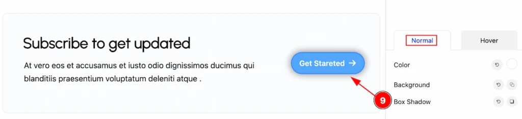
- Box Shadow: Set the Box shadow of the button.
Hover State Button
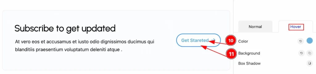
- Color: Set the color of the button label for the hover state.
- Background: Set the background of the Button for the hover state.
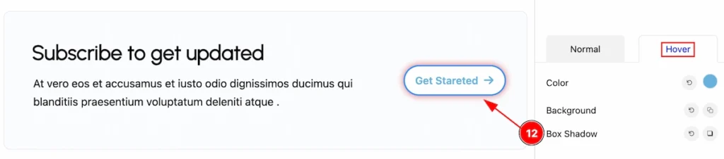
- Box Shadow: Set the Box shadow of the button for the hover state.
Extra Tab Controls
The extra tabs provide the controls of any blocks. You can make different visual layouts by following these Controls.
Click to learn more>>.
Video Assist
Video Tutorial for learning more.
Check the Demo Page.
Thanks for being with us!
