”Advanced Heading block” could be a specialized formatting option for creating headings with additional customization options beyond the basic formatting options.
Inserting The Block To The Editor
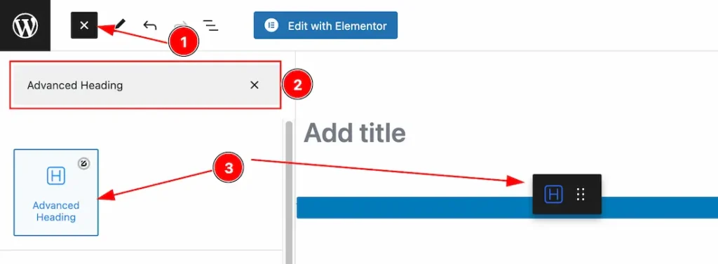
- Click the Toggle Block Inserter icon and a sidebar will appear on the left side, All the blocks will be visible here.
- Search the Advanced Heading Block Name inside the search Box. otherwise, select the Advanced Heading blocks ( with Zoloblocks logo T.R corner).
- Then Drag and Drop it on the page.
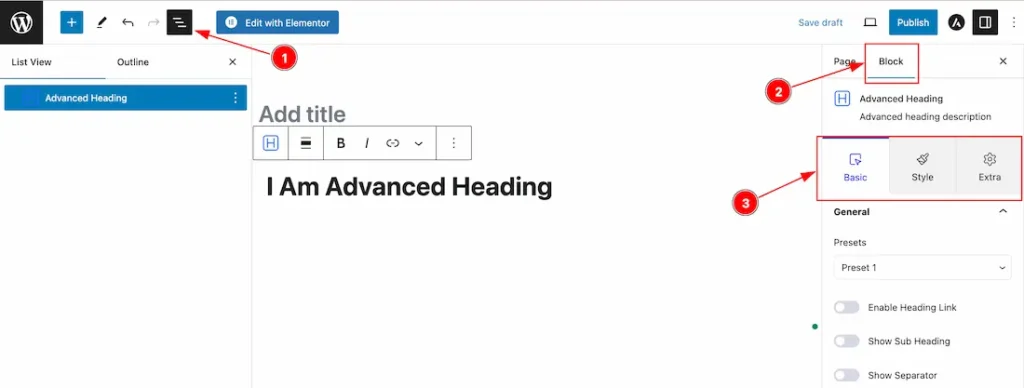
After Inserting the blocks, Follow this.
- Click on the Document Overviewer button and the Blocks list view will appear.
- After on the right side, Click on the Block.
- Here show all the control tabs( Basic, Style, Extra ) of a block.
Basic Tab Customization
The Basic tab controller displayed here offers the flexibility to adjust the layout of blocks according to your preferences.
General Section
Go to Basic > General
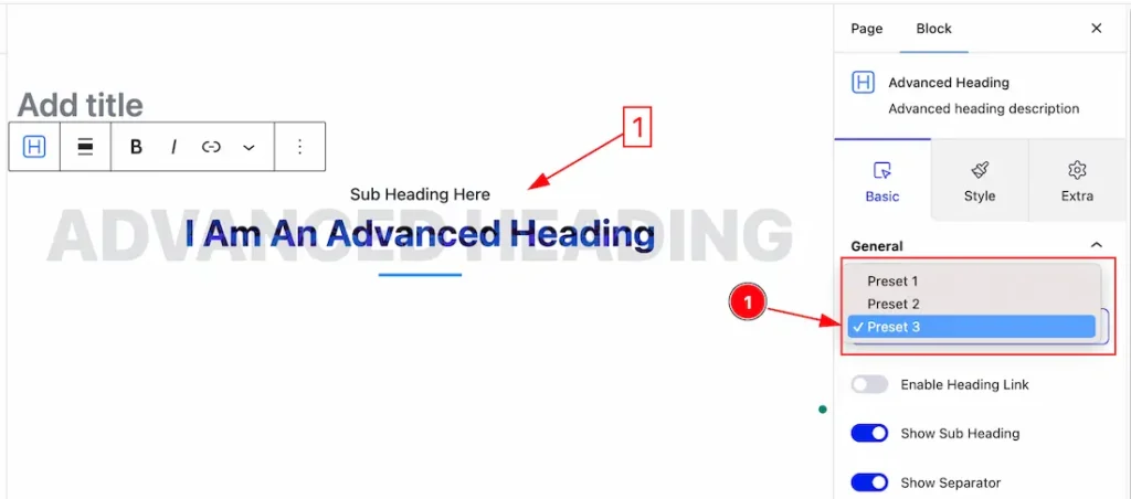
1. Presets: Actually, the Prestes are pre-design Headings. Here we have 3 presets. You can choose any one of them.
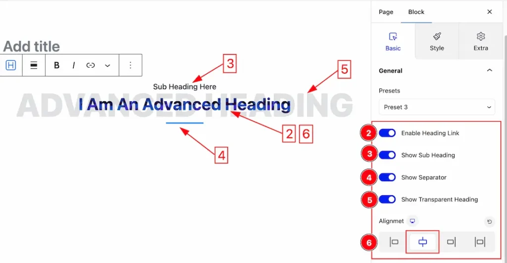
2. Heading Link: The Enable Heading Link switcher button lets you show or hide the link on the Advanced Heading.
3. Sub Heading: The Sub Heading switcher button lets you show or hide the Sub Heading on your page.
4. Separator: The Separator switcher button lets you show or hide the Separator on your page.
5. Transparent Heading: The Transparent Heading switcher button lets you show or hide the Transparent Heading on your page.
6. Alignment: Alignment may refer to the positioning of text or data within a specified space or column. Make the Heading align by following the icons ( Left, Center, Right, and Justify).
Content Section
Go to Basic > Content
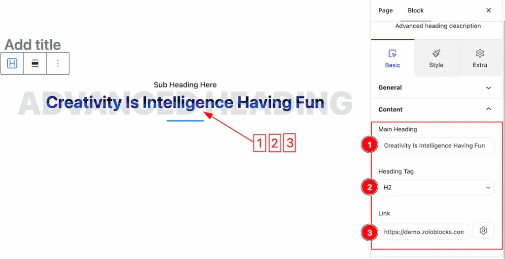
1. Main Heading: you can change the Main Heading Text to your needs. Just Keep the Texts in the Main Heading Box.
2. Heading Tag: Here also you get the Heading Tag options to decorate your Main Heading in different Tags. Like as H1 to H6, Div, Span, and P.
3. Link: you can set a link under the Main Heading. Here we set a link (https://demo.zoloblocks.com) just to show the option. you can set the link as your working demand.
Sub Heading Section
Go to Basic > Sub Heading
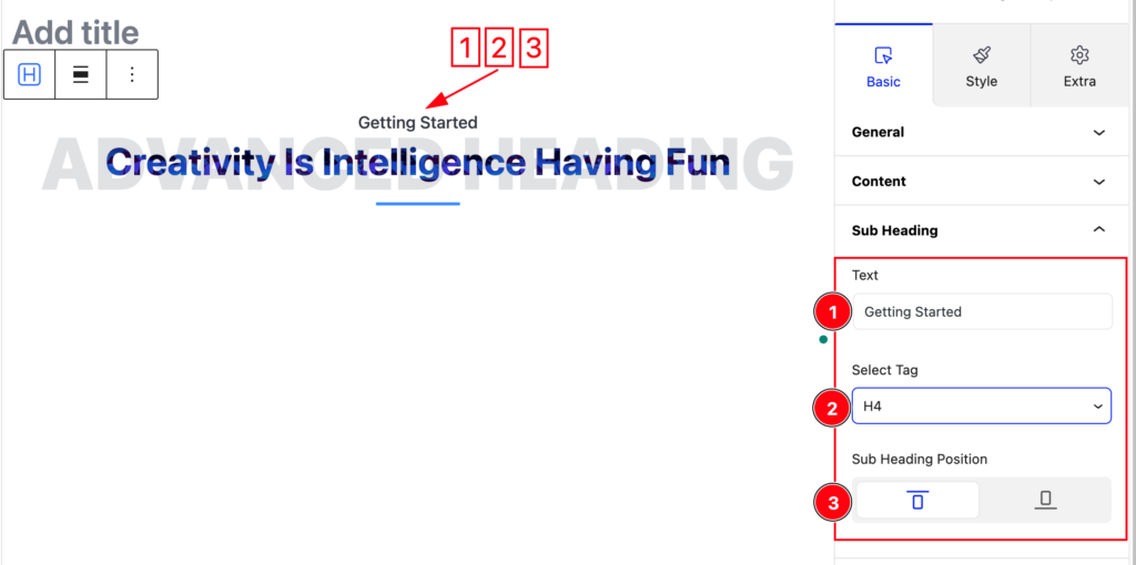
1. Text: you can change the Sub Heading Text to your needs. Just Keep the Sub Heading Text in the Text Box.
2. Select Tag: Here also you get the Select Tag options to decorate your Sub Heading in different Tags. Like as H1 to H6, Div, Span, and P.
3. Sub Heading Position: The Sub Heading Position option lets you position the Sub Heading Above or below the main heading.
Separator Section
Go to Basic > Separator
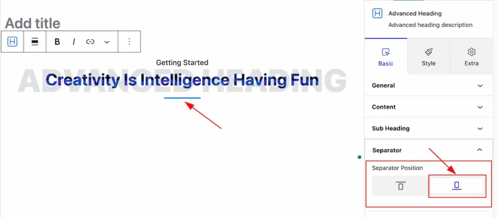
Separator: Come to the Separator section, you will get two positions of Separator. You can choose one of them.
Transparent Heading Section
Go to Basic > Transparent Heading
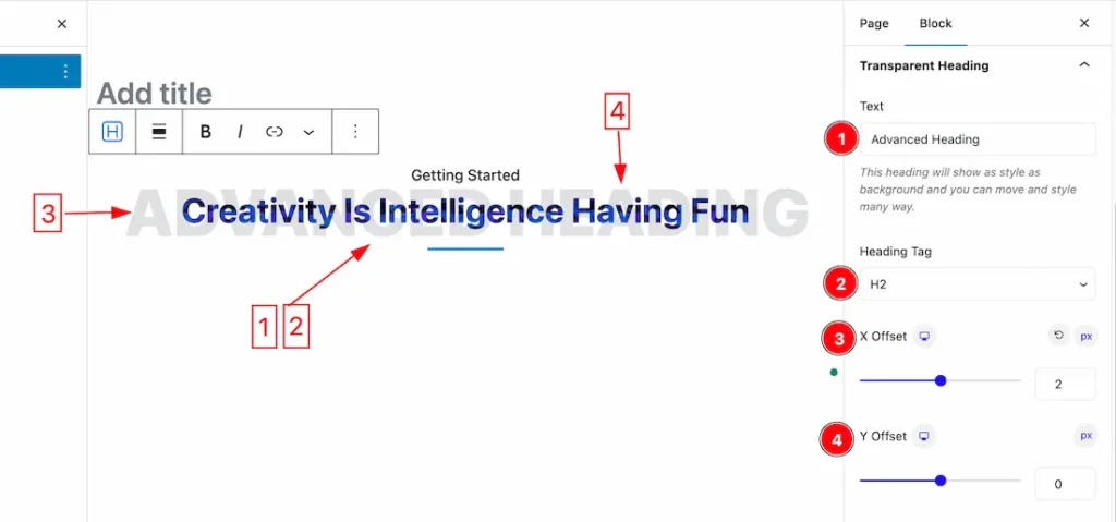
1. Text: you can change the Transparent Heading Text to your needs. Just Keep the Transparent Heading Text in the Text Box.
2. Heading Tag: Here also you get the Heading Tag options to decorate your Transparent Heading in different Tags. Like as H1 to H6, Div, Span, and P.
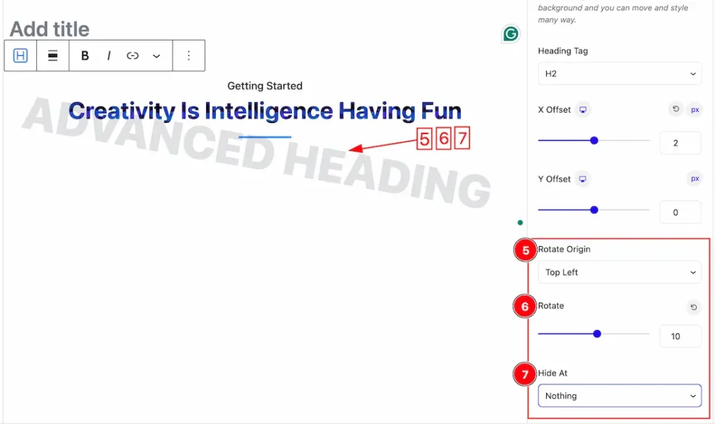
3. X Offset: The “X Offset” value refers to the horizontal displacement or adjustment applied to the heading. you can set the value to your needs.
4. Y Offset: The “X Offset” value refers to the Vertical displacement or adjustment applied to the heading. you can set the value to your needs.
5. Rotate Origin: you can select the Rotate Origin – Default, Top Left, Top Center, Top Right, Center, Center Left, Center Right, Bottom Left, Bottom Center, and Bottom Right.
6. Rotate: Set the value of Rotate to Rotate your Transparent Heading.
7. Hide At: The Hide At option helps to hide your Transparent Heading. You can select – Nothing, Tablet and Mobile, and Mobile to hide the Transparent Heading.
Work with The Style Tab
Heading Section
Go to Style > Heading
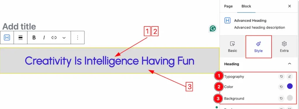
1. Typography: Changes the font family, size, weight, style, transform, decoration, line height, letter spacing, and word spacing from here.
2. Color: This lets you change the Heading color.
3. Background Color: This lets you change the Heading Background color.
Note: if you set the Preset 3 then you should must set the Background color or Background image. Otherwise, the Main Heading will disappear.
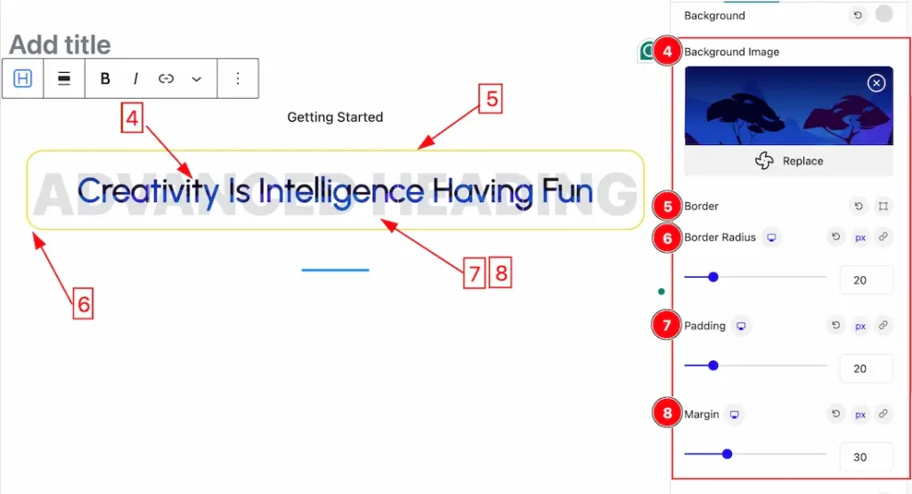
4. Background Image: This lets you set the Background Image.
5. Border: you can set the Border Color and Border Type to None, Solid, and Custom. We choose here the Border Type Solid.
6. Border Radius: Customizes the border corners for roundness.
7. Padding: Add spaces around an object to increase the inner area. Padding allows you to control the internal space within an element.
8. Margin: Adjusts the position of an object over the canvas.
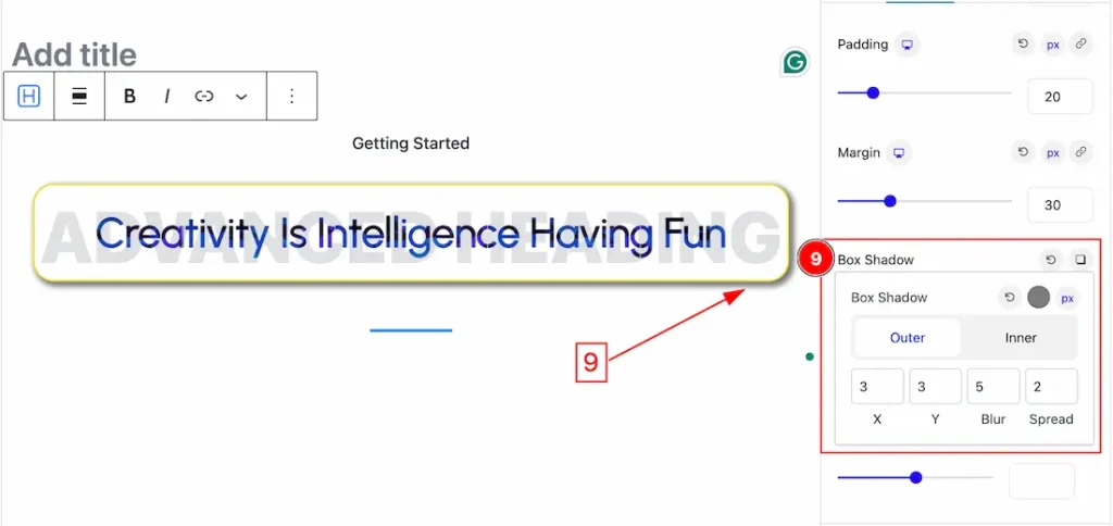
9. Box Shadow: The Box Shadow property is used to create the shadow around the Heading. It takes Four values: Horizontal offset (X), Vertical offset (Y), blur, and Spread to customize the Box shadow.
- Box Shadow Color: This lets you change the Box Shadow color.
- Position: you can set the Box Shadow position Outer and Inner. Here we set the Box Shadow position Outer.
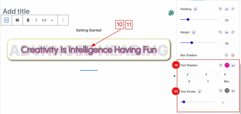
10. Text Shadow: The Text Shadow property is used to create the shadow around the text. It takes three values: horizontal offset (X), vertical offset (Y), and blur. Here you also can change the Text Shadow Color.
11. Text Stroke: If you want to add a stroke (outline) around the text, you can use the Text Stroke property. you also can change the Text Stroke Color and Value as your working demand.
Sub Heading Section
Go to Style > Sub Heading
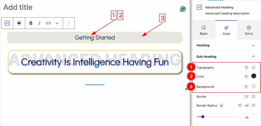
1. Typography: Changes the font family, size, weight, style, transform, decoration, line height, letter spacing, and word spacing from here.
2. Color: This lets you change the Sub Heading color.
3. Background: This lets you change the Sub Heading Background color.
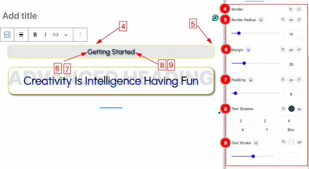
4. Border: you can set the Border Color and Border Type to None, Solid, and Custom. We choose here the Border Type Solid.
5. Border Radius: Customizes the border corners for roundness.
6. Margin: Adjusts the position of an object over the canvas.
7. Padding: Add spaces around an object to increase the inner area. Padding allows you to control the internal space within an element.
8. Text Shadow: The Text Shadow property is used to create the shadow around the text. It takes three values: horizontal offset (X), vertical offset (Y), and blur. Here you also can change the Text Shadow Color.
9. Text Stroke: If you want to add a stroke (outline) around the text, you can use the Text Stroke property. you also can change the Text Stroke Color and Value as your working demand.
Separator Section
Go to Style > Separator
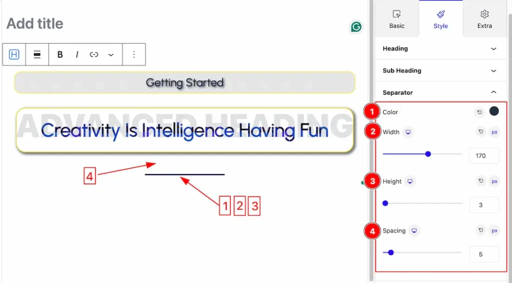
1. Color: This lets you change the Separator Color.
2. Width: Set the Separator Width.
3. Height: Set the Separator Height.
4. Spacing: Set the Separator Spacing.
Advanced Heading Section
Go to Style > Advanced Heading
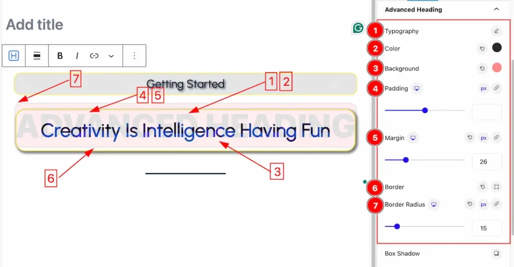
1. Typography: Changes the font family, size, weight, style, transform, decoration, line height, letter spacing, and word spacing from here.
2. Color: This lets you change the Advanced Heading Color.
3. Background: This lets you change the Advanced Heading Background color.
4. Padding: Add spaces around an object to increase the inner area. Padding allows you to control the internal space within an element.
5. Margin: Adjusts the position of an object over the canvas.
6. Border: you can set the Border Color and Border Type to None, Solid, and Custom. We choose here the Border Type Solid.
7. Border Radius: Customizes the border corners for roundness.
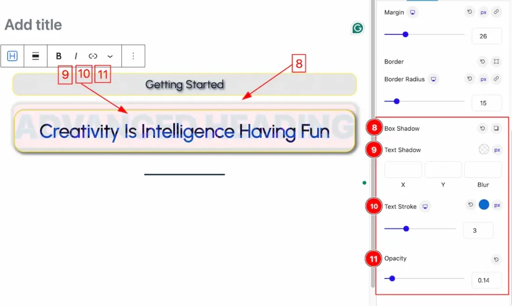
8. Box Shadow: The Box Shadow property is used to create the shadow around the Heading. It takes Four values: Horizontal offset (X), Vertical offset (Y), blur, and Spread to customize the Box shadow.
- Box Shadow Color: This lets you change the Box Shadow color.
- Position: you can set the Box Shadow position Outer and Inner. Here we set the Box Shadow position Outer.
9. Text Shadow: The Text Shadow property is used to create the shadow around the text. It takes three values: horizontal offset (X), vertical offset (Y), and blur. Here you also can change the Text Shadow Color.
10. Text Stroke: If you want to add a stroke (outline) around the text, you can use the Text Stroke property. you also can change the Text Stroke Color and Value as your working demand.
11. Opacity: The opacity property sets the opacity level for an element. The opacity-level describes the transparency-level. you can set the Opacity value to show the transparency of the Advanced heading.
All done! You have successfully customized the Advanced Heading Blocks on your website.
Video Assist
You can also watch the video tutorial Learn more about the Advanced Heading Block. Please visit the demo page for examples.
Thanks for being with us.