Your landing page might not be performing as well as you think – and that’s okay, because web design evolves fast. With AI-driven experiences, mobile-first expectations, and ever-shorter attention spans, the rules for landing page design have shifted dramatically heading into 2026.
This guide covers the essential Do’s and Don’ts to help you build landing pages that truly convert – not just look good on a screen.
What Is a Landing Page?
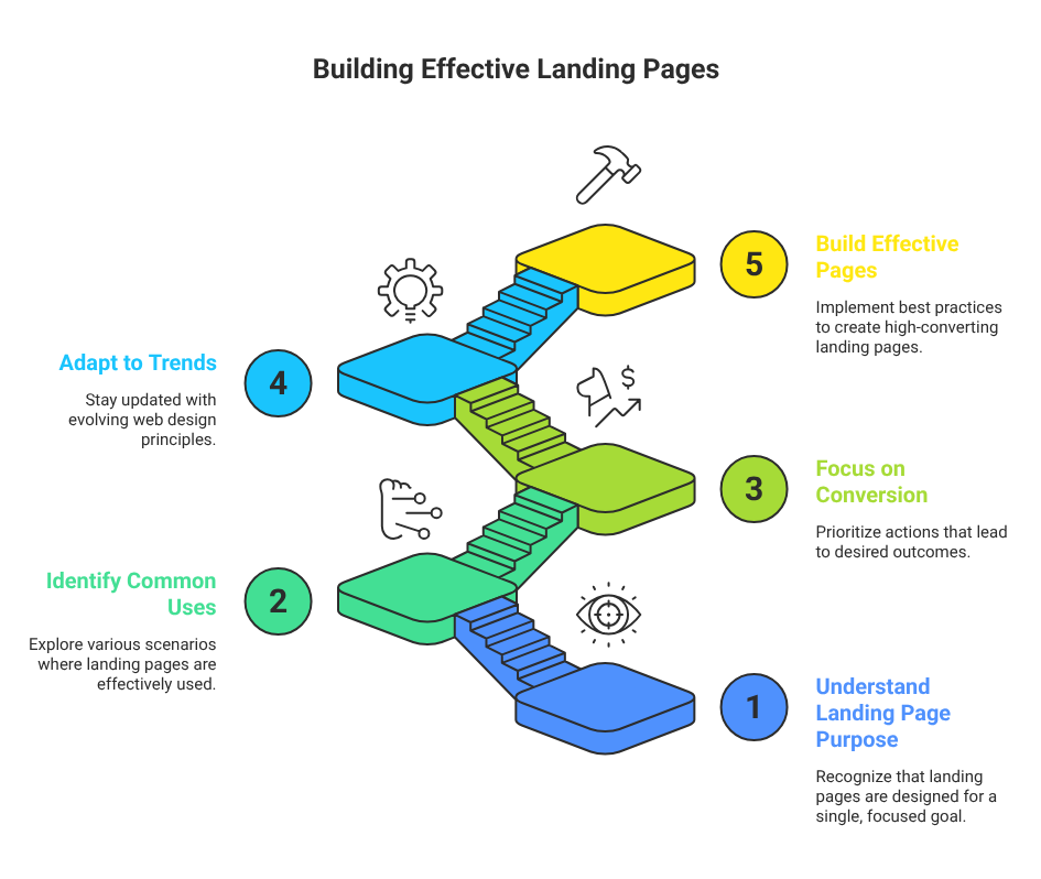
A landing page is a focused, standalone web page designed with a single goal in mind. Unlike your homepage, which serves many audiences and purposes, a landing page is purpose-built – it directs visitors toward one specific action.
When a user clicks on an ad, email link, or social media post, they “land” on this page. That’s where your one shot to convert them begins.
Common uses include:
- Promoting a product, service, or event
- Collecting leads through sign-up forms
- Driving registrations for webinars or courses
- Offering free trials, ebooks, or downloads
- Running seasonal promotions or campaign pages

Why Landing Page Design Matters More Than Ever in 2026
Attention is the scarcest resource online. Studies consistently show you have fewer than 8 seconds to capture a visitor’s interest before they leave. If your landing page is cluttered, slow, or confusing, your conversion rate suffers regardless of how much budget you’ve poured into driving traffic.
Great landing page design bridges the gap between your marketing message and your visitor’s intent. It’s not just about aesthetics – it’s about psychology, clarity, and strategic content flow.
Core Elements of a High-Converting Landing Page
A well-structured landing page in 2026 should include:
- A powerful, benefit-driven headline
- A concise and engaging subheadline
- Clear, persuasive copy focused on one goal
- High-quality visuals or a short explainer video
- A prominent, irresistible Call-to-Action (CTA)
- Social proof – testimonials, reviews, ratings, logos
- A Unique Selling Proposition (USP)
- A simple lead capture form
- Trust badges or security seals (especially for e-commerce)
The DO’s – Best Practices for Landing Page Design
1. Start With a Compelling, Benefit-Focused Headline
Your headline is the first thing visitors see – and in 2026, first impressions are everything. It needs to stop the scroll, communicate value instantly, and make the visitor want to keep reading.
A great headline should:
- Speak directly to the visitor’s pain point or desire
- Be concise – ideally under 10 words
- Clearly state the benefit, not just the feature
- Avoid jargon or overly clever wordplay that confuses
- Use active, energetic language
2. Focus on a Single Goal Per Page
One page, one mission. Trying to sell multiple products, push multiple CTAs, or serve multiple audiences on a single landing page is one of the most common – and costly – mistakes in web design. Every element on the page should serve one purpose: guiding the visitor toward a single conversion goal.
If you have multiple products or offers, create a dedicated landing page for each one.
3. Design With a Strategic Content Flow
Structure your content like a story: introduce the problem, present your solution, build credibility, and then ask for action. This top-to-bottom narrative keeps visitors engaged and moves them naturally toward conversion.
Follow this proven content flow:
- Hero section (headline + CTA above the fold)
- Problem statement – make visitors feel understood
- Solution overview – show how you solve the problem
- Features and benefits
- Social proof and testimonials
- Pricing or offer details
- Final CTA with urgency
4. Use Clear, Easy-to-Read Language
Write for humans, not search engines. Your copy should feel like a conversation with your ideal customer. Use plain language, short sentences, and plenty of white space to make reading effortless.
Pro tip – use the “pain-solution-loss” formula:
- Acknowledge the visitor’s problem so they feel understood
- Explain how your product/service is the solution
- Highlight what they lose by NOT taking action
5. Place Your CTA Prominently – and Early
Your Call-to-Action is the most important element on the page. Don’t bury it below the fold or at the end of a long scroll. Put it above the fold, repeat it at key scroll points (after features, after testimonials, at the end), and make it visually unmissable.
Your CTA button should:
- Use action-oriented language (“Start Free Trial”, “Get Instant Access”, “Claim Your Spot”)
- Stand out with a contrasting color
- Be large enough to click on mobile
- Create a sense of urgency when appropriate
6. Build Trust With Social Proof
In 2026, trust is the currency of online conversions. Visitors won’t convert unless they believe your product delivers. Social proof accelerates that trust by showing real people getting real results.
Effective social proof includes:
- Customer testimonials with names, photos, and results
- Star ratings and review counts
- Logos of well-known clients or media mentions
- Video testimonials (especially powerful in 2026)
- User-generated content and case studies
- Number of customers served or units sold
7. Make It Fully Responsive and Mobile-First
Mobile traffic now accounts for over 60% of all web browsing globally, and in many regions like South Asia, that figure is even higher. If your landing page isn’t optimized for mobile, you’re losing the majority of your potential customers before they even read your headline.
Mobile optimization checklist:
- Tap-friendly buttons (minimum 44×44 pixels)
- Single-column layout on small screens
- Fast-loading images (use WebP format)
- Large, readable fonts (minimum 16px body text)
- Thumb-friendly CTA placement
8. Leverage Color Psychology Strategically
Color influences emotion, trust, and action. Choosing the right color palette for your landing page isn’t just about aesthetics – it’s about guiding your visitor’s emotional journey.
- Red/Orange: Urgency, energy, excitement – great for limited-time CTAs
- Blue: Trust, stability, professionalism – ideal for SaaS and finance
- Green: Health, growth, prosperity – works well for wellness or eco brands
- Yellow: Optimism, warmth, creativity – use sparingly as an accent
Keep your palette tight: 2-3 primary colors max, with one reserved for CTAs to make them pop.
9. Embed a Short Explainer Video
Video remains one of the highest-converting elements on a landing page. An 80-second explainer that shows your product in action can communicate what 500 words of text cannot.
Keep the video under 2 minutes, include captions (since many users watch without sound), and show real results or demo footage rather than generic stock visuals.
10. Keep Forms Short and Simple
Every extra field on your form reduces your conversion rate. Only ask for what you absolutely need at this stage. For most lead generation goals, just a name and email address is plenty – you can gather more information later once the relationship is established.
11. A/B Test Everything
No amount of design expertise can predict exactly what will convert best with your specific audience. A/B testing is how you replace guesswork with data. Test one variable at a time: your headline, CTA text, hero image, form length, or page layout.
Key metrics to track:
- Conversion rate
- Bounce rate
- Average time on page
- Scroll depth
- Heatmap click patterns
12. Use Professional Templates as Your Starting Point
You don’t need to reinvent the wheel. High-quality landing page templates – built by professional designers and optimized for conversion – give you a proven structural foundation. Customize the content, colors, and imagery to match your brand.
Element Pack for Elementor, for example, offers 2000+ professionally designed templates across dozens of categories – from SaaS and e-commerce to webinars, lead generation, and product launches.
The DON’Ts – Mistakes That Kill Conversions
1. Don’t Distract Visitors With Multiple Goals
If you want more subscribers, focus on getting subscribers. If you want product sales, focus on sales. The moment you mix goals – asking visitors to subscribe, buy, share, and refer all at once – you trigger decision fatigue and lose them entirely. Every navigation link, pop-up, or off-topic promotion is a potential exit door.
2. Don’t Promote Multiple Offers Simultaneously
Mixing multiple products or services on one landing page is a conversion killer. Even if your catalog has 20 products, each landing page should spotlight exactly one offer. This keeps your message focused, your visitor’s attention intact, and your conversion rate healthy.
3. Don’t Ask for Unnecessary Information
Long forms are a psychological barrier. Asking for a phone number, job title, company size, date of birth, or other non-essential data at the first touchpoint signals a lack of respect for the visitor’s time – and they’ll leave. Start with the minimum and build the relationship gradually.
4. Don’t Hide Your CTA
Burying your CTA at the bottom of a long page, using a low-contrast button color, or placing it in an unexpected location breaks the user journey. A visitor who is ready to act but can’t find the action button won’t hunt for it – they’ll simply leave.
5. Don’t Fill Every Inch of Space
White space is not wasted space – it’s a design tool. Pages crammed edge-to-edge with content feel overwhelming and untrustworthy. Generous spacing between sections, around text blocks, and within cards gives the page room to breathe, helps visitors focus, and dramatically improves readability.
6. Don’t Let Your Page Load Slowly
Page speed is a conversion factor, a ranking factor, and a user experience factor all at once. Research shows that a page loading in 3+ seconds can lose 70% or more of its visitors before they see a single word of your copy.
Speed optimization essentials for 2026:
- Compress and convert images to WebP or AVIF format
- Use a Content Delivery Network (CDN)
- Minimize CSS, JavaScript, and third-party scripts
- Enable browser caching and lazy loading
- Target a Lighthouse Performance score above 90
7. Don’t Neglect Accessibility
This is a growing requirement – both ethically and legally. Ensure your landing page works for users with visual impairments (proper alt text, color contrast), motor disabilities (keyboard navigation), and cognitive differences (clear language, simple layout). Accessible pages also tend to rank better in search engines.
8. Don’t Use Misleading Headlines or Clickbait
If your ad or email promises one thing and your landing page delivers something different, visitors feel deceived – and they bounce instantly. Message match between your traffic source and your landing page is critical for both conversions and ad quality scores. Say what you mean, and deliver what you promise.
Quick Reference: Do’s vs Don’ts at a Glance
| ✅ DO | ❌ DON’T |
|---|---|
| Focus on a single clear goal | Mix multiple goals or offers |
| Write a compelling, benefit-focused headline | Use vague or overly clever headlines |
| Place CTAs prominently above the fold | Bury your CTA at the bottom |
| Use white space generously | Cram content into every space |
| Include authentic social proof | Make unverified or exaggerated claims |
| Optimize for mobile-first experience | Ignore mobile responsiveness |
| Keep forms to 1-3 fields max | Ask for excessive personal information |
| A/B test regularly | Assume your first design is the best |
| Optimize page speed aggressively | Load heavy scripts and uncompressed images |
| Match your ad copy to the landing page | Use misleading or clickbait headlines |
Final Thoughts
A high-converting landing page in 2026 isn’t about packing in the most features or using the trendiest design – it’s about clarity, trust, and a frictionless path to action. Every element should earn its place by moving the visitor one step closer to saying yes.
Start with these Do’s and Don’ts as your foundation, test relentlessly, and keep refining. The brands that win online aren’t the ones with the biggest budgets – they’re the ones who understand their visitors the best.
If you’re building on WordPress with Elementor, tools like Element Pack Pro give you 2000+ conversion-optimized templates and widgets to bring all of the above to life without starting from scratch.
- How to Add Links to Social Media on WordPress
- How to Create a Highly Advanced Form Using an AI Form Builder
- 15 Best Alternatives to Jotform for Smarter Online Forms in 2026
- 12 Best Coming Soon Landing Pages Examples (2026 Inspiring Designs)
- The Ultimate Guide to WordPress Admin and Site Enhancements


