Due to some inherent limitations, working with Gutenberg alone can be a hassle—especially if you want to design a highly functional website with a stylish look!
Moreover, Installing a fine 3rd party plugin that copes with Gutenberg is not an easy task either.
But what if there was a tool that designed your website dynamically from the Gutenberg dashboard and did not cause you any headaches?
We bring you ZoloBlocks, a plugin made by BDThemes, a trusted platform that has built its reputation from the very first.
Let’s hop on the ride and learn and explore more about ZoloBlocks. Shall we?
What is ZoloBlocks?
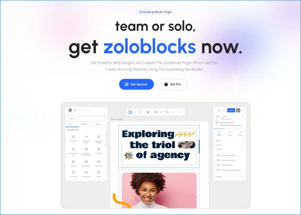
ZoloBlocks is a new plugin for WordPress block editor (Gutenberg site builder). Whether you’re working alone or with a team, ZoloBlocks makes web design easy with 30+ free elements, such as an Accordion, Advanced Button, Image Gallery and more.
The upcoming Pro Plan will include SEO readiness, top-notch security, a friendly user interface, fast performance, regular updates and reliable support. ZoloBlocks is designed to simplify web design without breaking the bank.
Exploring the 30+ Elements
With more than 30 elements, ZoloBlocks meets your website’s needs. More are yet to come and join the list. But let’s check out the details of the available ones.
01. Accordion
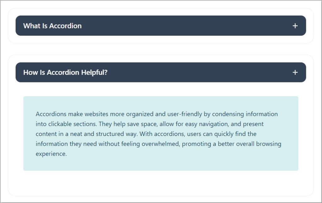
An accordion is a neat way to organize information on a website. It’s a clickable section with a title that opens to show more details.
Accordions are mostly used for FAQ sections or to show details without making the webpage look too crowded. With this tool, you can design the FAQ section to be more interesting and clickable.
02. Advanced Button

Buttons make websites interactive and help you move around or do stuff with a click. The Advanced button element is a prebuilt dynamic button with many features. Now you can design a normal button differently making your website more attractive.
03. Advanced Heading

Headings make the webpage organized and easy to read. When you see a heading, you know what the following content is going to talk about. It’s a great element for placing keywords for SEO.
It’s like a guide that divides the webpage into different sections. Now you can style your website content headings dynamically in minutes.
04. Advanced Icon Box
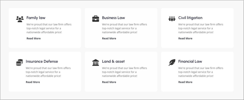
Advanced Icon Box lets you design a section with an icon, description and button. This is specifically used to describe features, small notes, etc. ZoloBlocks Advanced Icon Box is designed to the next level. You can design add color, change icons and style up according to your website’s necessity.
05. Advanced Image
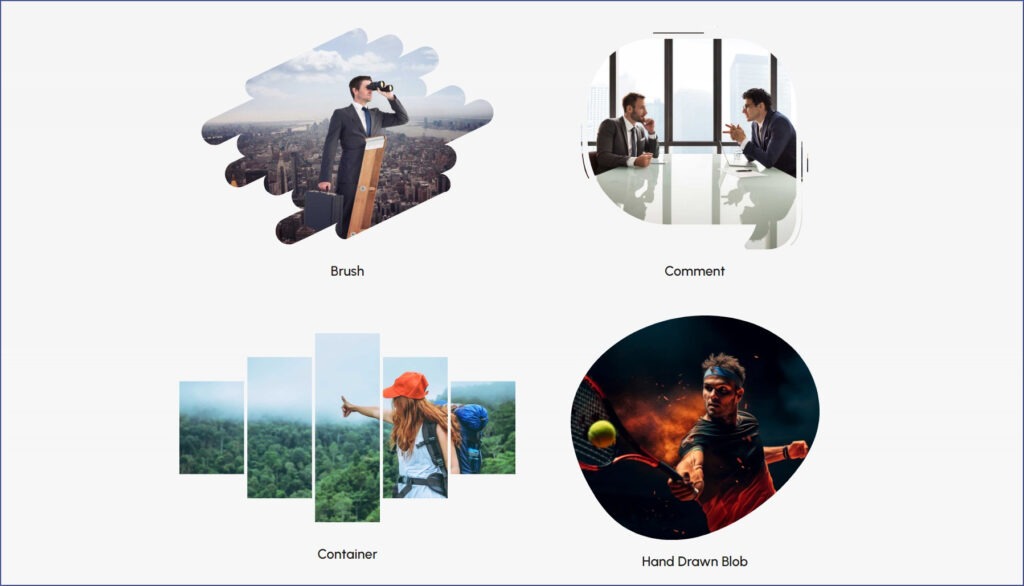
The Advanced Image Gutenberg Blocks in WordPress offer versatile image display options right within the editor. They let you customize image size, alignment, borders and effects with full control to enable stunning visual storytelling.
06. Advanced Search

Advanced Search is a dynamic tool designed to empower your WordPress site. This interactive block can help you craft a personalized search bar for your audience, improving their user experience.
07. Brand Grid
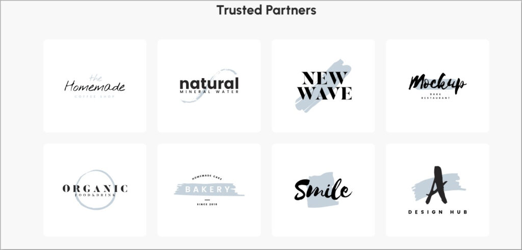
The Brand Grid section on a website is like a cool gallery where you can see different logos or brands all in one place. It’s a way for a website to showcase the companies or partners they’re connected with. This section helps build credibility and shows that the website is associated with reputable names.
08. Business Hours
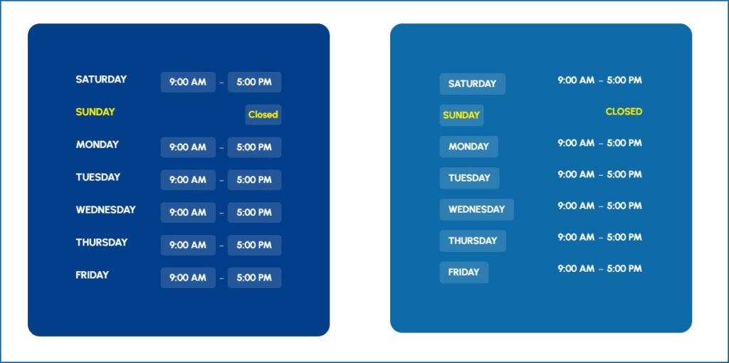
With our Business Hours element, showcasing your opening hours is simple. Customize and present your schedule for a sleek and professional look that enhances user experience.
09. Charts
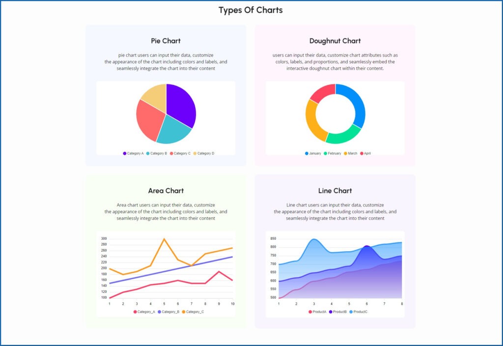
Charts in WordPress offer an easy and engaging way to visualize data. With options like bar, line, pie and area charts, users can quickly create informative visuals. Whether presenting statistics or tracking trends, WordPress makes it simple to create visually appealing charts that enhance data presentation.
10. Container

A container element is like a blank canvas for dynamic section design. It holds other elements and lets you arrange them however you want, giving you total control over the layout and appearance of each section.
11. Call To Action
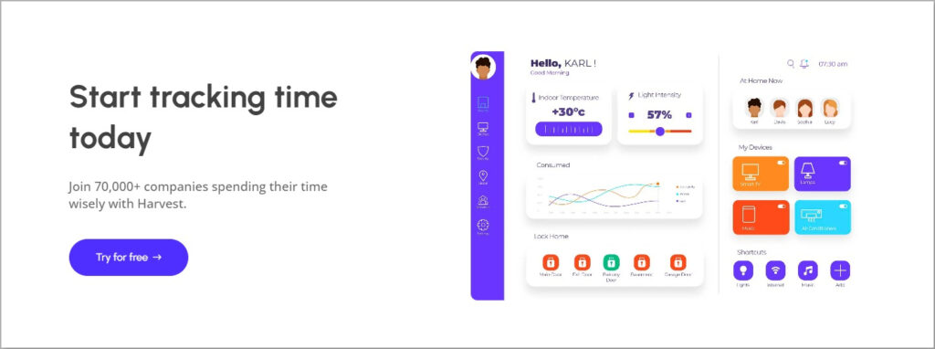
The Call to Action (CTA) section usually involves buttons or links prompting users to do something, like signing up for a newsletter, clicking to learn more, or purchasing. This section is important because it guides visitors on what to do next and helps achieve the website’s goals.
12. Counter
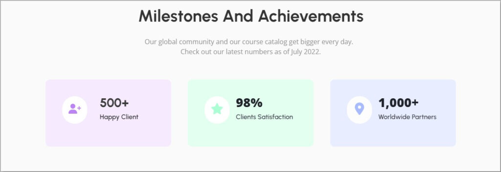
A counter section on a website is like a digital scoreboard that shows numbers counting up or down. It’s often used to highlight achievements, milestones, or statistics related to a business or project. This section adds a dynamic and engaging element to the website, capturing visitors’ attention and emphasizing important numbers.
13. Count Down
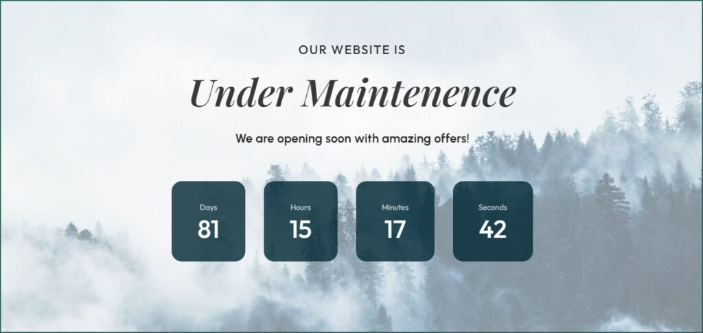
A countdown is a powerful tool for creating excitement and anticipation. By setting a specific date and time and customizing colors, fonts and styles, you can engage your audience and build anticipation for an upcoming event or launch. As the timer ticks down, excitement grows, making the event even more memorable.
14. Form
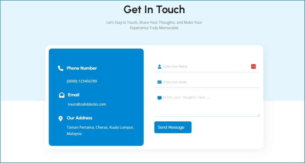
Our Gutenberg form builder block simplifies creating interactive forms for your website. Whether you need contact forms, surveys, or any other type of form, this tool helps you gather valuable information from your audience effortlessly.
15. Fancy List
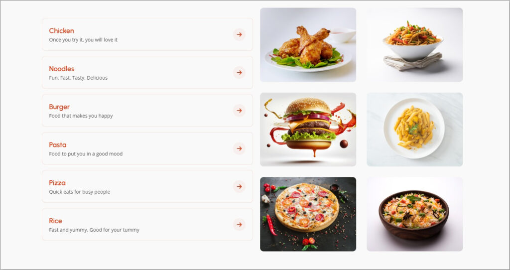
A Fancy List section on a website is a creative way to showcase information. Instead of just a regular list, it adds a bit of style. Each item in the list can have a unique design, making them look more appealing and exciting.
16. Flip Box
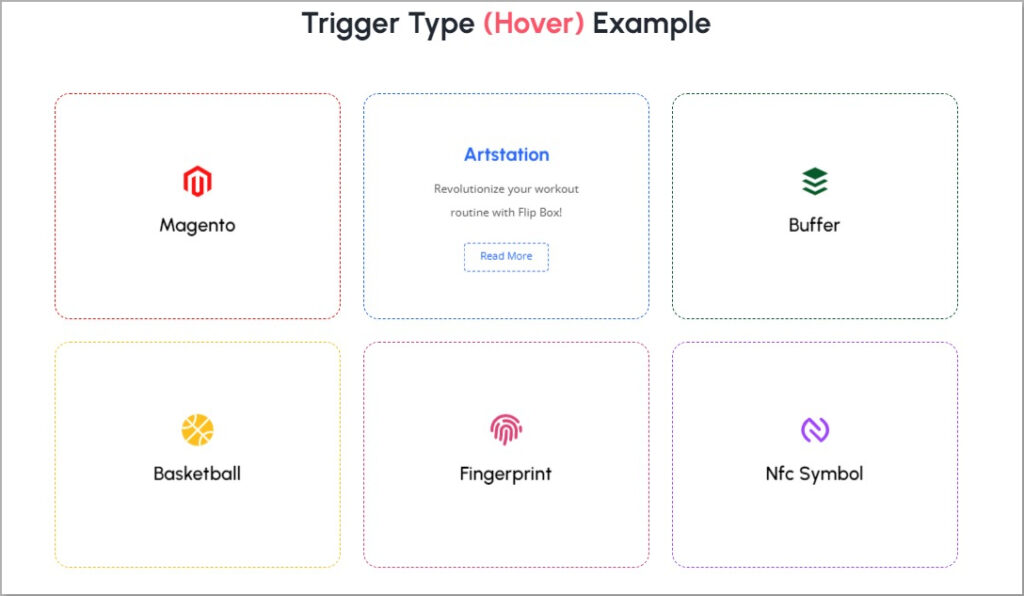
A Flip Box section is like a digital card that you can flip to see different content on each side. For example, on one side, there might be an image and when you click or hover over it, the box flips, revealing more details or text on the other side.
17. Google Map
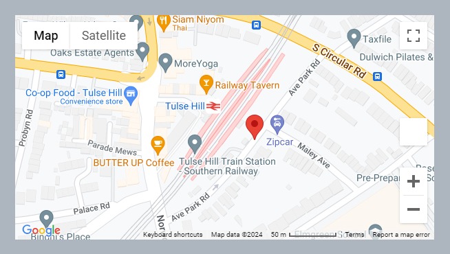
Google Maps can be very helpful for your website, allowing visitors to locate your address. Visitors can easily find the dedicated location and get directions. It’s like having a little map on the website to guide you to the places you want to go.
18. Image Gallery
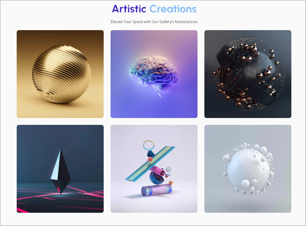
An Image Gallery on a website is a special section where you can see many pictures in one place. When you click on the gallery, it shows you bigger versions of the pictures and you can even scroll through them.
This is a great way to showcase products, share event photos, or display incredible images.
19. Image Compare
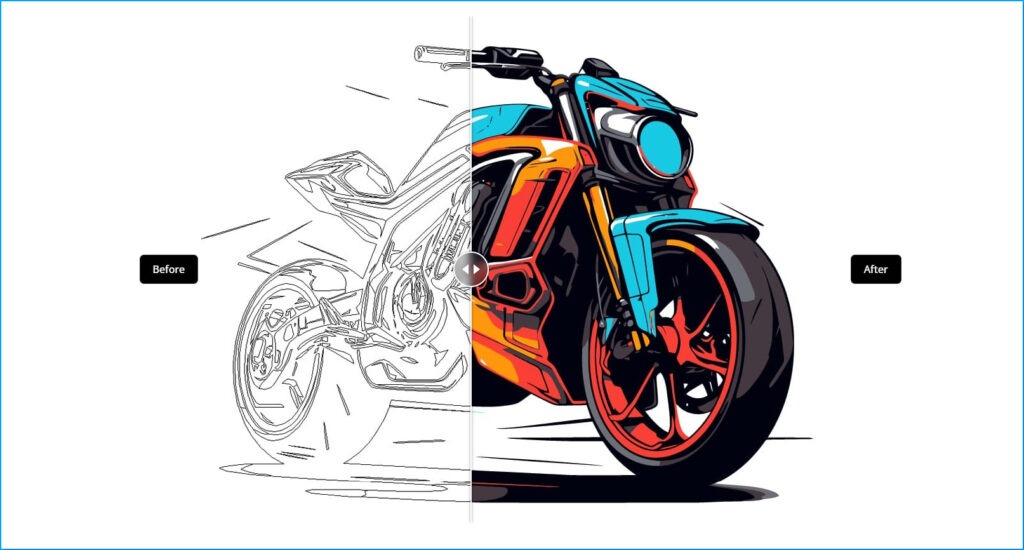
Image Compare is a dynamic element that enables users to interactively compare two images by sliding between them, revealing changes over time or variations in content.
This feature significantly enhances content presentation, making it more engaging and informative for viewers. Users can easily observe and comprehend differences by simply sliding back and forth.
20. List
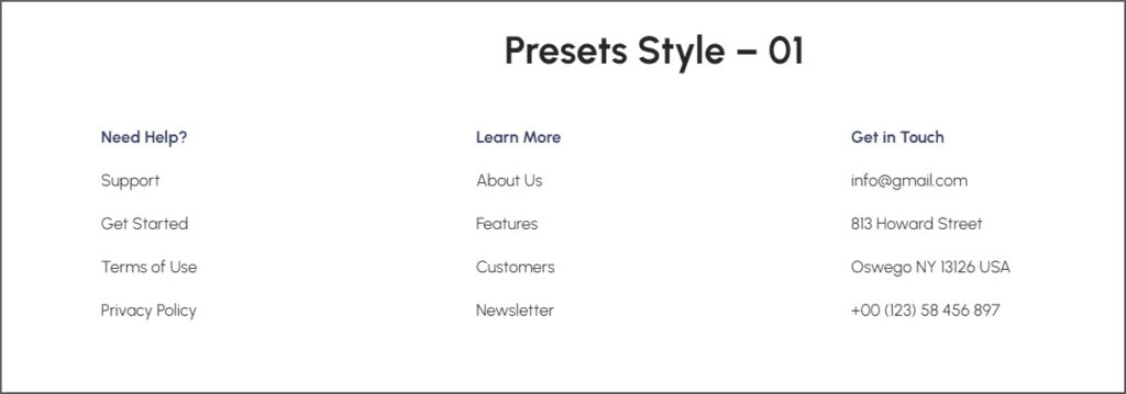
A list is a handy tool for organizing and presenting information clearly and concisely. It allows you to compile critical points, features, or steps in an easily digestible format for your audience. Whether you’re outlining a product’s benefits, summarizing important details or laying out a series of steps, lists help streamline communication and enhance understanding.
21. Post Carousel
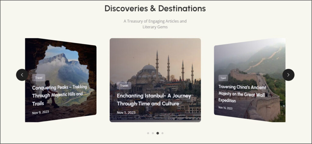
A Post Carousel is essential for WordPress users seeking dynamic ways to display their content. This feature lets you showcase your WordPress posts in an eye-catching carousel format, perfect for captivating your audience.
Whether you’re a blogger, business owner or content creator, the Post Carousel enhances your WordPress website’s visual appeal and user experience.
22. Post Grid
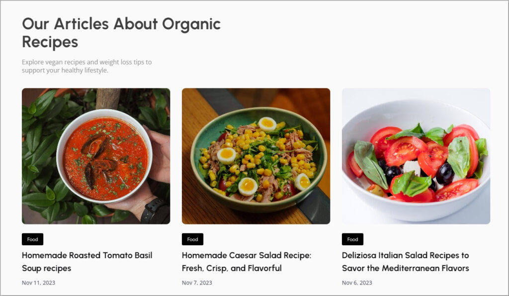
A Post Grid section arranges your blog posts or articles in a grid format. Each post gets its own space, kind of like a small card. It makes your website look tidy and helps visitors easily see and click on different posts.
23. Post List
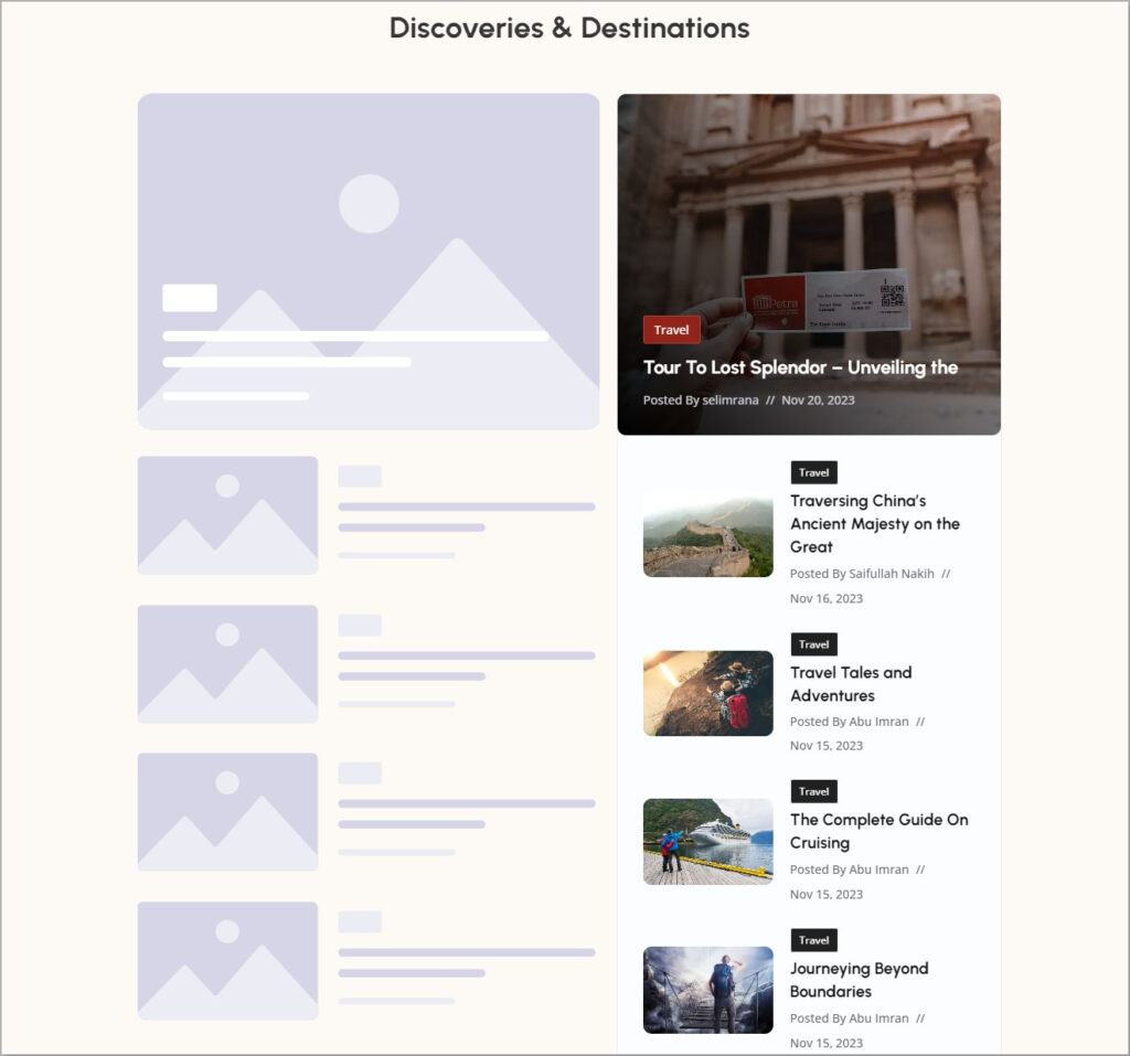
A Post List section showcases a list of articles or posts. It’s a way for visitors to see a collection of different stories or updates in one place. Each post usually has a title, a little snippet of what it’s about and maybe a picture. It’s handy for websites that share regular content, like blogs or news pages.
24. Pricing Table
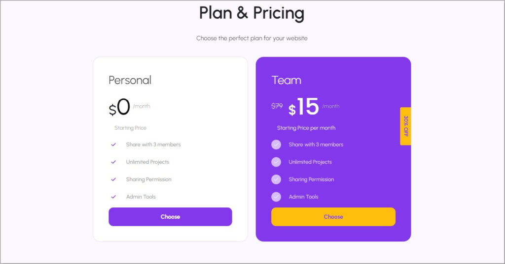
The Pricing Table shows pricing plans for any software or service. It helps visitors understand what features or services they can get at different price points.
25. Profile Card
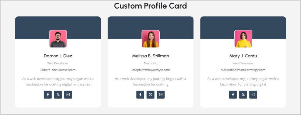
A Profile Card section is like having small cards with pictures and short details about different individuals or items. When you click on a card, it shows more information, like a sneak peek into someone’s profile. This is handy for showcasing team members, products or anything you want people to know more about.
26. Progress Bar
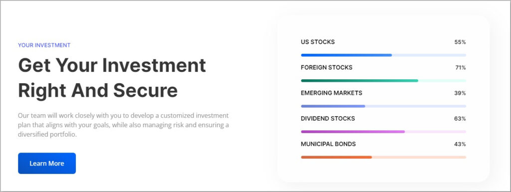
A Progress Bar shows a lining bar indicating any fixed information. It’s a visual indicator, often a colored bar, that lets visitors know specific data.
27. Review
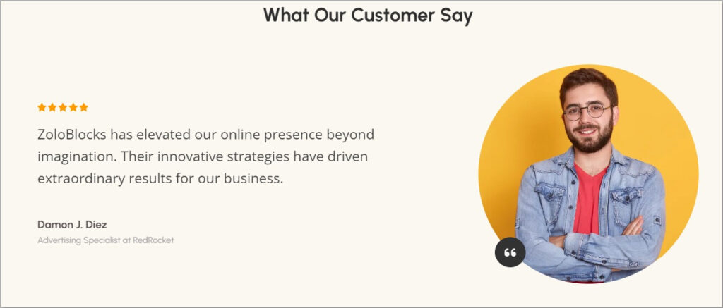
With a Review section, users get to share their working experience and review any product or service. With ratings and comments, visitors get to know the product’s success story and the experience of others.
28. Review Grid
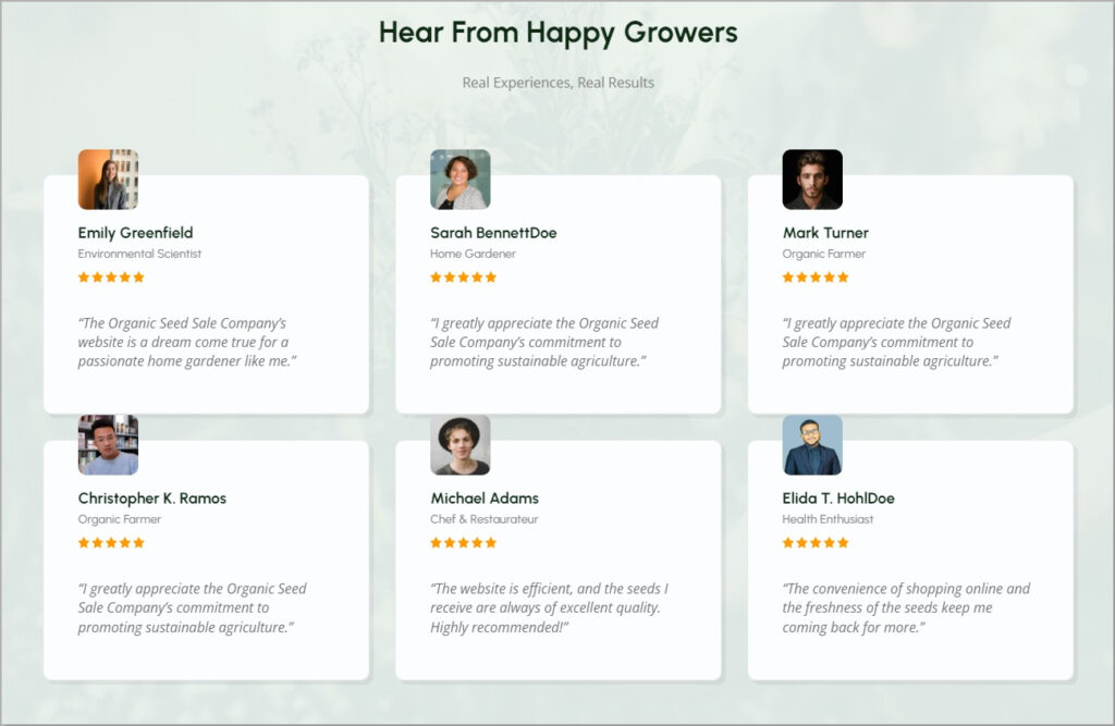
Review Grid helps you showcase multiple testimonials together. You can have the same or similar or different design for each testimonial. It looks great and increases the brand value.
29. Review Carousel
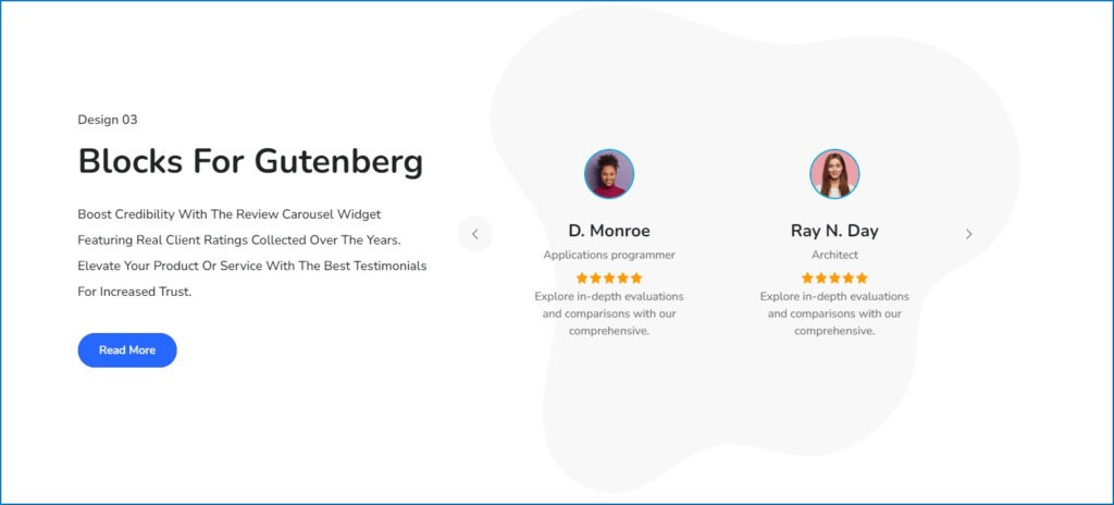
You can showcase glowing testimonials, enhancing brand credibility and trust. This feature allows you to craft engaging carousels that cycle through customer feedback, displaying essential elements such as names, photos, ratings and feedback effortlessly.
With this powerful tool, you can highlight positive experiences, bolstering confidence in your brand among potential customers.
30. Slider
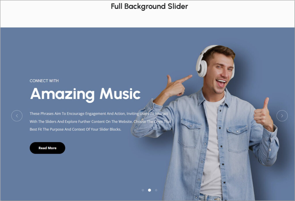
A slider section is a dynamic photo gallery that showcases different images or messages one at a time. It’s like a slideshow where pictures or content automatically change, or users can manually move through them.
31. Social Links

The Social Links section is the small icons representing sites like Facebook, Twitter, Instagram and more. Clicking on these icons takes you to their respective pages, allowing you to follow or connect with the website’s social accounts.
32. Social Share

A Social Share section lets you easily share cool things you find with your friends. Usually found at the end of articles or posts, it has buttons for popular social media platforms like Facebook, Twitter and Instagram. With just one click you can share the page with your friends.
33. Star Rating

A Star Rating section is how much people love, appreciate or use your service. It’s like proof of how good your product or service is. You can use this to let your visitors know how trustworthy your product or service is.
34. Team Grid

The Team Grid is a small profile section where you get to know the incredible people behind the scenes. It’s a neat arrangement of pictures and short descriptions of each team member. Clicking on a person’s picture or name might reveal more details like their role and what they love to do.
35. Tabs

Tabs are like folders for content. They help users find and access different information in an organized way. By clicking on tabs, users can easily switch between text, pictures, videos and more, making navigation simple and efficient.
Why Do You Need ZoloBlocks?
Now, the most important question is: Why do you need to use ZoloBlocks while so many plugins are available?
Well, there are many plugins, but not many are compatible and flexible with Gutenberg.
Here are some solid reasons you should consider testing ZoloBlocks at least once.
Simple to Use: ZoloBlocks is made in such a way that even a beginner can learn and use it in a few hours like a pro.
Compatibility: It works smoothly with any WordPress theme and has supportive addons.
Fast Performance: ZoloBlocks won’t slow down your site. It’s optimized for speed and reliable performance.
User-Friendly: The interface is professional-looking, clean and user-friendly.
Support and Updates: ZoloBlocks provides excellent support, quickly addressing issues and adding new features. Regular updates ensure it gets better over time.
Affordable: ZoloBlocks offers competitive prices for its Pro Plan, but there’s also a forever-free Core or Lite version.
How to Get Started?
To get started, download ZoloBlocks and upload it to your WordPress dashboard. Then, follow these simple steps.
Step 01:
Sign up for ZoloBlocks and get early access. Then, download ZoloBlocks. A zip file will soon be in your download folder.
Step 02:
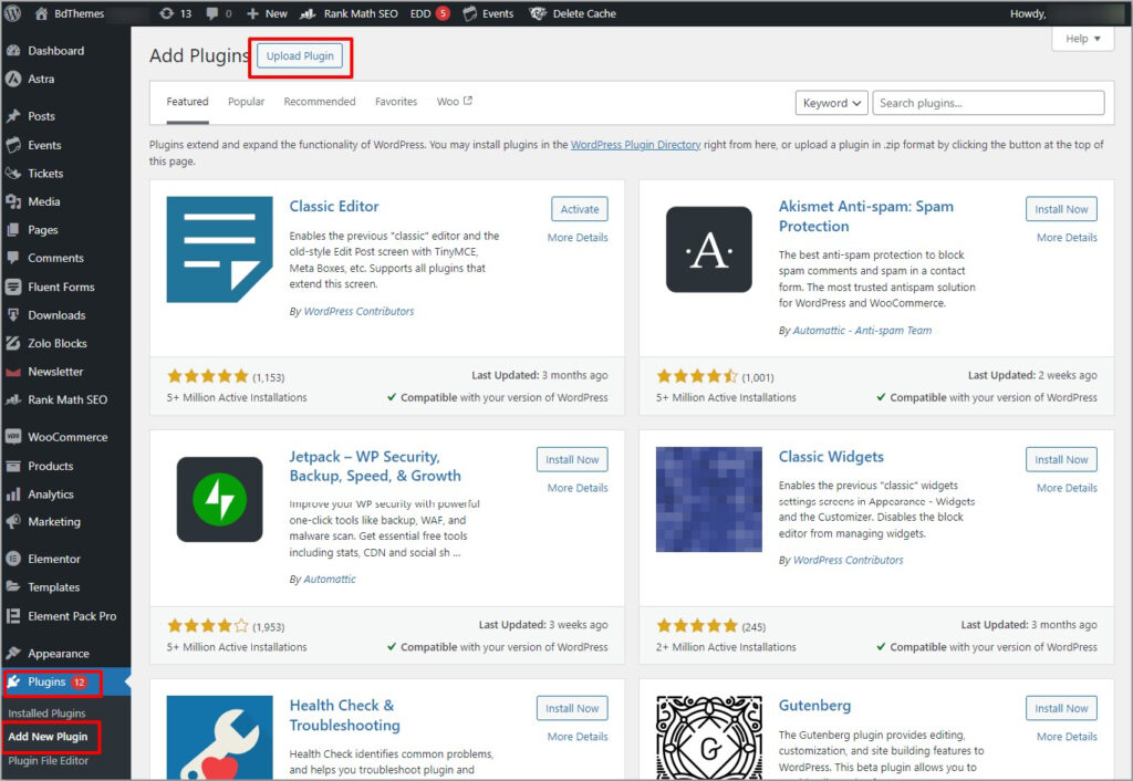
Log in to your WordPress admin dashboard. Go to Plugins > Add New Plugin > Upload Plugin.
Step 03:
Now, upload the zip file and install the plugin. Once the installation process is complete, activate it.

Step 04:
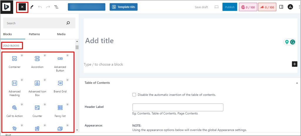
Now, go to the page or post from the WordPress admin dashboard. You’ll find ZoloBlocks right in your Gutenberg platform.
Note: You need to deactivate Elementor to work with ZoloBlocks.
Final thoughts
In the world of website building, ZoloBlocks is your trusty sidekick, turning the ordinary into the extraordinary.
Picture it like a box of magical building blocks for your site!
With over 20 cool tricks up its sleeve, ZoloBlocks is the friend you want by your side, whether you’re a web wizard or just getting started.
So, if you’re ready to sprinkle some enchantment on your website, hop on board and let ZoloBlocks be your creative companion.
Download it now and let the web adventures begin!
Frequently Asked Questions
What is the pricing of ZoloBlocks?
The pricing has not been decided yet, but you can download the beta version from the site for free.
Is There Any Documentation of Zoloblocks?
The team is working day and night to serve you the complete documentation as fast as possible.
Is there any video tutorial on Zoloblocks?
The team is working on it and the tutorial will be available soon. In the meantime, you can follow the ZoloBlocks YouTube channel.

