Let’s say your visitors come to your WordPress site at midnight. Visitors at night always expect a comfortable, dark interface. But if their background is so bright white that they can’t stay for long. This, in turn, increases the bounce rate of visitors. This reduces the time visitors spend on the website day by day.
Forcing dark mode by default eliminates this problem, reducing eye strain for every user from the start. This is what keeps visitors on the website longer. In this post, we will show you how to force a WordPress website into dark mode.
What Is Dark Mode and Why Is It Useful?
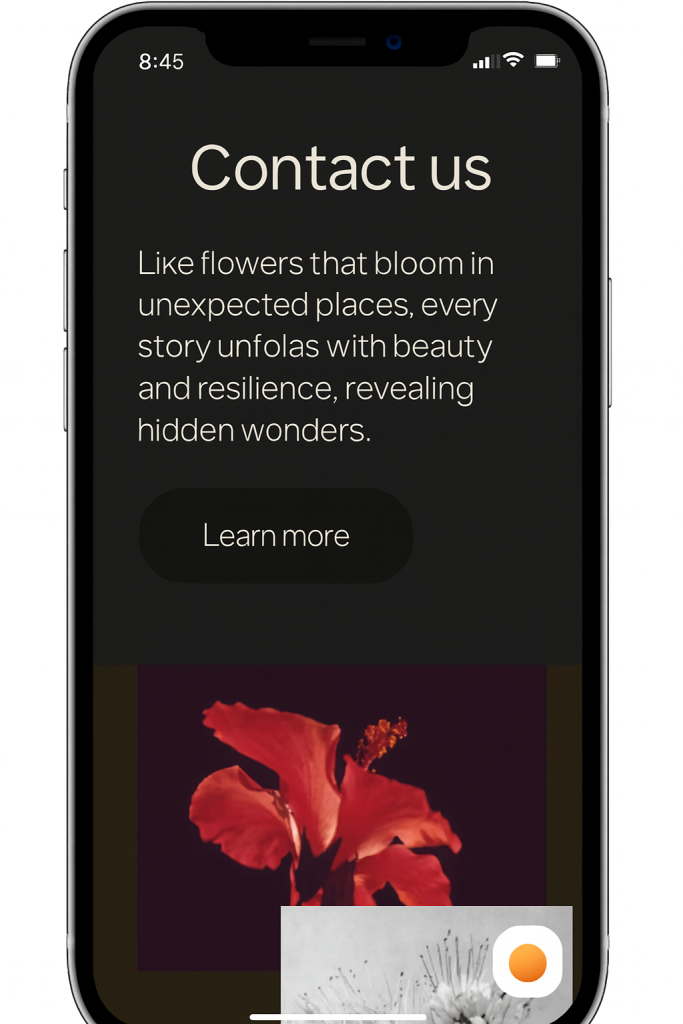
Dark mode inverts a website’s color scheme, replacing light backgrounds with dark ones and light text on dark backgrounds for better low-light viewing.
It proves useful by reducing blue light exposure, which helps alleviate eye fatigue during extended sessions, especially after 10 PM, when over 80% of users prefer it.
This feature also appeals to users with light sensitivity or visual impairments, improving accessibility and keeping visitors on your site longer.
Dark Mode’s Most Notable Benefits
Dark mode delivers key advantages like significant battery savings on OLED screens, up to 67% less power at full brightness and extending mobile browsing time.
It enhances focus by minimizing glare and directing attention to content, while modernizing your site’s look to match user expectations across apps and devices.
Dark Mode vs. Night Mode
Dark mode applies a full, persistent color inversion across the entire site, often with customizable brightness and contrast controls. Night mode, by contrast, focuses mainly on reducing blue light via sepia or grayscale filters without a complete theme overhaul.
Use dark mode for a comprehensive black theme experience; reserve night mode for subtle evening adjustments that preserve original colors.
How Do You Force a WordPress Website Into Dark Mode
Forcing dark mode means setting it as the default for all visitors, overriding browser or system preferences until they toggle it off. Plugins like Dark Reader make this straightforward without code changes.
Force Dark Mode Using a Plugin (Recommended for Most Users)
Adding a forced dark mode to your WordPress website starts with choosing the right plugin and configuring it correctly.
In this guide, the focus is on the Dark Reader plugin, which offers both free and premium options to create a professional default dark experience with advanced controls like color contrast, automatic scheduling and full compatibility with popular page builders.
Compared to many basic dark mode toggles, Dark Reader gives you deeper visual control and smarter behavior, making it ideal when you want your site to load in dark mode by default while still keeping things user‑friendly. So, let’s jump into the steps.
Step 1: Install the Dark Reader Plugin on WordPress
The Dark Reader plugin powers your site’s dark mode experience, so the first step is to install and activate it correctly. Once it’s added to your WordPress setup, you’ll unlock all the customization options for brightness, contrast, filters and toggle controls in later steps.
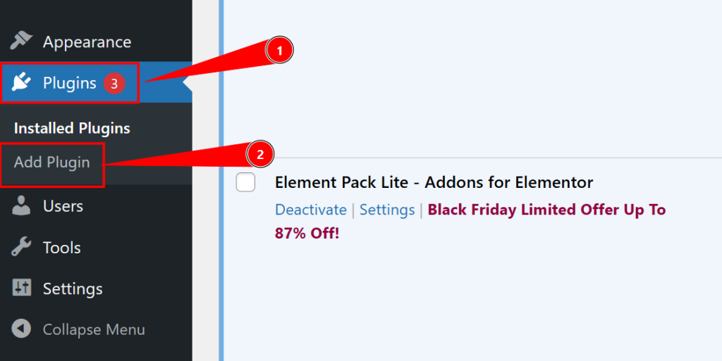
Here’s how to install it from your WordPress dashboard:
- Log in to your WordPress Dashboard and go to Plugins → Add New.
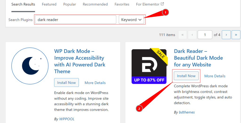
- In the top‑right search bar, type “Dark Reader” and locate the official plugin by BdThemes in the results.
- Click Install Now to download and install the plugin files.
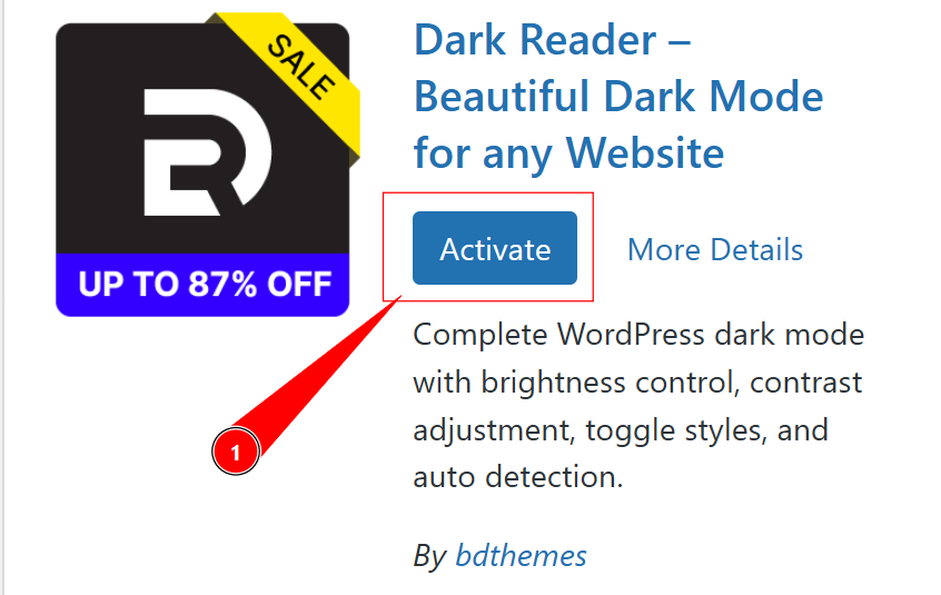
- When the installation finishes, click Activate to turn the plugin on.
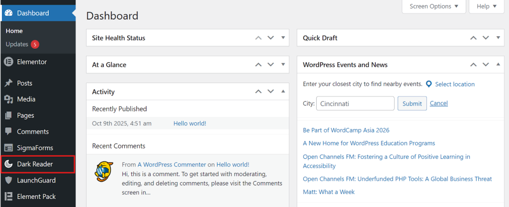
- After activation, Dark Reader will add its settings panel to your admin area, usually under Dashboard Menu → Dark Reader.
Step 2: Configure Basic Dark Mode Appearance Settings
After activating Dark Reader, your next task is to define how dark mode should look and behave on your site. To begin, go to your WordPress Dashboard, then navigate to Dark Reader to open the Dark Reader settings panel.
This settings area is where you’ll control the default behavior for new visitors, the overall brightness and contrast, and how the dark theme feels visually across your pages.
Step 2.1: Set Default Dark Mode Behavior for New Visitors
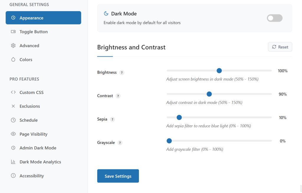
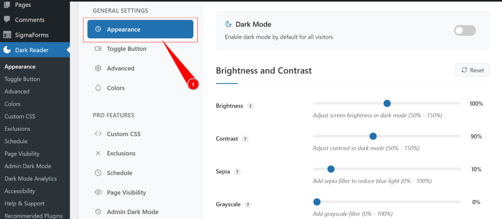
- Inside the Dark Reader settings, click on the Appearance tab.
- Look for the primary Dark Mode toggle.
- Turn this toggle ON to have your website load in dark mode by default for all new visitors.
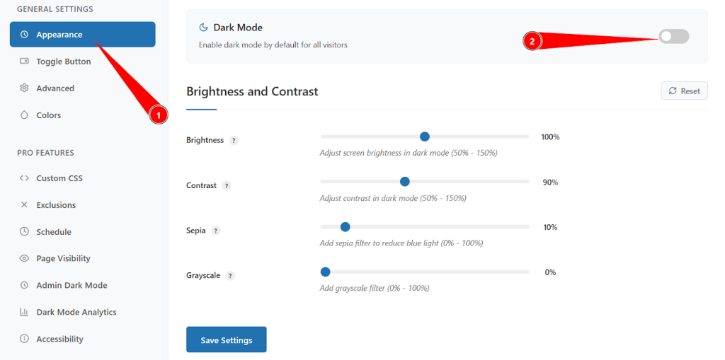
If you’d rather let users choose their preferred mode first, you can keep this disabled initially and rely on the toggle button or system preference detection. This approach gives visitors more control, even if they prefer a lighter interface.
Step 2.2: Adjust Visual Elements for Optimal Dark Mode Display
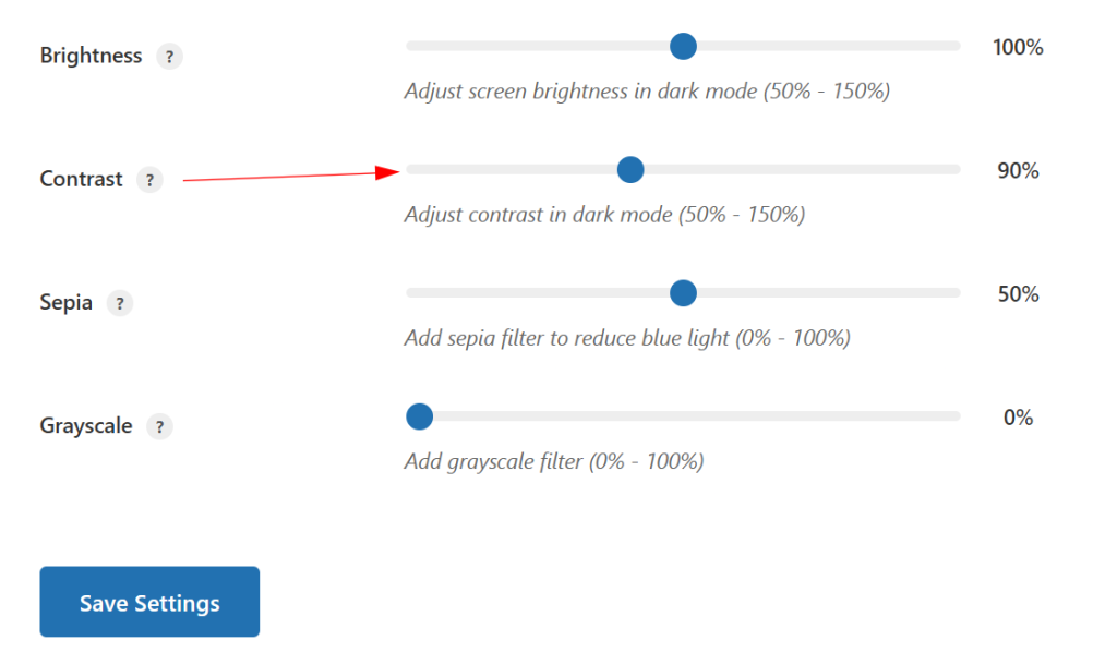
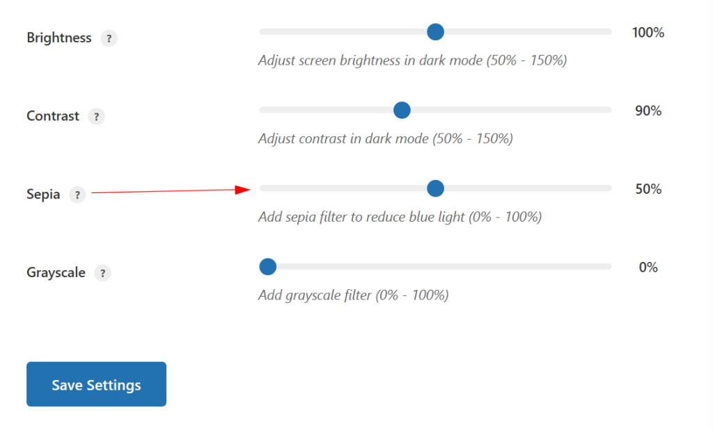
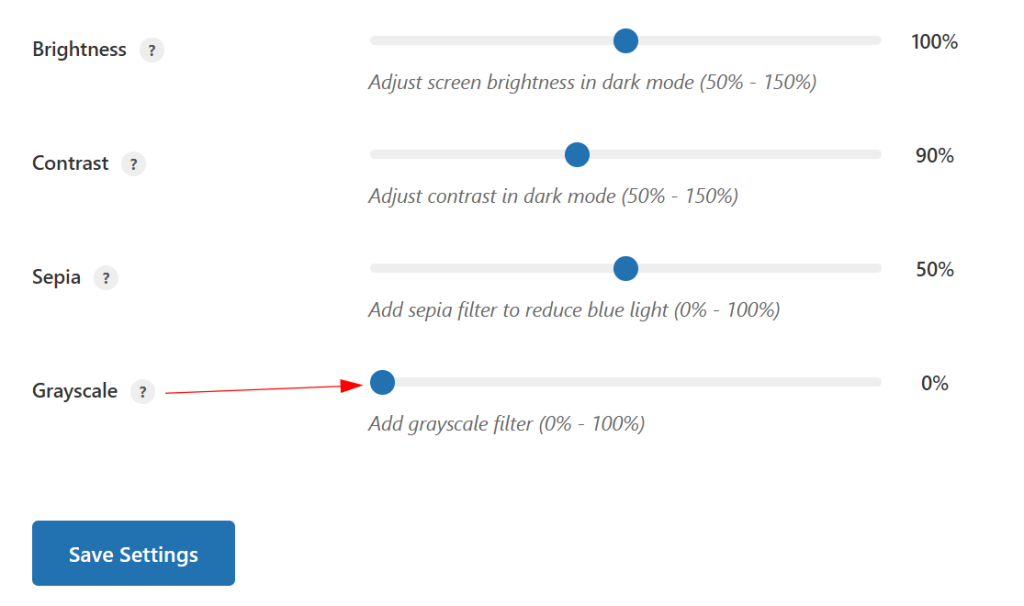
To ensure your dark mode is both attractive and readable, fine‑tune the visual sliders in the Appearance tab:
- Brightness (50% – 150%): Controls the overall luminance of your dark layout. Lower values create a deeper, more intense dark theme, while higher values lighten the background slightly for better readability on some screens.
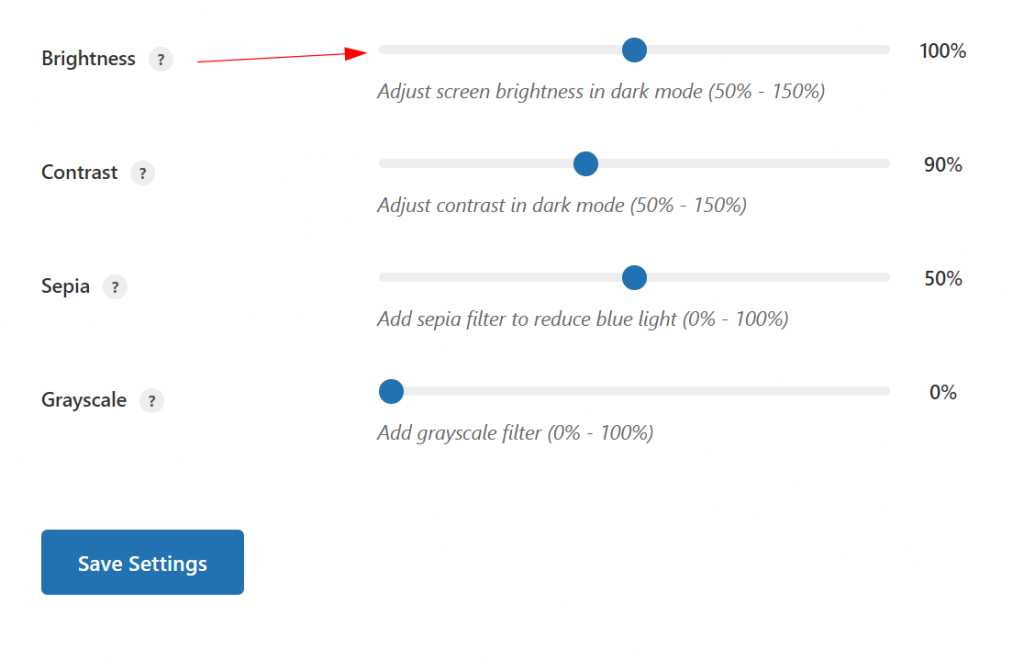
- Contrast (50% – 150%): Adjusts how strongly text and elements stand out against the background. Increasing contrast sharpens edges and improves clarity; decreasing it produces a softer, more muted look.
- Sepia (0% – 100%): Adds a warm, amber‑like filter that reduces blue light and makes long reading sessions more comfortable, especially at night.
- Grayscale (0% – 100%): Reduces or removes color, helping users stay focused on the content and minimizing distraction from highly saturated visuals.
Experiment with different combinations until you find a dark mode style that fits your brand while still meeting accessibility and readability standards.
Step 3: Customize the Dark Mode Toggle Button Position and Style
Even if you enable dark mode by default, visitors should still have a clear, convenient way to switch between light and dark. The toggle button is the main control for this, and its position and design play a big role in the overall user experience.
Step 3.1: Choose the Best Toggle Button Position
Go to the Toggle Button tab to choose where the switch will appear:
- Top Left: Highly visible but unobtrusive, ideal if your main navigation is on the right.
- Top Right: A familiar, expected spot for settings and mode switches, which works well with most headers.
- Bottom Left: A subtle position suitable for reading‑focused blogs or long‑form content.
- Bottom Right: Popular for floating UI elements and works nicely on most layouts, especially when paired with chat widgets or back‑to‑top buttons on the opposite side.
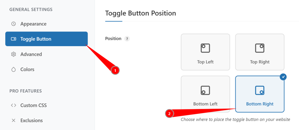
Pick a position that doesn’t clash with existing sticky elements like chat icons, cookie notices, or floating CTAs.
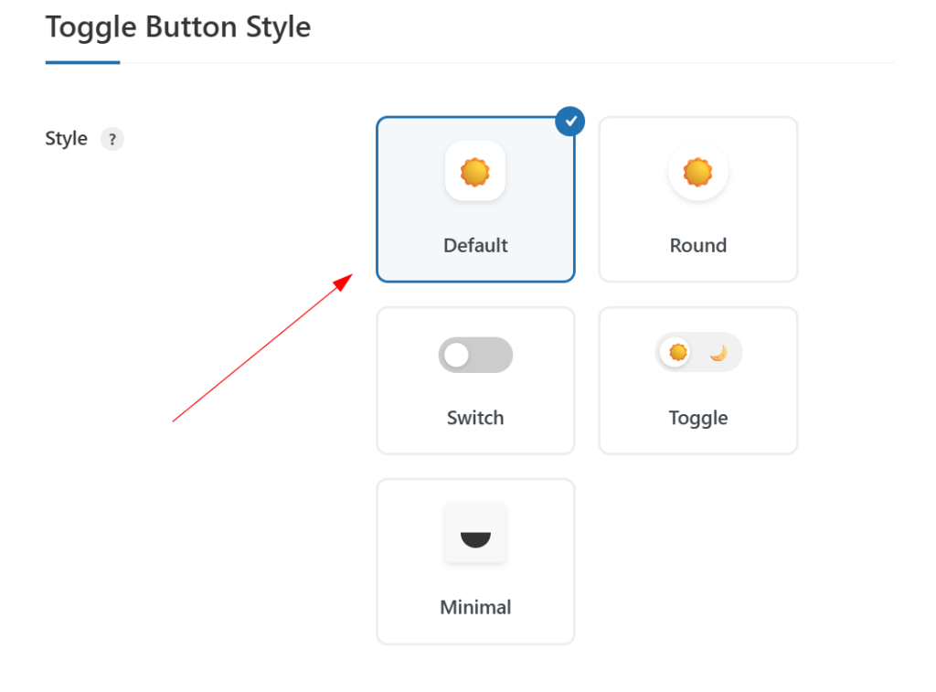
Step 3.2: Select a Toggle Button Design That Matches Your Brand
Within the same Toggle Button settings, choose a style that fits your site’s design language:
Free styles typically include:
- Default: Simple text‑based switch, minimal and straightforward.
- Round: Circular button that feels modern and compact.
- Switch: iOS‑style slider that clearly indicates ON/OFF states.
- Toggle: Traditional on/off button look for familiar usability.
- Minimal: Icon‑only design that blends seamlessly into clean, modern layouts.
Pro users get additional premium styles such as:
- Modern Slider: Smooth sliding animation for a polished, app‑like experience.
- Text Toggle: Clean text‑focused switch that works well with typography‑heavy designs.
- FlipFlop Toggle: Animated flip effect for a more playful interaction.
- iOS Toggle: Apple‑inspired switch familiar to mobile users.
- iOS Toggle Icon: Icon‑only variation of the iOS‑style toggle for compact placements.
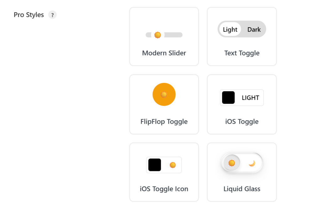
Choose a style that fits your branding and gives clear visual feedback when users change modes.
Step 4: Enable Smart Dark Mode Detection and Advanced Settings
Beyond the basics, Dark Reader includes advanced options that make dark mode feel smarter and more adaptive. These settings automatically respond to user preferences and different content types, reducing the need for manual toggling.
Step 4.1: Activate System Color Scheme Detection
In the Advanced tab:
- Enable Use System Color Scheme.
- This setting checks whether a visitor’s device or browser is already set to dark mode and applies the dark theme accordingly.
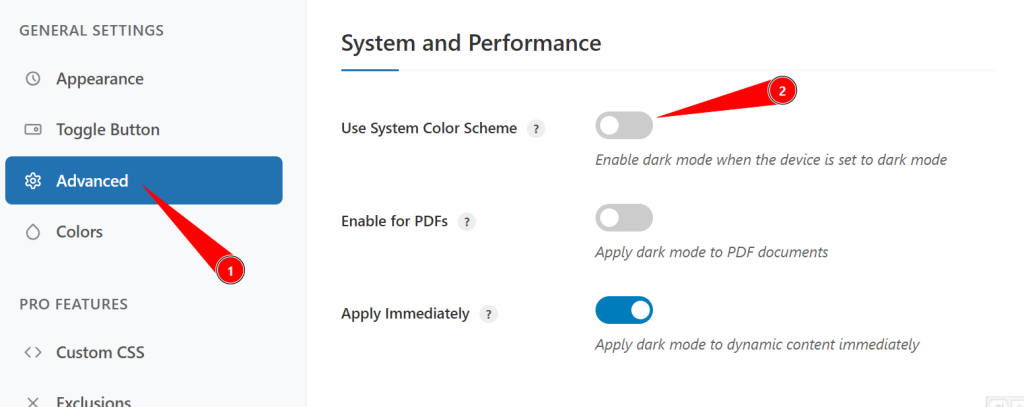
This creates a seamless experience by aligning your site with the user’s existing system preference, so they don’t feel forced into a mode that conflicts with their device settings.
Step 4.2: Apply Dark Mode to Different Content Types
Still in the Advanced tab, configure how dark mode interacts with various content types:
- Enable for PDFs: Applies dark theme styling to embedded PDFs and document viewers, making long documents easier to read in low‑light conditions.
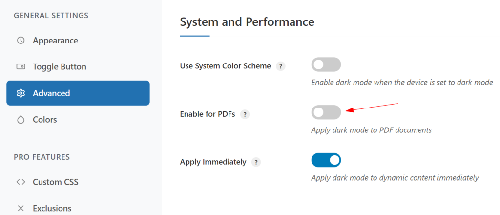
- Apply Immediately: Ensures dark mode is also applied to dynamically loaded content (like AJAX‑loaded sections or infinite scroll) instead of only the initial page load.
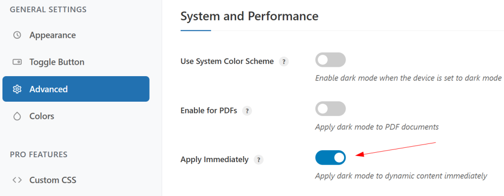
These options maintain a consistent dark experience across all content, even as new elements load on the page.
Step 4.3: Use Advanced Filter Options for Extra Control
You can further refine how strong your dark mode effect appears:
- Filter Mode:
- Dimmed Mode: Slightly darkens the page while preserving more of the original colors, perfect if you want a softer nighttime view.
- Dark Mode: Fully converts your site into a dark theme with a deeper contrast and stronger transformation.
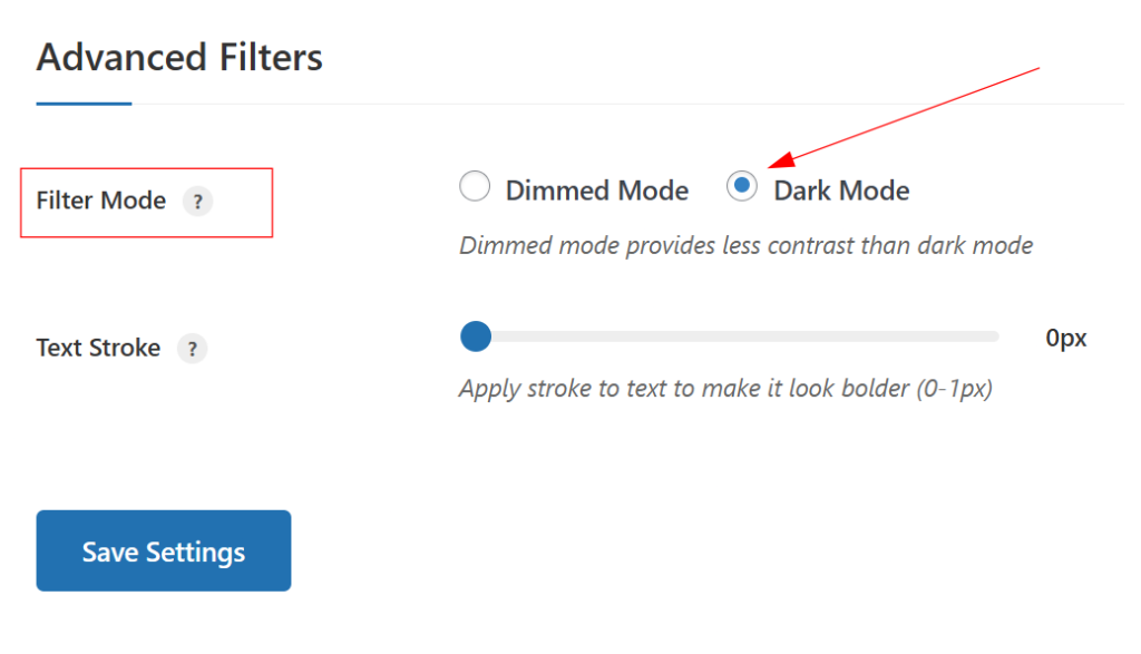
- Text Stroke: Add a subtle stroke around text to boost readability on complex backgrounds or over images, especially helpful for hero sections, banners, or sliders.
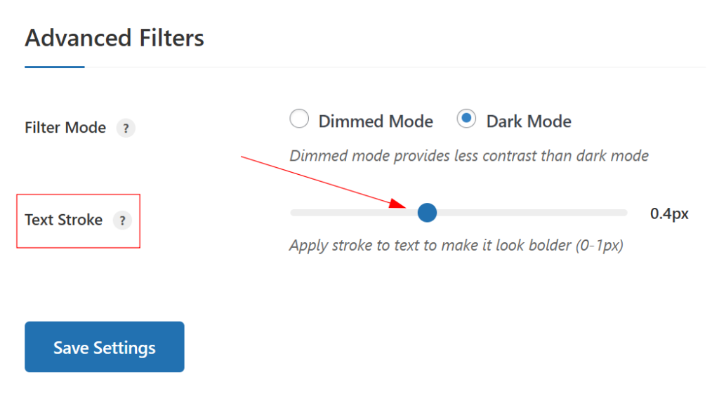
These options let you balance aesthetics and legibility without redesigning your entire theme.
Step 5: Fine‑Tune Colors and Apply Custom CSS
To create a truly on‑brand dark mode, you’ll likely need to tweak specific colors and occasionally target individual elements with custom CSS. Dark Reader gives you dedicated tools for both.
Step 5.1: Customize Background and Text Colors
Open the Colors tab to adjust your core palette:
- Background Color: Set the main dark background for the site—typically a deep gray rather than pure black for better readability and less eye strain.
- Text Color: Choose a text color with strong contrast against your background (e.g., off‑white or light gray) to ensure body copy and headings remain easy to read.
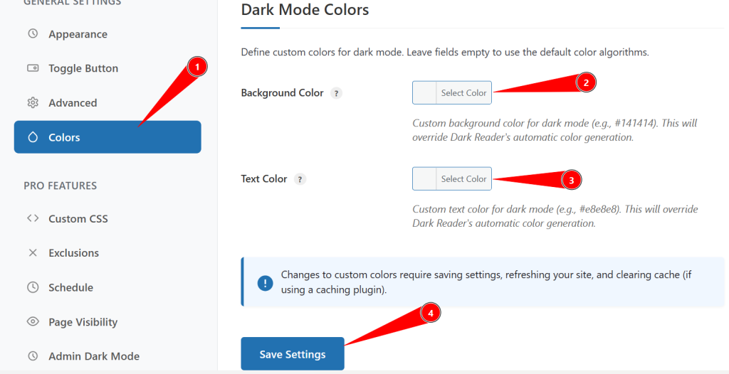
Test combinations on key templates (blog posts, archive pages, product pages) to confirm they meet accessibility guidelines and still feel aligned with your brand.
Step 5.2: Add Custom CSS for Advanced Styling
The Custom CSS tab is designed for fine‑grained control:
- Enable Custom CSS to apply code that only runs when dark mode is active.
- Use built‑in CSS Templates as starting points for common tweaks (e.g., adjusting specific sections, cards, or buttons).
- Click Beautify CSS to clean up formatting and keep your custom styles easy to maintain.
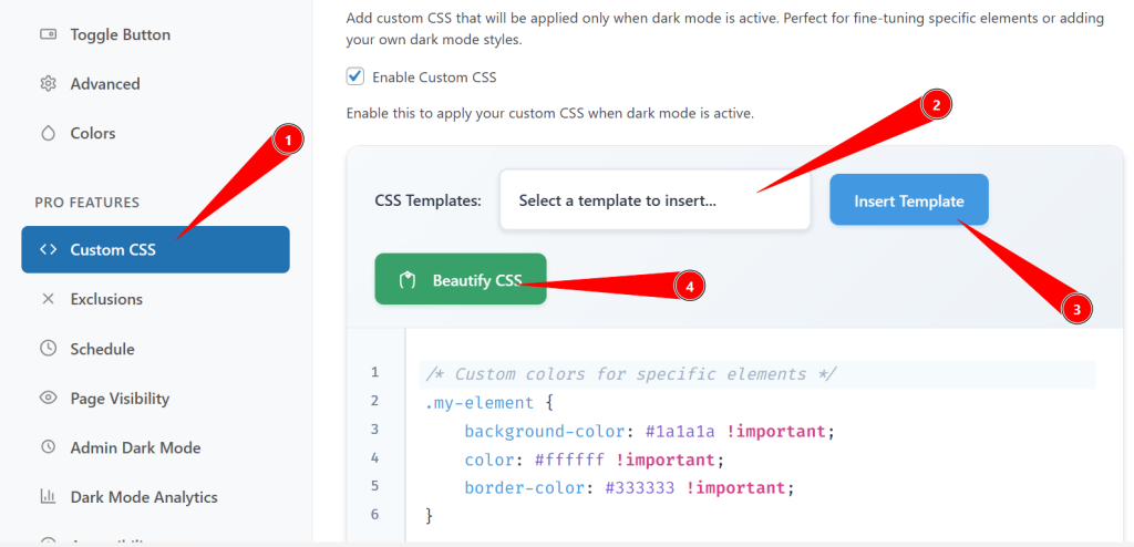
This is ideal for refining tricky areas like complex headers, third‑party widgets, or unique layout sections.
Step 5.3: Exclude Specific Elements from Dark Mode
Some elements, such as logos, icons, or branded imagery, may look better without darkening. In the exclusions settings, you can:
- Use CSS Selectors to exclude particular elements (e.g., .logo, #header-image, .brand-badge).
- Configure Image Exclusions to prevent all or specific images from being altered.
- Keep Logo Images in their original colors for consistent branding.
- Apply CSS Filters (brightness, contrast, saturation, blur) specifically to images and videos in dark mode for a more controlled look.
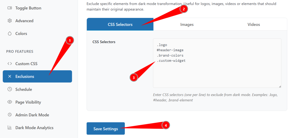
These options help you avoid dull or distorted visuals while still enjoying a cohesive dark layout.
Step 5.4: Schedule Automatic Dark Mode Activation
If you want dark mode to behave differently based on time or conditions, enable scheduling:
- Time‑Based Scheduling: Define start and end times (e.g., 7 PM–7 AM) for automatic dark mode activation, useful for audiences concentrated in specific time zones.
- System Preference: Let dark mode mirror the user’s OS setting, switching automatically between light and dark.
- Sunset/Sunrise: Use visitors’ locations to toggle dark mode around actual sunset and sunrise for a natural, environment‑aware experience.
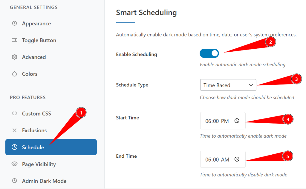
Scheduling gives you flexible control without requiring users to toggle manually every time.
Step 6: Control Dark Mode Visibility Across Pages
Not every page needs dark mode, and in some designs it might clash with specific layouts. Dark Reader’s visibility settings let you decide exactly where dark mode appears.
Step 6.1: Set Page‑Specific Visibility Rules
Use the visibility options to define scope:
- Show on all pages: Enable dark mode (and/or the toggle) across the entire site.
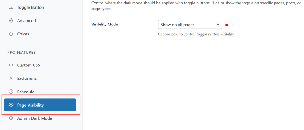
- Show only on selected pages: Activate dark mode for specific posts, pages, or templates (e.g., blog posts but not sales pages).
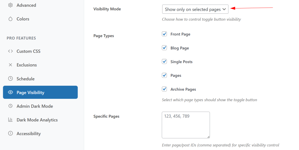
- Hide on selected pages: Exclude certain URLs where dark mode causes design issues.

- Hide on all pages: Temporarily disable dark mode while keeping your configuration intact for later use.
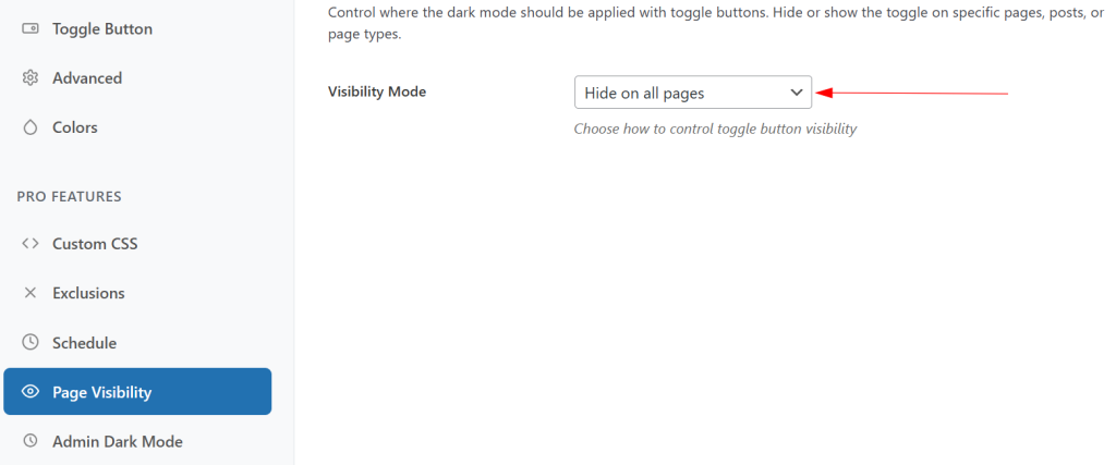
This level of control is especially helpful during testing or when you’re gradually rolling dark mode out across a large site.
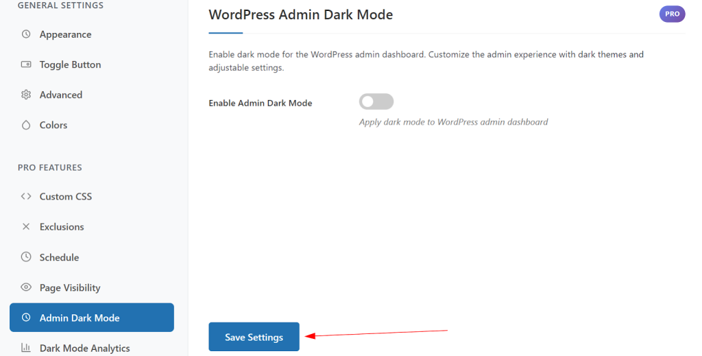
Step 6.2: Enable Dark Mode for the WordPress Admin Dashboard
If you spend long hours in the dashboard, admin dark mode can reduce strain for you and your team:
- Toggle Enable Admin Dark Mode to activate dark mode in the WordPress backend.
- Adjust Admin Brightness (50% – 150%) to make the interface comfortable on your monitor.
- Set Admin Contrast (50% – 150%) to keep menus and text sharp and readable.
- Enable Auto detect user preference so the admin interface respects each user’s system theme setting.
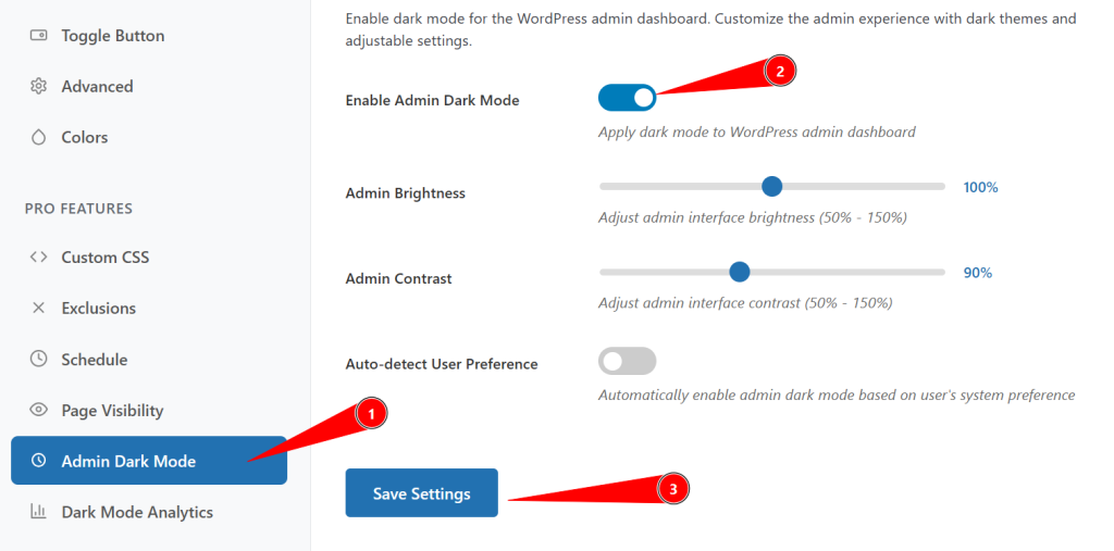
This creates a consistent dark experience not just for visitors but also for site administrators.
Step 7: Test and Optimize Your Dark Mode Implementation
Before you roll dark mode out to all visitors, thorough testing helps avoid UX issues and visual glitches. Treat this like a pre‑launch checklist.
Frontend Testing Checklist
- Toggle Functionality: Confirm the toggle appears where expected and works consistently on all key templates.
- Color Contrast: Check headings, body text, links, buttons, and alerts for sufficient contrast in dark mode.
- Image Appearance: Make sure images, logos, and icons look natural and not overly darkened or inverted.

- Form Elements: Test inputs, labels, placeholders, and buttons to ensure they remain visible and usable.
- Mobile Responsiveness: View the site on different devices and orientations to confirm dark mode works well everywhere.
- Loading Speed: Ensure enabling dark mode doesn’t introduce noticeable lag or layout shifts.
Common Issues and Quick Fixes
- Toggle Button Not Showing: Clear caching and minification plugins, then check for theme or builder conflicts.
- Images Look Strange: Use image or selector exclusions, or fine‑tune CSS filters for more natural results.
- Text Hard to Read: Adjust brightness/contrast sliders or add a subtle text stroke to lift text off busy backgrounds.
- Caching Problems: Purge your cache and CDN after every major dark mode change so visitors see the latest version.
Step 8: Save Settings and Go Live
Once you’re satisfied with how everything looks and behaves:
- Scroll to the bottom of the Dark Reader settings panel.
- Click Save Settings to store all your configurations and apply them site‑wide.
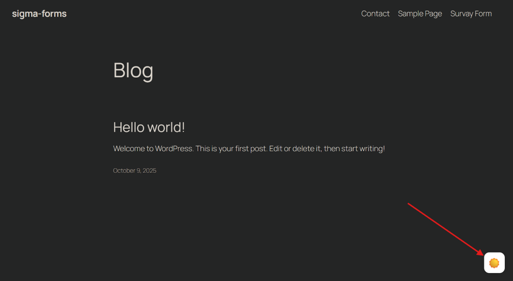
- Visit the frontend of your website, use the dark mode toggle, and navigate through a few pages to confirm that the transition is smooth and instantaneous.
If everything looks good, your dark mode implementation is officially live, giving visitors a comfortable, modern alternative viewing experience on every visit.
Conclusion
By now, you’ve seen how a default dark experience can reduce eye strain, modernize your design, and keep late-night visitors on your site longer. All without touching a single line of code.
With a powerful plugin like Dark Reader, you get fine-grained control over brightness, contrast, color, and page-level visibility.
If you’re a freelancer or building agency client sites, this is an easy win. Set dark mode as default, let the toggle follow system preferences or schedule, and your website is dark mode ready.
Want to go even further? In future guides, I’ll cover A/B testing dark vs. light layouts, tracking engagement changes in analytics, and combining dark mode with accessibility best practices to create a truly inclusive WordPress experience.
Stay tuned, and if you’ve finished implementing dark mode with this tutorial, let me know how it went in the comments.
