A visitor lands on your blog, scans the page for three seconds and hits the back button.
Why?
Your outdated blog layout failed the instant test.
Readers spend only 37 seconds on average reading blog posts and blogs have bounce rates of 70-90%, compared to 20-45% for eCommerce sites.
Your blog layout design determines whether those precious seconds convert to engagement or abandonment.
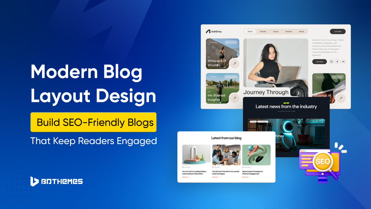
Modern blog layout design combines visual hierarchy, responsive architecture and performance optimization.
This comprehensive guide reveals how to create a blog layout for a website that captures attention instantly while delivering the content experience readers demand in 2026.
Why Blog Layout Design Matters More Than Ever in 2026
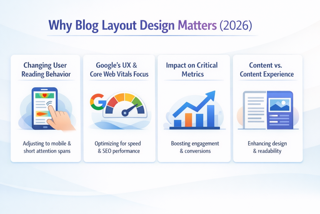
The blog layout trends of recent years have shifted from aesthetic choices to a critical factor affecting the user experience (UX) and search engine rankings.
Changing User Reading Behavior
Only 27% of readers read blog posts thoroughly, while 73% skim for relevant information. The average person spends 37 seconds reading blog posts, making every element of your modern blog layout crucial for retention.
Visual elements can increase reading time by 100%, demonstrating that thoughtfully integrating multimedia into blog design changes engagement patterns.
Videos, infographics and styled formatting fundamentally alter how readers consume content.
Google’s UX and Core Web Vitals Focus
Core Web Vitals are central ranking factors in 2026. These metrics measure the real user experience for loading, interactivity and visual stability. Your responsive blog layout directly affects all three.
Sites with poor Core Web Vitals experience 15-20% higher bounce rates, which in turn tank dwell time and conversions.
This is where managed cloud hosting becomes important.
InstaWP’s managed cloud hosting is designed to maintain strong Core Web Vitals by addressing the infrastructure bottlenecks that typically slow WordPress sites. Since sites created on InstaWP run on a managed cloud stack rather than traditional shared hosting, developers get faster server response times, optimized caching, and performance controls that directly impact metrics such as Largest Contentful Paint (LCP), Interaction to Next Paint (INP), and Cumulative Layout Shift (CLS).
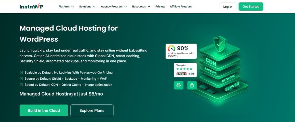
One of the primary contributors to slow LCP is server response time. InstaWP mitigates this with a cloud hosting environment that provides dedicated resources based on the selected pay-as-you managed hosting plan. This reduces Time to First Byte and allows large page elements such as hero images, product grids, or media libraries to load faster, helping sites stay within the recommended 2.5-second LCP threshold.
Caching and database performance also influence interaction speed. InstaWP includes an optional built-in Object Cache that improves database query performance for dynamic WordPress sites. For WooCommerce stores, directory sites, or content-heavy blogs, this significantly reduces backend processing time and helps pages respond quickly to user interactions, supporting the INP target of under 200 milliseconds.
Content delivery also plays a role in real user performance. InstaWP integrates CDN-style delivery and image optimization capabilities so that static assets like images, scripts, and stylesheets are delivered from edge locations closer to the visitor. This reduces latency globally and improves page rendering speed, which contributes to both LCP and overall load performance.
For developers and agencies, another advantage is the ability to test performance before going live. InstaWP allows sites to be created instantly in cloud sandboxes and staging environments. This makes it possible to run performance audits using tools such as GTmetrix or Pingdom, optimize caching or images, and validate Core Web Vitals before deploying the site to production hosting.
The specific thresholds: Largest Contentful Paint under 2.5 seconds, Interaction to Next Paint under 200 milliseconds and Cumulative Layout Shift below 0.1.
Tools like GTmetrix andcPingdom measure real performance.
Impact on Critical Metrics
- Time on Page: Financial services blogs average 4 minutes 56 seconds, while eCommerce sites see only 2 minutes 3 seconds. Your blog layout ideas directly influence these numbers.
- Bounce Rate: The average website bounce rate is 41-55%, with blogs and content sites showing the highest rates. Poor modern blog layout design, confusing navigation, slow loading or cluttered interfaces drive visitors away.
- Content Discoverability: Strategic placement of key information, compelling headings and visual breaks helps readers find valuable content faster. Category-based layouts improve internal discovery significantly.
- Conversion: Clear call-to-action placement within content flow matters immensely for email signups, product sales and return visits.
Content Versus Content Experience
Articles with embedded video see 47% more time on page than text-only content.
Website blog design now encompasses information architecture, loading performance, mobile responsiveness and aesthetic appeal, working together.
Blog Layout Trends That Will Dominate Websites in 2026
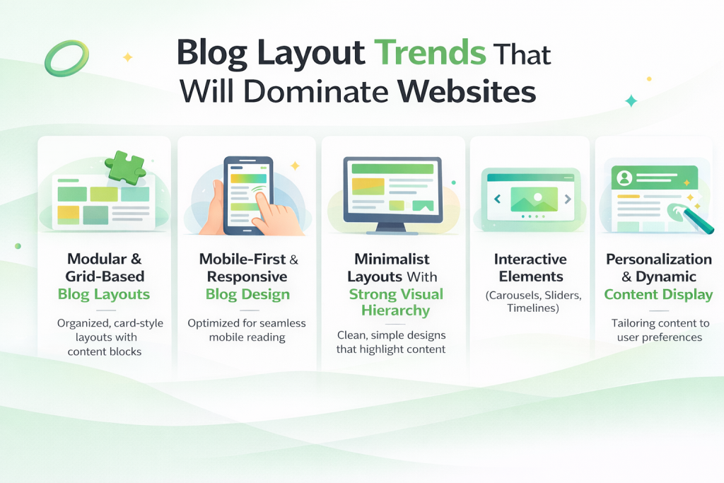
The blog layout trends 2026 respond to changing user behavior, device capabilities and search requirements.
Modular and Grid-Based Blog Layouts
Grid-based blog layouts solve multiple challenges simultaneously.
These layouts adapt to different screen sizes, create clear hierarchies and organize diverse content efficiently using CSS Grid and Flexbox.
Mobile-First and Responsive Blog Design
Mobile devices account for over 63.3% of blog traffic, with projections reaching 75-78% by 2025. Google uses mobile-first indexing for all sites.
Your responsive blog layout determines whether mobile visitors stay or leave.
Touch targets must be at least 48×48 pixels. Text requires a 16px base size. Navigation must work with thumbs, not mouse cursors. These aren’t aesthetic choices; they’re accessibility requirements affecting both user experience UX and SEO performance.
Minimalist Layouts With Strong Visual Hierarchy
Minimalism dominates modern blog layout trends because it addresses cognitive load. Every unnecessary element distracts from your message.
A strong visual hierarchy guides eyes naturally through content on blogs, using headers, white space, color and typography.
Interactive Elements (Carousels, Sliders, Timelines)
Static content no longer effectively holds attention. Carousels showcase multiple featured posts without overwhelming above-the-fold space.
Sliders highlight essential content with visual appeal. Timelines present chronological information naturally.
Personalization and Dynamic Content Display
Rather than showing identical layouts to every visitor, dynamic blog layouts adapt based on user behavior, referral source or previous interactions.
Category-specific homepages, recent post widgets filtered by reading history and recommended content based on engagement patterns all improve relevance.
Essential Elements of a Stunning Blog Layout
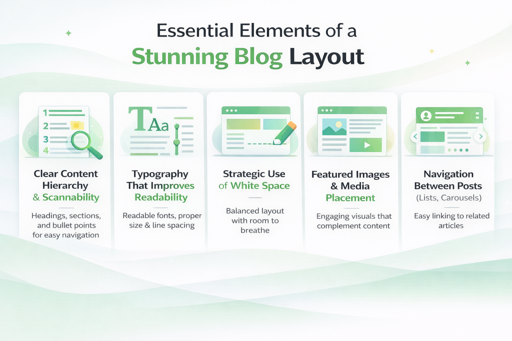
Certain elements consistently appear in effective blog page layouts because they address specific user needs.
Clear Content Hierarchy and Scannability
Only 27% read sincerely; the rest scan for relevant information. Start with headlines that tell the story alone. Use descriptive subheadings. Break content into digestible chunks with paragraphs rarely exceeding 3-4 sentences.
Typography That Improves Readability
Typography for blogs affects reading speed, comprehension and perceived credibility. 16px represents the minimum for body text, with 18-20px increasingly standard. Line height should be 1.5-1.6 times font size for comfortable reading flow. Optimal line width is 50-75 characters.
Strategic Use of White Space
White space isn’t wasted space; it’s functional design improving comprehension. Margins around text blocks prevent a cramped feeling. Padding inside content containers adds comfort. Space between sections signals topic changes.
Featured Images and Media Placement
Articles with images get 94% more views than text-only posts. Above-the-fold images must load quickly to prevent poor LCP scores. Lazy loading images below the fold improves initial page speed, as measured by tools like GTmetrix.
Navigation Between Posts (Lists, Carousels)
Related posts widgets keep readers engaged after they finish reading articles. Previous/next post navigation enables chronological browsing. Post lists and carousels present multiple options visually. Strong internal linking structures help search engines while improving user experience UX.
How to Create a Blog Layout That Is SEO-Friendly
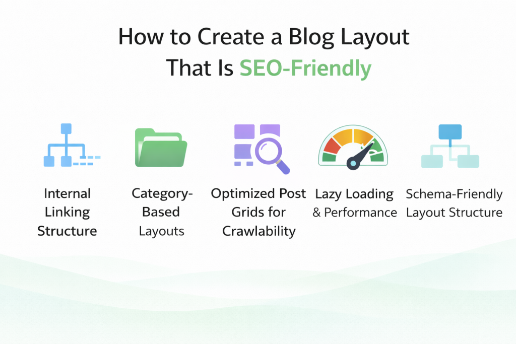
SEO-friendly blog layout design extends beyond content quality. How you structure and present information affects crawlability, indexing and ultimately rankings.
Internal Linking Structure
Internal links help search engines discover and index content while distributing page authority throughout your site. Your blog layout should facilitate natural internal linking through related posts, category pages and contextual links.
Readers who easily find related content stay longer and visit more pages. Search engines that efficiently crawl your site index content faster. Both outcomes improve from thoughtful blog page layout planning.
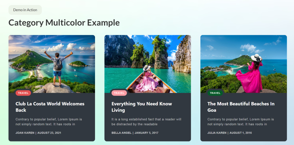
Category-Based Layouts
Organizing content by categories creates both user-friendly navigation and an SEO-friendly blog layout. Category pages act as topical hubs, signaling expertise to search engines while helping visitors browse specific interests.
Category layouts differ from homepage layouts. While homepages might show recent posts in chronological order, category pages should present relevant content regardless of publish date. This keeps evergreen content discoverable long after publication.
Optimized Post Grids for Crawlability
Post grid layouts must balance visual appeal with technical crawlability. Search engines need to access all content efficiently, which means avoiding pagination that hides articles or JavaScript rendering that blocks crawlers.
Image-heavy grids need optimization. The WebP format reduces file sizes without loss of quality. Lazy loading improves initial load times. Proper alt text ensures images contribute to SEO rather than just aesthetics.
Lazy Loading and Performance
Sites passing all Core Web Vitals see 24% higher CTR – performance isn’t optional. Lazy loading delays loading images and content until users scroll to them, dramatically improving initial page speed.
Balance matters. Loading too little content initially can increase CLS (layout shift) as elements load. Loading too much negates performance benefits. Testing with Pingdom helps find the optimal balance for your specific blog design.
Schema-friendly Layout Structure
Schema markup helps search engines understand your content structure, improving eligibility for rich snippets and knowledge panels. Modern blog layout design incorporates schema naturally through semantic HTML and structured data.
The article schema should include headline, author, publish date and featured image. The organization schema identifies your site. Breadcrumb schema shows navigation hierarchy. Review schema enables star ratings in search results. These aren’t separate from design – they’re integrated into the blog page layout structure.
Tools like Google’s Rich Results Test verify schema implementation. A proper schema won’t guarantee rich snippets, but a missing schema eliminates eligibility. SEO-friendly blog layout design includes these technical elements from the start.
There’s also a newer discoverability layer worth considering: AI search. When readers ask ChatGPT or Perplexity for blog tool recommendations, those answers don’t come from sitemaps or schema – they come from how your brand is represented across the web. You can check whether your blog appears in AI recommendations for free with Beamtrace.
Designing a Modern Blog Layout Without Coding
The gap between design vision and technical capability has narrowed dramatically. Modern blog layout design no longer requires custom development for professional results.
Why No-Code Design Matters in 2026
Website creation has become increasingly accessible, with tools that eliminate the technical barriers that previously required developers. No-code design democratizes the creation of professional blog layouts, letting content creators focus on writing rather than wrestling with CSS.
Speed matters too. Building custom layouts from scratch takes weeks. No-code tools deliver in hours. For blogs where content freshness drives traffic, this speed advantage directly impacts competitiveness and growth potential.
Maintenance becomes simpler. Updates that required developer time now happen through visual interfaces. A/B testing different blog layout ideas goes from an expensive project to an afternoon experiment. This flexibility enables continuous optimization based on actual performance data.
Elementor’s Role in Modern Blog Design
Elementor has become the leading WordPress page builder with millions of active installations. Its visual, drag-and-drop interface makes complex layouts accessible without requiring any coding knowledge.
For blog design, Elementor provides grid systems, responsive controls and styling options that cover most needs. You can create unique blog page layouts by combining widgets, adjusting spacing and applying custom styling through visual controls.
However, Elementor focuses on general page building rather than blog-specific features. Default widgets handle basic post display but lack specialized blog layout variations. This is where focused solutions become valuable.
Limitations of Default Elementor Widgets
Elementor’s post widgets provide basic functionality – simple post lists, grids and carousels. For straightforward blog layout needs, these suffice. But modern blog layouts require more nuanced presentation options.
Default widgets lack sophisticated filtering, advanced layout patterns and specialized display types that professional blogs need. Creating timeline layouts, masonry grids or category-filtered carousels requires extensive customization or custom code.
The styling limitations matter too. While you can adjust colors and fonts, creating a truly unique blog design often requires CSS knowledge. For users seeking modern blog layout design ideas without coding, these limitations create frustration.
Introducing Ultimate Post Kit for Elementor
For Elementor users seeking advanced blog layout capabilities, Ultimate Post Kit provides specialized widgets purpose-built for content display. Rather than general-purpose tools adapted for blogging, this addon focuses exclusively on blog layout design.
What Ultimate Post Kit Offers
Ultimate Post Kit delivers 80+ widgets designed explicitly for blog layouts, news portals and magazine-style websites. These aren’t variations on themes – each widget offers a unique presentation style that addresses different content needs.
The focus on blogging means features directly address real challenges content publishers face.
How do you create engaging homepage layouts? What’s the best way to showcase featured posts? How can you present archived content attractively?
These questions guided development, resulting in practical solutions rather than theoretical possibilities.
Integration with Elementor means a familiar workflow. If you know Elementor basics, Ultimate Post Kit widgets work similarly. Drag, drop, customize. The difference lies in the output: a professional blog layout design that would otherwise require custom development.
Who Benefits Most
Bloggers building personal or niche sites find the Ultimate Post Kit helpful. You get magazine-quality layouts without hiring designers or developers. Content creation can focus on writing rather than technical implementation.
Content marketers managing multiple sites benefit from reusable blog layout ideas. Create effective patterns once, deploy across properties. The consistency improves brand recognition while reducing setup time for each new project.
Publishers running news portals or magazine-style sites need the sophisticated layout options Ultimate Post Kit provides. Ready-made templates like TrendDesk and FreshMag offer professional starting points that would cost thousands to custom-build.
Why It’s Built for Modern Blogs
Modern blog layout design requires responsive behavior, performance optimization and user-friendly customization. Ultimate Post Kit addresses all three.
Every widget includes responsive controls for mobile, tablet and desktop. Lazy loading works natively. Code stays clean and efficient. These technical foundations ensure your blog design performs well on GTmetrix and Pingdom speed tests.
Performance, Compatibility and Multilingual Support
Performance matters increasingly as Core Web Vitals affect rankings. Ultimate Post Kit loads assets conditionally – widgets not used on a page don’t load any code. This architectural approach keeps performance impact minimal.
Compatibility extends beyond Elementor. RTL (right-to-left) language support serves global audiences. Multilingual plugins like WPML and Polylang work seamlessly. ACF (Advanced Custom Fields) integration enables custom field display. These integrations make Ultimate Post Kit practical for diverse use cases.
Regular updates maintain WordPress, Elementor and PHP compatibility. As platforms evolve, Ultimate Post Kit keeps pace. This long-term reliability matters for sustainable blog growth.
Blog Layout Types You Can Create
Understanding available options helps you choose the right blog page layout for your specific content and audience. Each layout type serves different purposes and creates distinct user experiences.
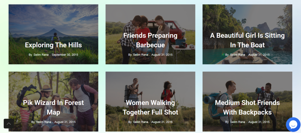
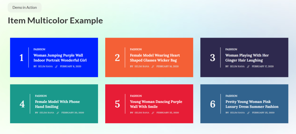
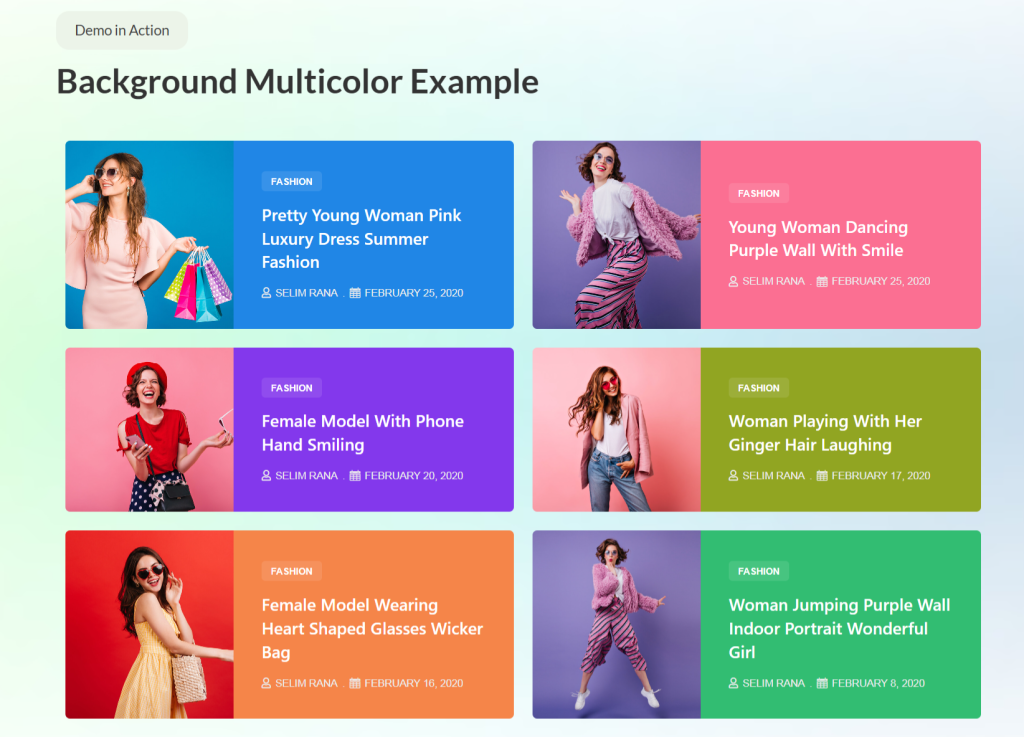
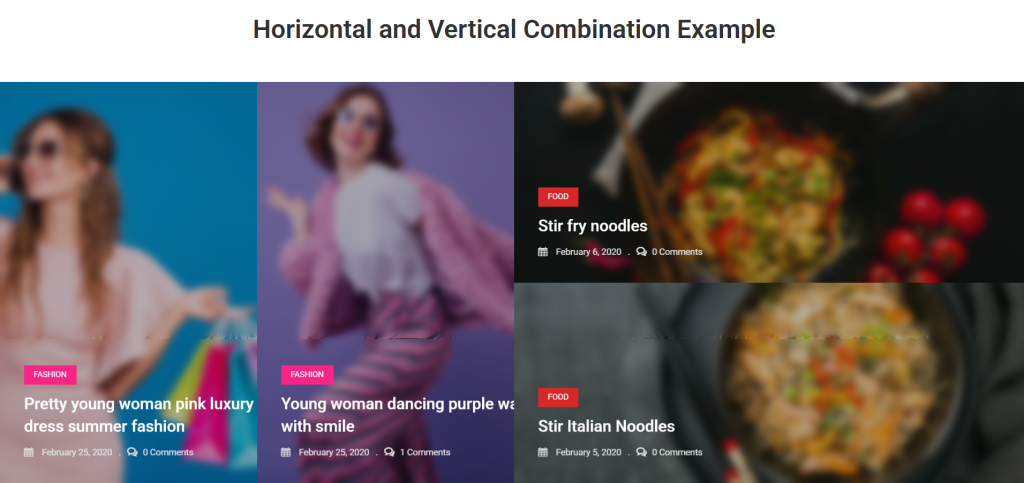
Grid-Based Blog Layouts
Grid layouts organize posts in structured rows and columns, creating a clean organized appearance. This blog layout works well when you want visitors to browse multiple articles and make choices based on headlines and featured images.
- Alex Grid provides a modern, card-based presentation with hover effects. Each post gets equal visual weight, making it perfect for content where no single article demands dominance. The layout adapts responsively across devices.
- Alice Grid offers elegant styling with sophisticated typography. It works particularly well for lifestyle blogs, creative portfolios and sites where aesthetic appeal matters as much as content itself.
- Alter Grid delivers a classic newspaper-style layout. Multiple columns, tight spacing, and high information density make it ideal for news sites where readers want to quickly scan many headlines.
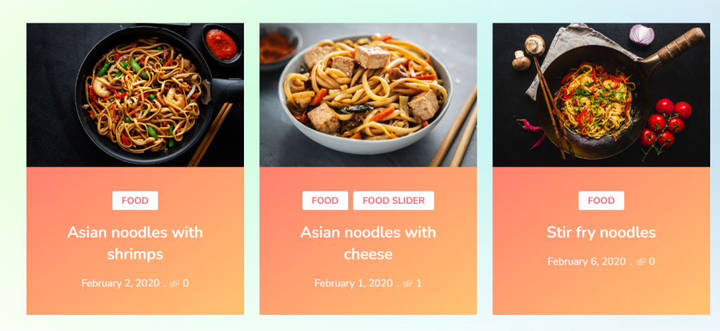
- Elite Grid focuses on featured images, giving visual content prominence. Food blogs, travel sites and photography portfolios benefit from this image-forward approach.
- Hazel Grid balances text and images equally. The layout works across content types – business blogs, educational sites and general publishers all find it versatile.
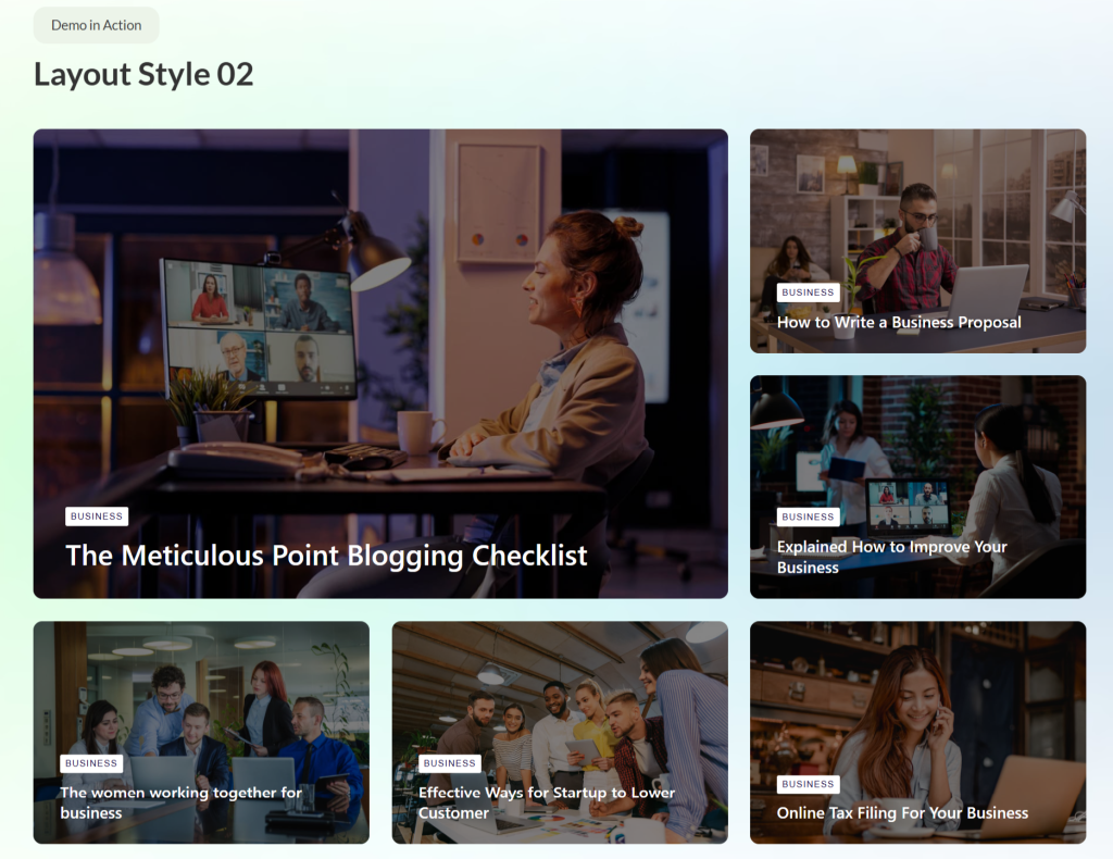
Grid layouts suit blogs, news portals, lifestyle sites and any scenario where browsing multiple options simultaneously serves user needs.
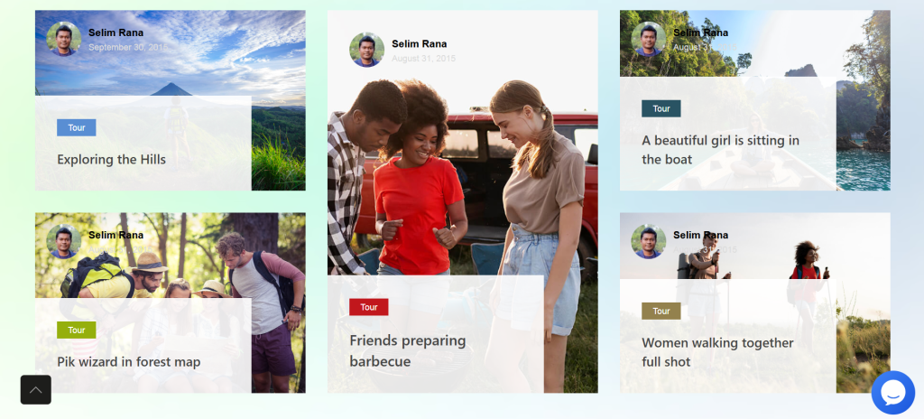
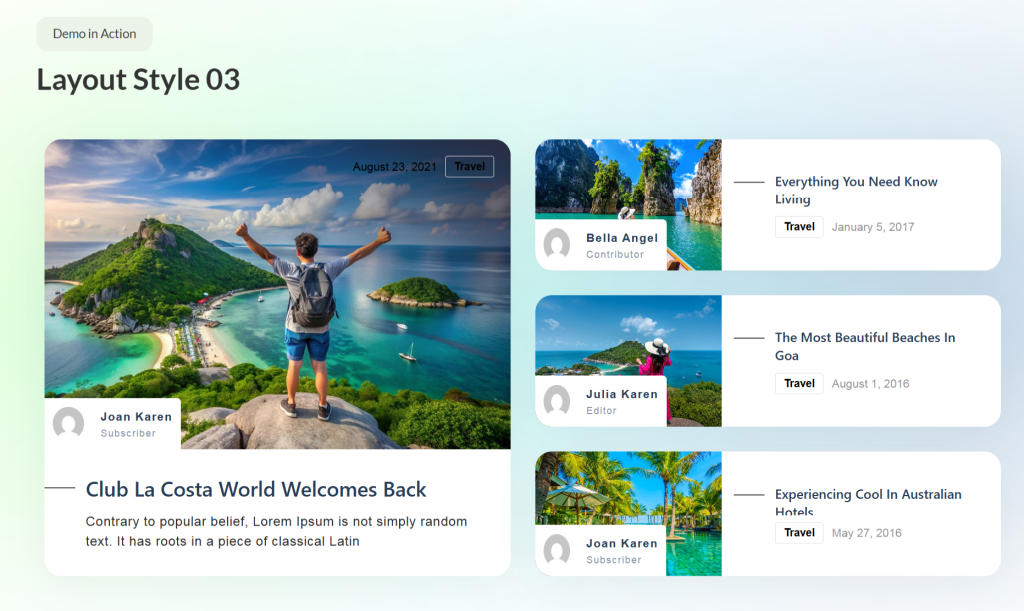
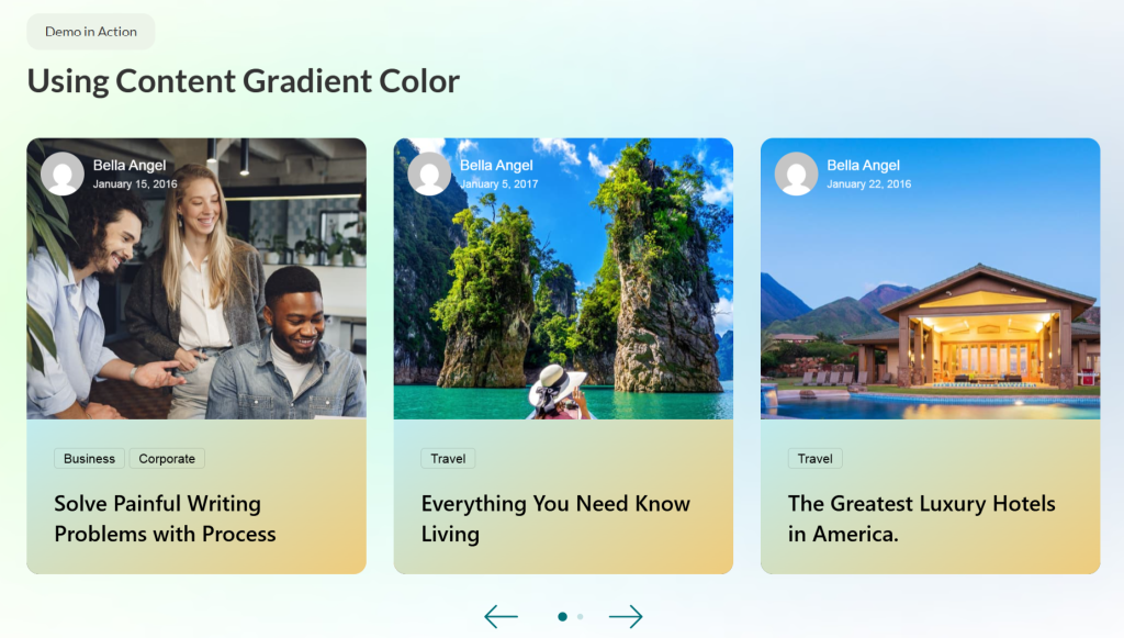
Blog List Layouts for Readability
List layouts present posts vertically, one after another. This blog layout emphasizes readability and detailed previews over visual browsing. Readers get more context before clicking through.
- Buzz List creates a magazine-style presentation with substantial excerpt text. The layout works well when you want to showcase content depth and encourage thoughtful selection.
- Featured List highlights top posts prominently while showing additional content below. This hierarchy guides attention to priority content while maintaining a comprehensive listing.
- Harold List offers clean, minimal presentation. Simple card design focuses attention on headlines and opening paragraphs without visual distractions.
- Tiny List creates a compact presentation, fitting more posts in less vertical space. Perfect for sidebar widgets or footer sections where space constraints matter.
List layouts work well for personal blogs, long-form content sites and situations where readers prefer a detailed preview before committing to full articles.
Carousel-Based Blog Layouts
Carousels showcase multiple posts in a rotating fashion, saving vertical space while highlighting several articles. Interactive sliding encourages engagement and exploration.
- Alex Carousel provides smooth transitions between posts with modern styling. The format works well for featured content sections on homepages.
- Maple Carousel offers an elegant presentation with sophisticated hover effects. The carousel maintains visual interest while keeping the interface clean.
- Category Carousel filters posts by category, letting visitors explore specific topics without leaving the page. This interactive filtering improves content discovery.
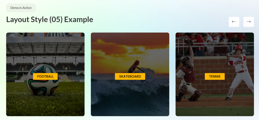
- Ramble Carousel creates a playful, engaging presentation. The format suits lifestyle blogs, entertainment sites and brands with a casual tone.
Carousels work best for featured sections, homepage hero areas and situations where you want to showcase multiple options without requiring excessive scrolling.
Sliders for Featured Content
Sliders present a full-width, immersive content display. They work particularly well for highlighting important posts, announcements or featured stories.
- Camux Slider delivers a bold, attention-grabbing presentation. Large typography, prominent imagery and strong call-to-action make it perfect for homepage heroes.
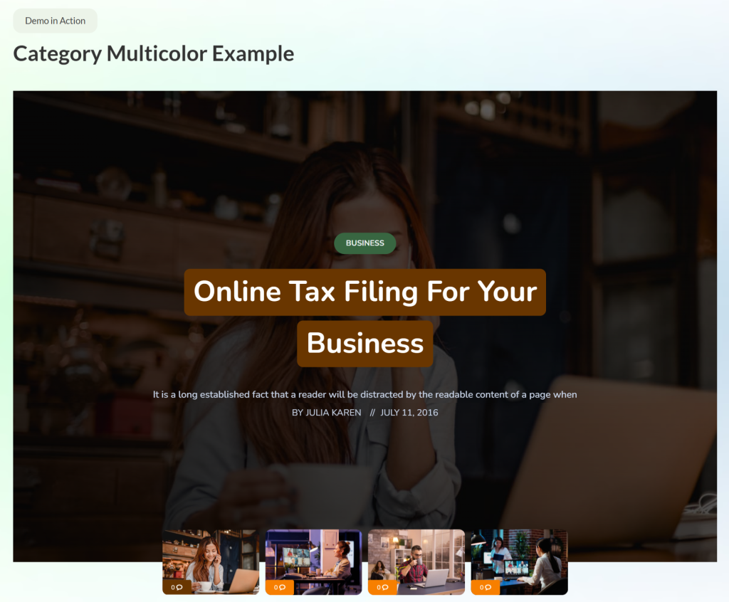
- Crystal Slider offers sophisticated, elegant styling. Smooth transitions and refined aesthetics suit professional blogs and business sites.
- Noxe Slider creates a dynamic, modern feel with creative transitions. The format captures attention while maintaining readability across devices.
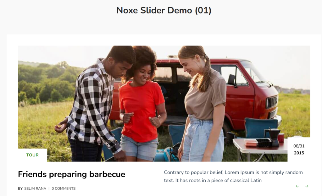
Sliders excel at homepage headers, announcement sections and anywhere you want a single content piece to dominate attention before visitors explore further.
Timeline-Based Content Layouts
Timeline layouts present content chronologically, creating narrative flow through time. This blog layout works particularly well for company blogs showing evolution, project documentation or any content where temporal sequence matters.
Oras Timeline creates a vertical timeline with alternating content on either side. The visual presentation makes chronological flow obvious while maintaining readability.
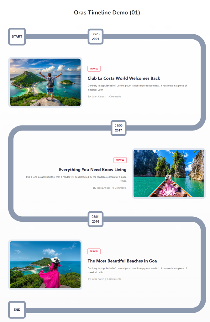
Timeline layouts work for company updates, project progress blogs, historical content and anywhere chronological sequence provides essential context.
Enhancing Blog UX With Supporting Widgets
Beyond primary post display, several supporting elements improve overall user experience UX and engagement on blogs.
Reading Progress Bar
The Reading Progress Bar shows readers how far they’ve progressed through articles. The visual indicator provides a sense of accomplishment and encourages completion. Given that scroll depth averages only 62%, anything encouraging deeper reading helps.
The progress bar works particularly well for long-form content where readers want to gauge time commitment. It also creates subtle gamification – the desire to “complete” reading increases engagement.
Post Accordion
Post Accordion presents multiple posts in a collapsible format. Readers expand sections they want to explore while keeping others collapsed. This format maximizes content density without overwhelming visitors.
Accordions work well in sidebar widgets, FAQ sections and anywhere you want to present many options within a limited space. The interactive nature encourages exploration.
News Ticker
News Ticker creates a scrolling headline display, perfect for highlighting breaking updates or recent posts. The constant movement draws attention without requiring much vertical space.
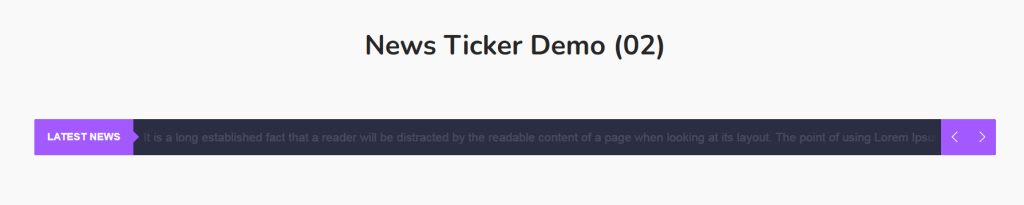
News portals, sports sites and any blog where timeliness matters benefit from ticker implementation. It keeps the latest content visible even when readers scroll down pages.
Newsletter
The newsletter widget provides email subscription forms styled to match your blog design. Email marketing generates a $36 return for every $1 spent, making subscriber acquisition crucial.
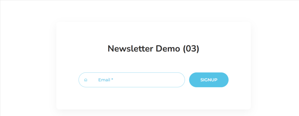
Well-designed signup forms convert better. Ultimate Post Kit’s newsletter widget integrates visually with the blog layout while providing necessary functionality. Place it strategically in the sidebar, after posts, or as a pop-up to maximize subscription rates.
Author Box
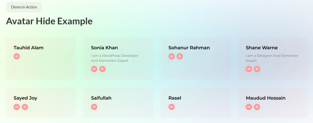
The author box displays the writer’s information, building a personal connection and credibility. Readers who connect with authors return more frequently and engage more deeply with content.
Multi-author blogs, in particular, need author boxes to differentiate contributors. The boxes can include bio, social links and links to other posts by the same writer. This creates a mini-portfolio within a larger blog.
Social Share and Social Count
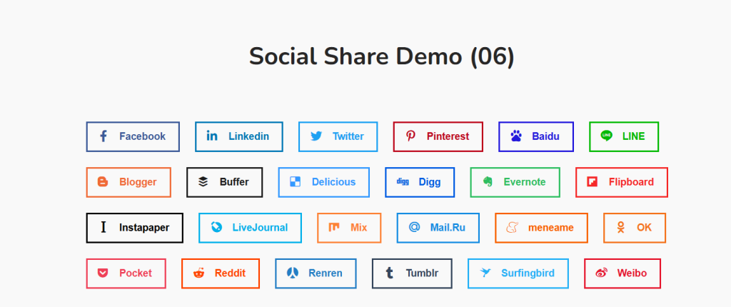
Social Share widgets make content easy to spread. Articles with sharing buttons see 7x more shares than those without. Strategic placement – floating sidebar, end of post or sticky header – maximizes sharing behavior.
Social proof through share counts encourages additional shares. People share content they perceive as already popular, creating a positive feedback loop.
Tag Cloud
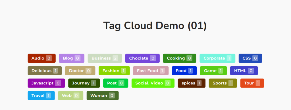
Tag Cloud presents popular tags visually, helping readers discover related content. The varied text sizes create visual interest while showing topic popularity at a glance.
Tags improve internal navigation and SEO when used correctly. They create topical connections between posts while providing additional entry points for search traffic.
Advanced Blog Layout Customization With Pro Features
Ultimate Post Kit’s Pro version extends capabilities for users needing maximum flexibility and control over blog page layout design.
Dynamic Grid, Carousel and Tabs
Dynamic Grid, Dynamic Carousel and Dynamic Tabs enable filtered content display. Visitors can sort posts by category, date or custom taxonomy without page reloads.
This interactivity improves content discovery significantly. Rather than browsing chronologically, readers immediately filter to specific interests. Sites with interactive content see 41% longer sessions – dynamic filtering contributes directly to this engagement boost.
Template Builder for Blog Posts
Template builder creates custom single-post layouts. Rather than accepting the default WordPress post design, you craft a unique presentation for individual articles.
This matters for content hierarchy. Different post types might need different layouts. Feature articles deserve an elaborate presentation. Quick updates need minimal formatting. The template builder accommodates both on a single site.
Remote Controls for Sliders
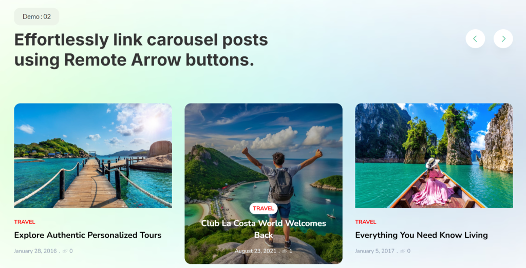
Remote controls separate slider navigation from the slider itself. This enables creative layouts where navigation appears elsewhere on the page – sidebar, header or custom location.
The flexibility helps advanced blog layout design where standard slider patterns feel limiting. You gain precise control over user experience UX without compromising aesthetics.
Cross-Builder Compatibility
While built for Elementor, Ultimate Post Kit works with Gutenberg, Divi and Beaver Builder. This compatibility matters for agencies managing diverse client sites or users switching between builders.
The widgets adapt to each builder’s workflow while maintaining functionality. You’re not locked into a single ecosystem – flexibility future-proofs your blog layout investment.
Bonus Tips: Are You Using Squarespace?
Modern blog layout design combines strong visual hierarchy, responsive architecture and performance optimization. If you use Squarespace to design and build your website, consider the Spark Plugin to make your design even more flexible and powerful.
Conclusion: Build a Blog Layout That Looks Great and Performs in 2026
Modern blog layout design balances competing demands: visual appeal versus performance, creativity versus usability, trends versus timelessness. Success requires understanding these tensions and making informed compromises.
While you can build layouts manually, specialized solutions like Ultimate Post Kit significantly accelerate development. Rather than wrestling with technical implementation, you focus on content strategy and audience engagement. The 80+ widgets, responsive architecture and performance optimization provide a foundation for sustainable blog growth.
Start exploring the Ultimate Post Kit to see how professional blog layout capabilities transform your WordPress site from standard to stunning. With free widgets to test and Pro features to expand, you can build the blog design your content deserves without requiring development budget or coding knowledge.
Frequently Asked Questions
What is the best blog layout for 2026?
The best blog layout depends on your content type and audience. Grid layouts work well for visual content, list layouts suit long-form articles and carousels showcase featured posts effectively.
How do I make my blog mobile-friendly?
Start with a mobile-first design approach. Use a responsive blog layout with flexible grids, ensure a minimum font size of 16px, implement touch-friendly navigation, and optimize images for mobile loading.
What elements make a blog layout SEO-friendly?
SEO-friendly blog layout design includes a proper heading hierarchy, internal linking structure, optimized images with alt text, fast loading times, mobile responsiveness and schema markup.
How can I create a blog layout without coding?
Use visual page builders like Elementor, combined with specialized plugins likeUltimate Post Kit. These tools provide drag-and-drop interfaces for creating a professional blog page layout without writing code.
What is the ideal blog post length for engagement?
Reader engagement peaks at 7 minutes for 1,500-2,000-word-posts. However, length matters less than value and readability. Your blog layout should accommodate various lengths through scannable formatting, clear headings and strategic white space.
How do blog layouts affect Core Web Vitals?
Blog layout directly impacts LCP (Largest Contentful Paint), INP (Interaction to Next Paint) and CLS (Cumulative Layout Shift). Heavy layouts with large, unoptimized images hurt LCP. Complex JavaScript affects INP. Elements loading without space reservations cause CLS. Sites meeting all Core Web Vitals thresholds see better rankings and user engagement.
Should I use carousels or grids for my blog homepage?
Both work depending on goals. Carousels save vertical space and create interactive engagement, making them well-suited for featured content. Grids show more posts simultaneously, helping readers browse options quickly.
How often should I update my blog layout?
Refresh blog design every 2-3 years to stay current with blog layout trends 2026 and beyond. However, avoid changing too frequently – consistency builds recognition. Focus on continuous minor improvements rather than complete redesigns.