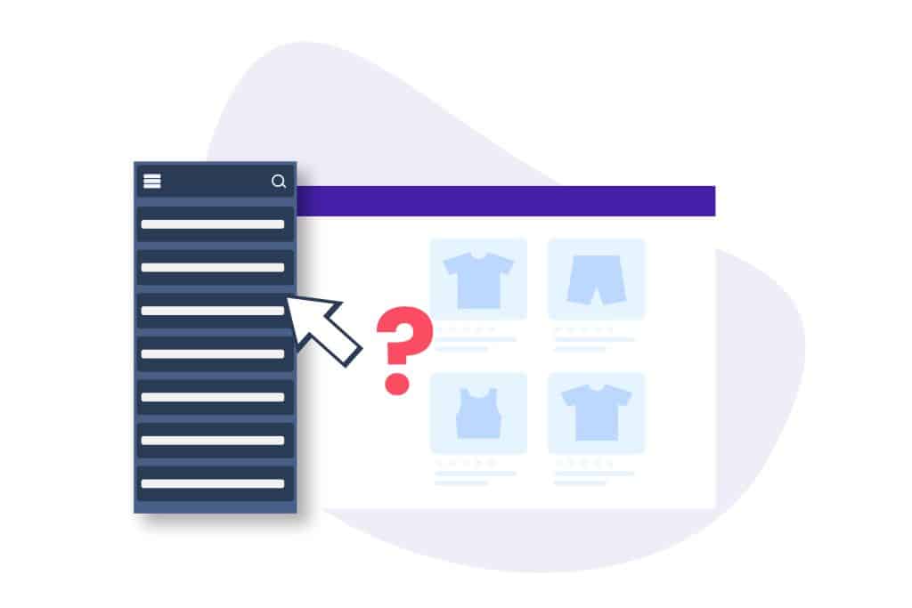
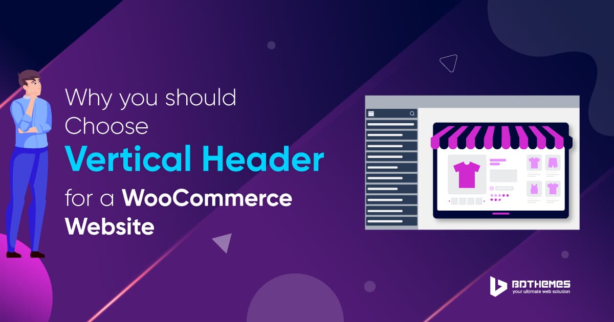
As a website user, you must have known that every website or webpage must have a header. There are two types of header- horizontal and vertical. This article will discuss why a vertical aligned header is suitable for a WooCommerce website.
A header declares the identity and characteristics of a personal website, niche business, or company. Generally, a header is presented horizontally which is most common for a personal website. But when you consider a header for a WooCommerce website, you must go for a vertical header.

What is a WooCommerce website?
WooCommerce is an ecommerce plugin working with WordPress. A WooCommerce website is a WordPress website built with the assistance of the WooCommerce plugin that turns your WordPress website into an online store.
With this online store, you can sell products of your own displaying them on your site freely and it is very easy.

Why is a vertical aligned header important for a WooCommerce website?
A vertical aligned header is very important for a WooCommerce website because the header gives many benefits. These are given below:
- It focuses on the website so the visitors can easily explore it.
- It consumes lesser space.
- It shows the menus finely.
- It keeps the website area clean.
- It directs the user to the menus and links quickly.
Reasons for using a vertical aligned header:
There are a number of good reasons for using a vertical aligned header for a WooCommerce website. A vertical header includes several advantages that boost your website and make it grow bigger and search-worthy for visitors. The reasons are given below:
1. Vertical aligned header maintains the scroll-down flow
A vertical aligned header does not cover the whole upper area of the website and does not make any obstacle to the view. Instead, it takes a small place at the corner so that the view of the website is clearly seen by the user.
And when the user scrolls down the screen, it keeps pace with the scrolling and he can see the clear view of the screen along with the header.
2. Keeps the screen arranged
The vertical aligned header design is very much fit for the arrangement of the screen. If a horizontal header is used, the upper screen is covered by it, and the visitor feels uncomfortable to surf on the website.
The horizontal header is not bad, but for a WooCommerce website, it is troublesome. So, for maintaining the arrangement of the screen, it is much better to use a vertical aligned header instead.
3. Does not consume full-screen area
As the view of the vertical aligned header is slim and short, it does not consume the full-screen area of the website.
As a result, the visitor can easily see the other options and items on the screen that make him hassle-free to surf the website.
4. Lets users work freely
While surfing on a website, the users generally seek a broad space to work freely. The vertical aligned header holds a little space on the screen and the rest of the website gets enough free space that lets the users work freely i.e.: search for items, browse products, see details, and so on.
5. Vertical aligned header does not create a menu jam
As the menus are set systematically in a vertical aligned header where the other options are kept in sub-menus so that the users get their necessary queries very easily. Thus the vertical aligned header takes a little space, so a menu jam does not occur here. For that, the view of the screen makes the user’s sights crystal clear.
6. Makes it easy to present niches neatly
As a WooCommerce website is for business and works on niches, it is very important to display the niche items to the visitors in detail. So, a vertical aligned header gives a broad space on the screen to present niches neatly to the visitors.
As a result, visitors come to your website, view the niches broadly, choose whatever they want, and get satisfied. They drive more visitors to your website, and it continues until your business grows bigger.
Choose the vertical aligned header style for your WooCommerce website
The online market is much more competitive and it is hard for a WooCommerce website to exist in this field. Considering the above discussion, it is better to choose the vertical aligned header style for your WooCommerce website if you want to go a long way with your business.
Conclusion
We have talked about the importance of a vertical aligned header for a WooCommerce website and focused on its vital points. Hope this information will help you a lot in growing your business bigger and more effectively.
Thank you for reading this article patiently. Have a nice day.


