You can create awesome-looking dynamic menu bars if you knew how to make a transparent header in Elementor.
Unlike average headers, an Elementor transparent header bears more user engagement as the visitors see the menu floating along with the screen when they scroll down.
Making such headers is no difficult task if you know the right way.
So, let’s learn that in this article.
Why header is important?
Your website has one goal – to attract visitors to your site and engage them with what you have to offer.
In fact, you need a strong foundation that visitors feel compelled to explore, so it’s necessary to add an element of quality into what makes up the backbone of any site – the header!
Just like a house welcomes guests, a good header welcomes visitors by clearly displaying where they are and what can be found throughout your site.
A simple but well-placed banner for easy navigation is important whether you own an e-commerce store or blog, social media profile, forum, or simply a portfolio website.
However, this doesn’t mean you should settle for basic!
Customizing your header using your imagination, and adding advanced elements that will truly leave visitors spellbound is what you need.
For instance, a transparent header acts as a sticky menu that follows the visitor on their journey no matter where they roam around your site.
If your website has long pages and you need people to move around faster, it’s best to add a transparent header.
So, let’s see how to how to make a transparent header in Elementor.
Why choose a transparent header
A header bears your site identity, so it’s essential to make it more attractive and visible to the visitors.
In the case of an Elementor transparent header, visitors could see it moving with the whole screen, adding more value to the branding.
The study shows a remarkable improvement in site traffic and conversion rate by consistently displaying your branding on the entire website.
A transparent header fits perfectly in this role.
Not only that, users can move faster on your website if they get a sticky header on the top screen to help them navigate easily.
So, a transparent header adds more flexibility and user experience.
That also means that Google will put your site in the top place because of the improved user experience and navigation system.
So, you can gather a good number of benefits by simply turning your regular header into a sticky transparent header.
All you need to design your transparent header
Not an airplane, not even a spaceship. But you need these things to design a transparent header in Elementor-
- A WordPress website
- Elementor Website Builder (former Elementor page builder)
- Element Pack Lite
- Most probably 6 minutes on your clock
Getting a running WordPress site doesn’t take much and you can do it any time you want.
We will use the Elementor Page Builder free version which doesn’t cost anything.
For the design part, we will use Element Pack Lite, a free version of the Element Pack Pro plugin.
You can find Element Pack Lite in the plugin search field on the WordPress site and install it.
Or, you can download the plugin from the WordPress directory and then install it manually.
Both works.
Now, let's begin with how to make a transparent header in Elementor.
Step #1: Create menu in your WordPress dashboard
First of all, you have to create a header menu in WordPress.
You can use your main menu bar in case it satisfies your needs.
Else, go to Dashboard> Appearance> Manus and create a custom menu bar for the header.
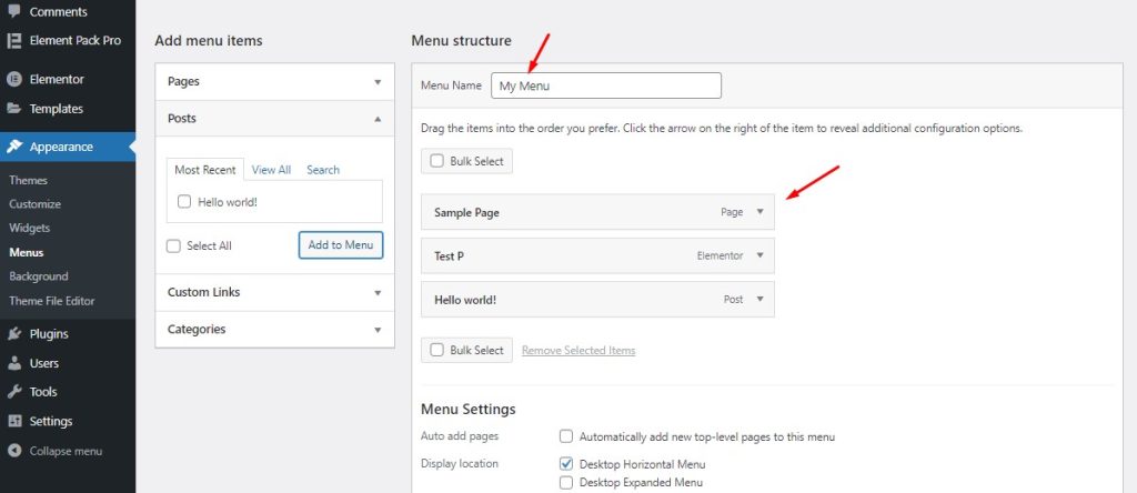
This is the primary menu editor provided by WordPress to create and customize menu content as your wish.
You can give a menu name that you will be creating and then arrange the menu items by clicking and dragging.
Once done, you can call upon the menu anywhere on your WordPress website.
On the other hand,
You can design the menu using the elements or widgets provided by the Element Pack plugin.
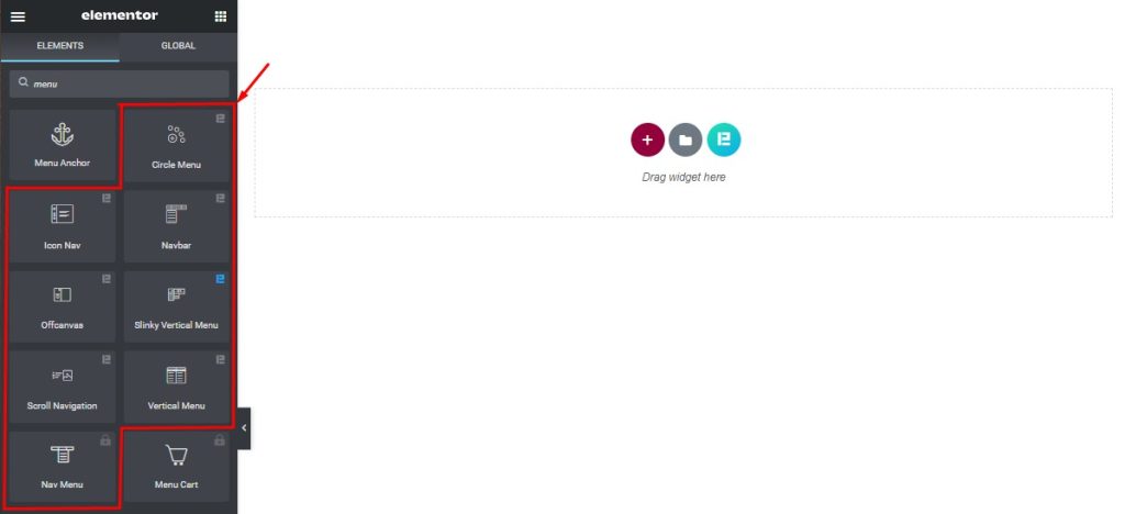
Once you open the target page in the Page Editor, you can see all the eight unique menu widgets you can use to create your header.
Here, you can also use the menu created in the WordPress dashboard in different types of unique menu layouts.
Or, you can make your own header menu using the interface and controls.
Step #2: Create a header template in WordPress Elementor
As you will always be using the header on your web pages, making it into a template will properly preserve the layout settings.
Elementor provides flexibility in creating and customizing the content layout for templates.
Just click on the Templates section from your WordPress dashboard and go for the Add New button.

Now, you have to give a name to the template and select Header as the template type.
To use the header template for the whole site, choose the ‘Entire Site’ as the condition.
Now, click on the Create Template button to begin designing the header.
Next, you will see a blank page opened within Elementor Page Builder where you need to design your header template.
Step #3: Choose a ready header template design
If you want to make a transparent header in Elementor without sweating a single drop, then using ready templates is the right way.
Making a custom header is okay but for a faster workflow, you can simply choose a template and work around it.
Though the website builder itself provides some basic header templates, they are not enough in numbers.
On the other hand, Element Pack provides quite a lot of blocks and templates for headers with creative ideas and designs.
So, you can easily choose a unique header layout within the selections.
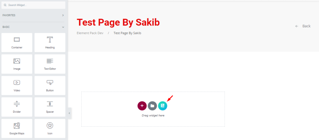
First, open your target page in Elementor page editor and click on the Element Pack logo on it.
If you can’t see the icon, you have to activate the feature from your dashboard.
Just go to Dashboard> Element Pack> Other Settings and turn on the Template Library (in editor) switcher and save settings.
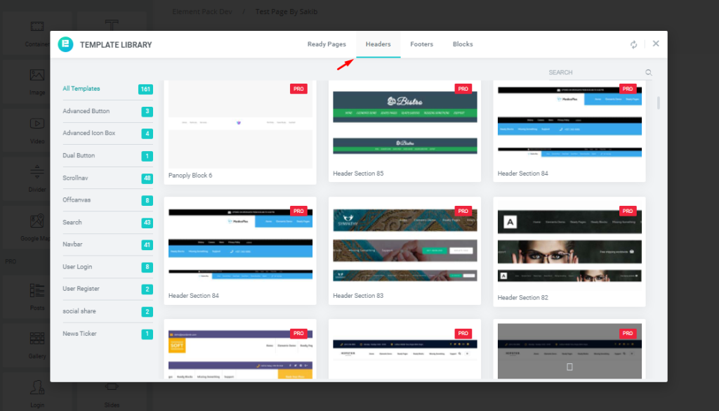
After that, you will see a popup window with lots of pre-made templates in it.
Then click on the headers section and scroll through hundreds of awesome header designs till you pick the one you like.
Select the header design and click on the “insert” button on it.
Step #4: Make sticking transparent menu
Now it’s time for the main part.
This is where you will learn exactly how to make a transparent header in Elementor.

First, click on the header section settings icon to bring up the controls for the section.
Now, go to the Advanced tab and click on the Section Sticky option there.
Element Pack’s section sticky control makes the section stick to the upper part of the page and moves along with scrolling.
This option comes with a couple of customizations like color, offset, z-index, etc.
Now you have a sticky header.
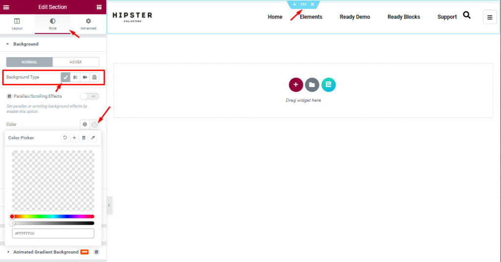
Then go to the Style tab within the section settings and see the background color option here.
Here, click on the color option and drag the opacity bar all the way down to the left side.
This should clear any color beneath the header and make its background transparent.
At this point, your header is ready.
Step #5: Test out the sticky transparent header
The last part of the transparent header in Elementor making process is to test it out on the preview page.
You might need to adjust some padding or margin for different devices, so double-check the responsiveness of the header.
Technically, all header templates from the Element Pack plugin are highly responsive and fit all devices.
The same goes for the header elements too.
That’s it. Your header is ready!!!😋😋
Create awesome headers with the Element Pack addon
Hopefully, you get the whole process of making a transparent header in Elementor.
Now it’s time for you to try out your own designs using 200+ essential elements from the Element Pack plugin.
Thanks for reading this.


