With the last update, Elementor brought out the Elementor Flexbox Container to be a permanent part of the page builder experience. So we will learn how to use Elementor Flexbox Container to do some unique things.
This is a massive change in the User Interface architecture that everyone had many reactions to once team Elementor announced it.
But those who didn’t prepare ahead of time had to suffer the lack of info on the container system.
So, if you are using Elementor and still can’t wrap around your head about Containers.
This blog is for you.
What is Flexbox Container
The Flexbox container is a powerful feature that changes how we structure Elementor layouts.
It allows elements within the container to automatically adjust their position and size based on available space.
Which increases the design flexibility and responsiveness to a higher level.
With its extensive customization options, Elementor Flexbox Container lets you explore more areas of creative design without breaking the design.
Although Flexbox isn’t a new concept, the new Elementor Container Flexbox makes the page builder even more flexible.
Let’s Explore The Options
Elementor Flexbox was like a test feature available to all users.
Now it’s the new norm. But many of us still aren’t used to it.
In order to understand how it works and how to customize Flexbox, we can learn about it in steps.
That should be easier and more efficient.
Guide about how to use Elementor Flexbox Container
Enable Flexbox Container
Flexbox is the new default for the editor in the latest version of Elementor.
But if somehow you can’t see it inside the editor, that can mean it’s not enabled from settings.
So, let’s enable it.
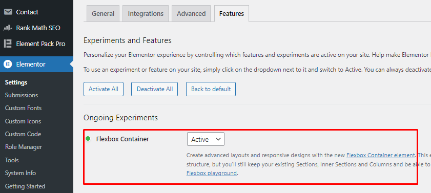
Go to Dashboard > Elementor > Settings > Features > select ‘Active‘ for the Flexbox Container option, and save settings.
Now, you will have the Flexbox widget inside the editor instead of sections and columns.
Working with Flexbox Container
Previously, clicking on the ‘+’ sign inside the Elementor editor page would add a section to let you work with.
Now, if you hover over the ‘+’ icon, it says container.
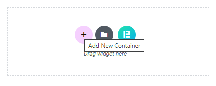
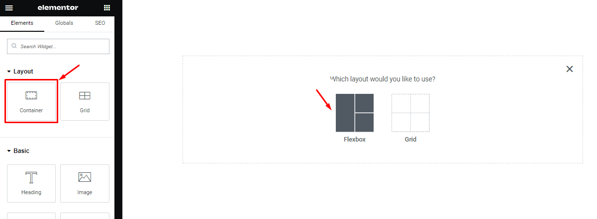
Then if you click on it, it will show you the option to choose a flexbox or a grid for the content (need to turn on Grid container from Elementor settings).
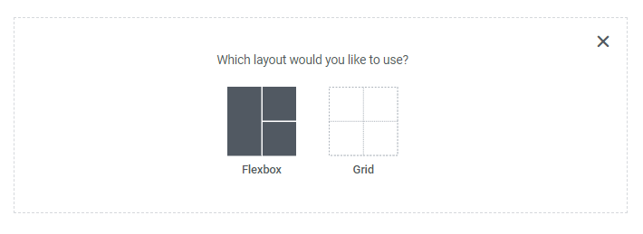
Let’s click on Flexbox and it will give you a bunch of layouts to start with.

Here, you will find single container layouts with the down arrow and side arrow (be discussed in the layout details).
And there are multiple container stack layouts, which you are already familiar with.
Instead, this time the stacked container layouts will consist of a parent container and individual containers for each division.

For example, we have selected a 6-division flexbox and you can see the parent and individual containers inside the screenshot.
These are presets and you can create these presets customly.
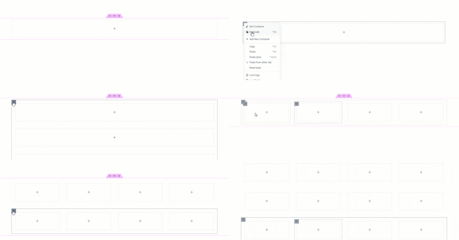
This gives you more flexibility to customize your design further.
Exploring Flexbox Container Layout Options
Elementor’s new container system introduces some new features and options to us.
As you insert your first container, you will see an option at the top that lets you change the layout between container and gird.
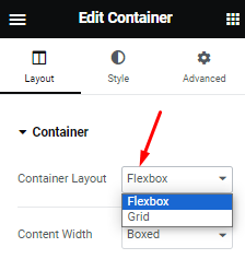
Here, Flexbox is the container system and grid is a separate kind of section container that has some automatic features with less control over the content.
Redefined Content Width Options
Next, the content width option has been evolved and now it lets you change content width in two ways.
First, you can set it to boxed and adjust the width through the scrollbar.

As you can see in the screenshot, only the subtle dots line for the content area is getting adjusted.
The whole container width remains the same.
Second, you can set the content width to Full Width which adjusts the container width along with the content area.

This simplifies the design post-processing and arrangements easier.

But the min-height option is the same as before.

So just like that, you can easily use both kinds of width adjustments to design your content.
New Content Direction Options
With the new container system, Elementor removes sections and columns and, instead, adds new ways to implement rows and columns.
Just like before, if you insert widgets one after another in the editor, the container will auto-select columns for them.
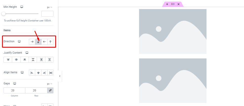
You will also see the column arrow (pointed downwards) grayed out because it’s in action.
And if you want to line the items up in rows, you can do that by clicking on the row arrow.
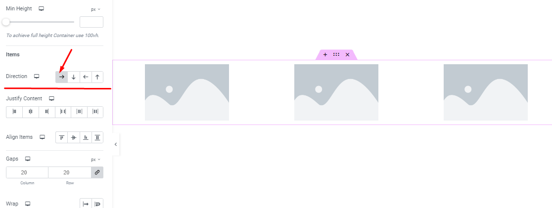
It’s easy to do and it automatically adjusts the width of the elements to fit inside the container.
The two other arrows there are called reverse column and reverse row.
They basically start the rows or columns backward, with the last item as the first.
New Justify Content Controls
Justify Content is a new addition to the container system that lets you further arrange the elements within the container.
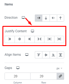
The justify controls are:- Start, Center, End, Space Between, Space Around, and Space Evenly.
While the first 4 justification is common, space around creates gaps all around the objects, and space evenly just creates symmetrical gaps among the content.

A quick example:- in the image above, the ‘Start’ justification is selected and you can see the items lined up closely to the start point on the left side of the screen. We have drawn a middle line to help understand it better.
The function addresses the justify-content property of Flexbox and helps determine the content positioning in different browsers.

For example, we can use the Space Around justification to add space between, and on both sides of the content area.
Question:- Why Can’t I Use Justify Content?
In case you are unable to justify your content, remember that this is not an issue but a simple width adjustment.
To use Elementor’s Justify Content feature, your content should only cover a part of the whole content area.

In the screenshot above, consider the total content area 100% and each of our image widgets occupies about 20% of the area.
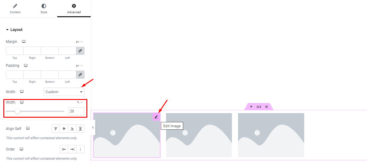
You go to the Advanced tab of each widget and select Custom Width from the option.
And adjust the width %. [ if the widget is in another container, adjusting container width will do ]
Also, Start Justify is selected and that’s why the widgets are sticking close to the left side.
New Content Align Controls Usage
There is a new Align Items control for the Flexbox container system introduced by Elementor.
With it, you can align content with different sizes over the page to create balance.

The Align options are Start, Center, End, and Stretched.
For example, we can look at the End alignment option in action.

In the screenshot, Align is set to End and you can see the widgets sticking to the ground of the container.
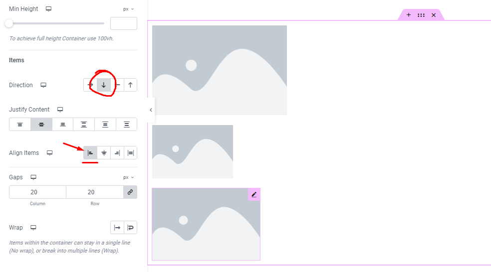
In another example, we have set the content Direction to columns and selected Start Alignment.
See how the widgets are now sticking close to the left side of the container.
With this option, you can combine multiple widgets in aligned positions to create stunning layouts.
New Content Gaps Option
In addition to the Flexbox container, Elementor also provides an easy way to adjust and customize rows and columns gaps between the content.

The Gaps option is specifically for this purpose.
You can adjust the gaps either with the same values or ungroup them to use different values.
Content Wrap Option Redefined
Content Wrap is an option that we needed the most for designing websites.
And Elementor finally put it inside the container options.
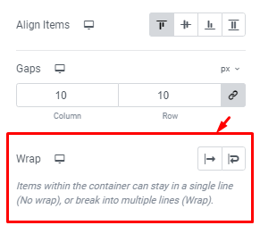
Wrap lets you choose to overflow the container or wrap it around to expand the content to its original size.
To understand this better, let’s see some examples.
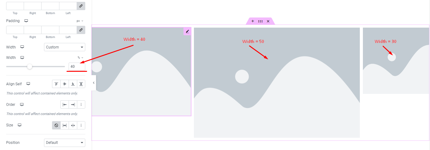
Suppose we customize each content width differently. And their percentage equal surpasses the 100% container width and sits at 120%.
This causes the container to overflow and some of the content gets cut from the sides.
The same scenario happens if you load too much content in a row.
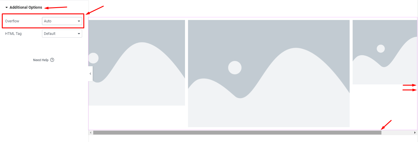
Going into the Container Additional Options, you can turn on Overflow to Auto in order to see the rest of the content with a scrollbar.
But, if you turn on Wrap, the container will auto-expand to accumulate the space required for the content to show in their original size.
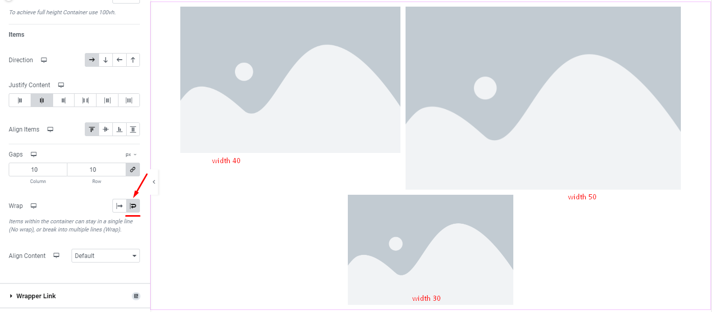
The screenshot above shows exactly what it looks like with wrap.
But what do we use wrap for? Won’t it just break the layouts?
Nope, no layouts breaking.
And you can create awesome galleries or custom UI with widgets and Wrap for creative designs.
Elementor just made it more simple to preserve your layout.
Not interested in container? You can still use make columns in elementor ,check out this blog.
Wrapping Up
Say hello to the new Flexbox Container that is about to change the workflow permanently.
If you are still having trouble with it, know that you are not alone and a new system takes time to get adjusted.
So, feel free to explore Elementor containers and let us know your experiences with it.

