Are you looking for a few great examples of the Elementor powered websites? Then you have landed on the right spot!
Many website builders promise fantastic results but leave you with generic, template-looking sites that fail to capture your brand’s unique identity. Even worse, you might be stuck with complex code or limited customization options.
But there’s good news: with over 461 million websites worldwide, Elementor has revolutionized the website-building experience without even touching a single line of code.
Want to see what’s possible with Elementor? We’ve curated a list of notable websites built by this powerful page builder – from Snoop Dogg’s official site to innovative business platforms.
These Elementor website examples will show how the page builder can make your web design dreams a reality.
Elementor website examples: 10 Famous websites built with Elementor
The followings are the top Elementor website inspirations picked from our editors.
| Website | Design Style | Key Features |
| Snoop Dogg | Simple, Accessible | – Accessible design with customizable font, spacing and contrast settings- Prominent call-to-action buttons with bold outlines |
| Plesk | Minimalist, Professional | – Responsive design that works well on all devices- Likely uses WordPress and Elementor’s dynamic content to automatically update certain elements |
| Trelement | Minimalist, Content-Focused | – Full-width background slideshow in the hero section- Effective information architecture with a single typeface and visual hierarchy |
| 23rd Street Distillery | Visually Appealing, Immersive | – Large, high-resolution photographs showcase the distillery’s products and facilities- Clear section headers and calls-to-action guide users |
| Plain English | Warm, Approachable | – Bright, earthy colors create a friendly, approachable feel- Prominent founder bio builds trust and personal connection |
| eBulletins | Simple, Easy-to-Use | – Clean, uncluttered design with plenty of white space- Likely uses calls-to-action throughout to drive conversions |
| Halley Stevenson | Minimalist, Organized | – Sections clearly distinguished with headers and subheaders- Encourages users to “Explore our collaborations archive” |
| The Vera Hotel | Clean, Modern | – Sections clearly distinguished with headers and subheaders- Encourages users to “Explore our collaborations archive” |
| R11 Solutions | Clean, Visually Appealing | – Black background with white text creates a striking visual- Prominent “Get in Touch” call-to-action button |
| WODO Agency | Clean, Modern | – Sliding announcement feature with bold, easy-to-read text- Prominent “Get in Touch” call-to-action button on the homepage |
Snoop Dogg
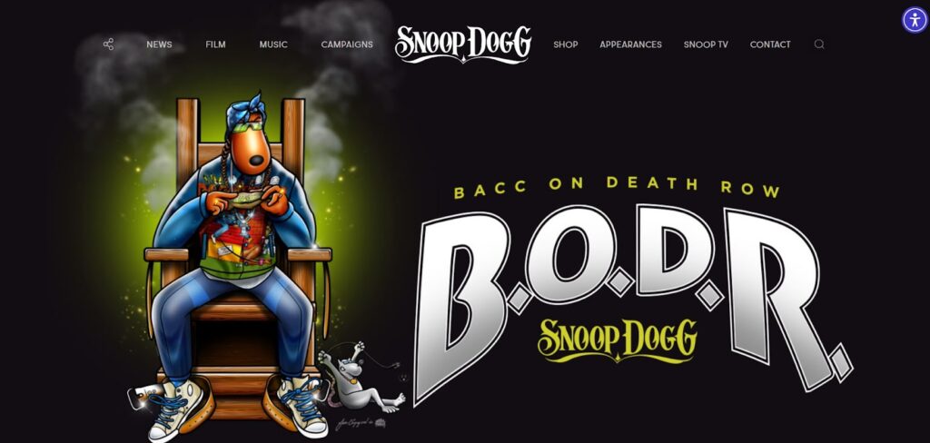
Famous WordPress sites like Snoop Dogg’s official site use the Elementor website builder to provide accessible and aesthetically pleasing designs.
The free Hello Elementor theme served as its basis, giving the site a sturdy framework over which Elementor’s drag-and-drop design tools could be created. The result is a unified, on-brand appearance for the site.
The homepage is simple, highlighting only the most important information, such as Snoop Dogg’s new music, tour dates and most-viewed videos on YouTube. The primary image showcases his most recent album, inviting viewers to discover more.
Other design elements, such as the call-to-action buttons with their translucent backgrounds and bold outlines, stand out against the black background.
The extensive accessibility menu located in the upper right corner of Snoop Dogg’s website is its most notable feature. Users who are visually impaired or have dyslexia can adjust the site’s font, spacing, color contrast and cursor settings to suit their needs.
Key highlights:
- Advanced accessibility features with customizable font, spacing and contrast settings
- Seamless integration of multimedia content including music and video
- Strategic use of transparent elements and bold outlines for visual impact
- Optimized user experience with intuitive navigation
- Perfect balance between brand identity and functionality
Plesk
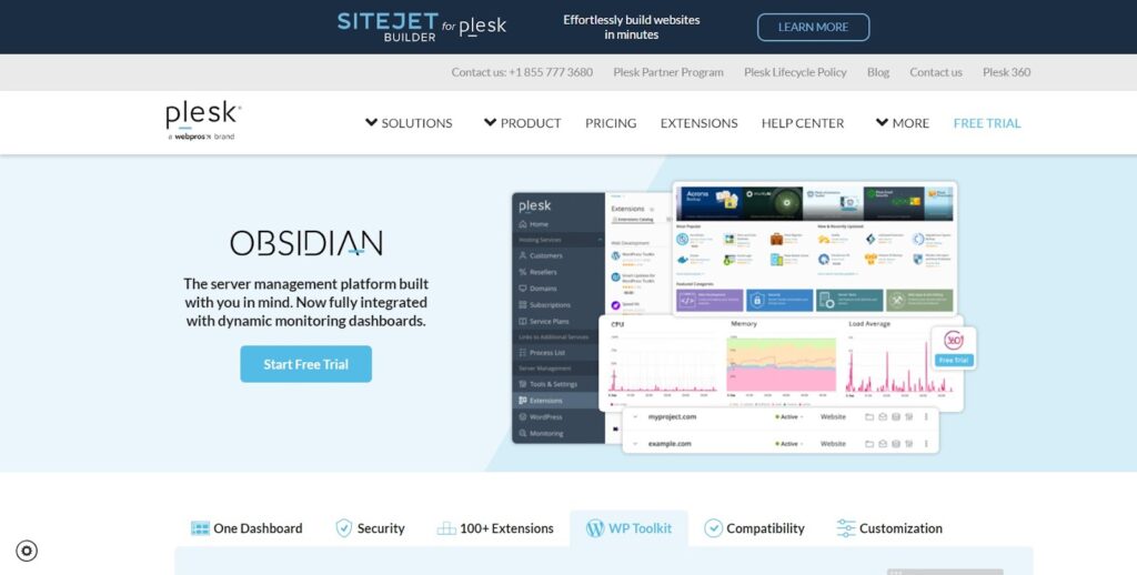
Plesk is a well-known web hosting control panel; the website is attractive, easy to use and technically sound, which are all qualities that potential customers look for in a good web host. Plesk can fulfill its business goals with a visually beautiful and highly adaptable website thanks to the combination of WordPress and Elementor.
To build and personalize the website’s pages, Plesk uses the Elementor plugin, which allows them to make sophisticated, aesthetically pleasing layouts without requiring a lot of code. The website exudes an air of professionalism and aesthetic appeal because to its minimalist design, large use of white space, strong font and high-quality images.
With its fully responsive design, the website works well on every device, regardless of screen size.
The website probably makes use of WordPress’s native capabilities and Elementor’s dynamic content features to automatically update specific components, such as the quantity of 5-star ratings or the frequency of newly-built Elementor websites.
Key highlights:
- Seamless responsive design across all devices
- Dynamic content integration for real-time updates
- Professional minimalist aesthetic with strategic white space
- Optimized technical performance
- User-friendly navigation structure
Trelement
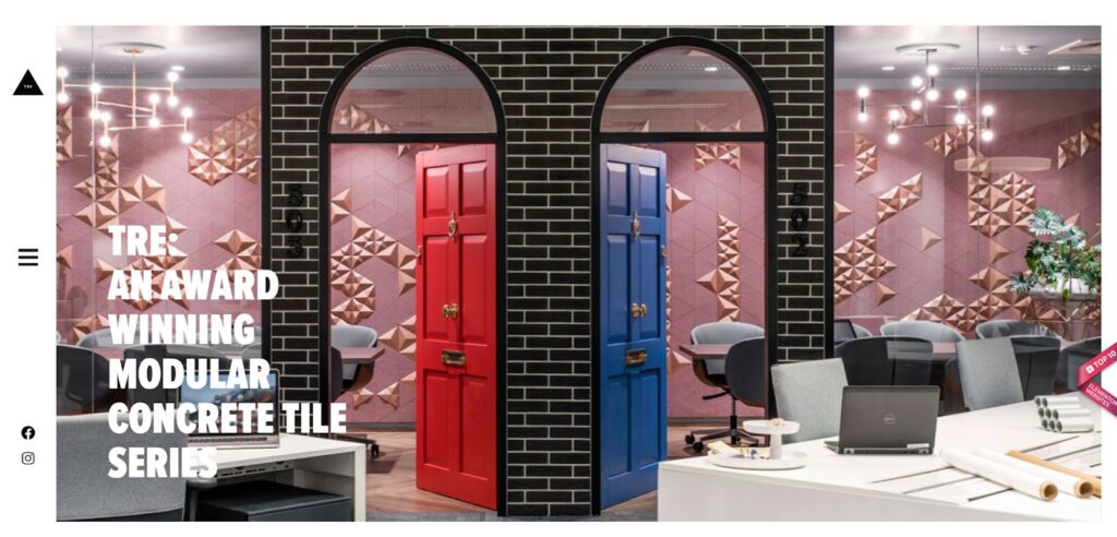
Trelements is a famous website for interior designers and architects who are interested in the TRE, an award-winning 3D tile design concept and product range by the industrial design business Kaza. It was created by Next Ship, a brand consultancy agency located in Hungary.
Trelements is built by the Elementor page builder plugin and includes OoohBoi Steroids for Elementor.
The website has a three-box style, with a main hero part showcasing a full-width background slideshow and two smaller sections below. The design takes a minimalist, content-first approach, with high-quality photography highlighting TRE tile items.
The website offers effective information architecture, with a cool single typeface (Proxima Nova) and sizes to establish a visual hierarchy. Its lively slideshow of modular images, beautiful symmetry and limitless pattern combinations inspire Elementor users to create this type of dynamic website.
Key highlights:
- Innovative three-box layout with full-width background slideshow
- Strategic use of single typeface for clean visual hierarchy
- Dynamic image presentation capabilities
- Professional product photography integration
- Optimized content architecture for easy navigation
23rd Street Distillery
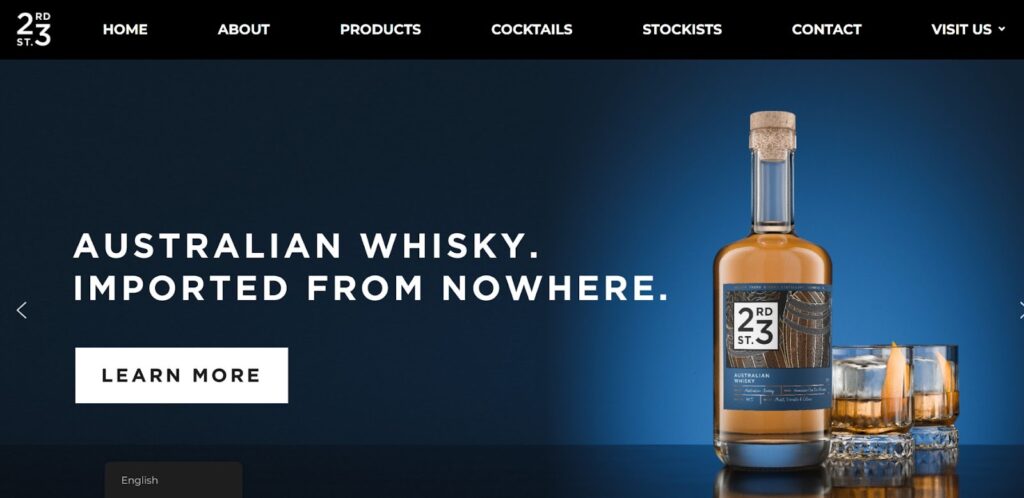
The 23rd Street Distillery creates high-quality spirits and innovations from top Australian ingredients. Due to its unique style and features that display the distillery’s products and visitor experience, the 23rd Street Distillery website stands out among Elementor’s websites.
A catchy motto in the website’s hero section sets the tone for the distillery’s brand and products. Large, high-resolution photographs of the distillery’s goods, facilities and production process make the website visually appealing and immersive. Users may easily find crucial information on the website thanks to clear section headers and calls to action.
The distillery’s café, gift shop and custom labeling choices are prominently displayed to encourage brand engagement beyond product purchases.
Key highlights:
- Stunning high-resolution product and facility photography
- Clear, strategic call-to-action placement
- Immersive storytelling through visual elements
- Effective showcase of additional services and facilities
- User-friendly navigation structure
Plain English
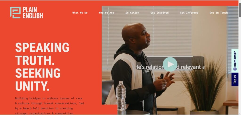
Plain English Inc. is an organization that wants to solve racial and cultural problems by having open and honest talks and bringing people from different cultures together. It featured a clean, professional look thanks to the Elementor page builder, which also made the layout, navigation and hero section uniform. The website probably changes its style based on screen size so it works well on phones and tablets.
All through the website, there is a warm, friendly vibe. Colors that are bright and earthy make the design feel friendly and approachable. The direct but caring language shows that they really care about their goal.
The website puts the founder’s name and bio in a prominent place and uses a slightly bigger font size and weight to draw attention to his knowledge and enthusiasm. This helps build trust and relationships with guests on a personal level.
Key highlights:
- Warm, welcoming color scheme that enhances user engagement
- Strategic personal branding through founder’s story
- Responsive design across all devices
- Clear communication of organizational mission
- Balanced professional and approachable tone
eBulletins
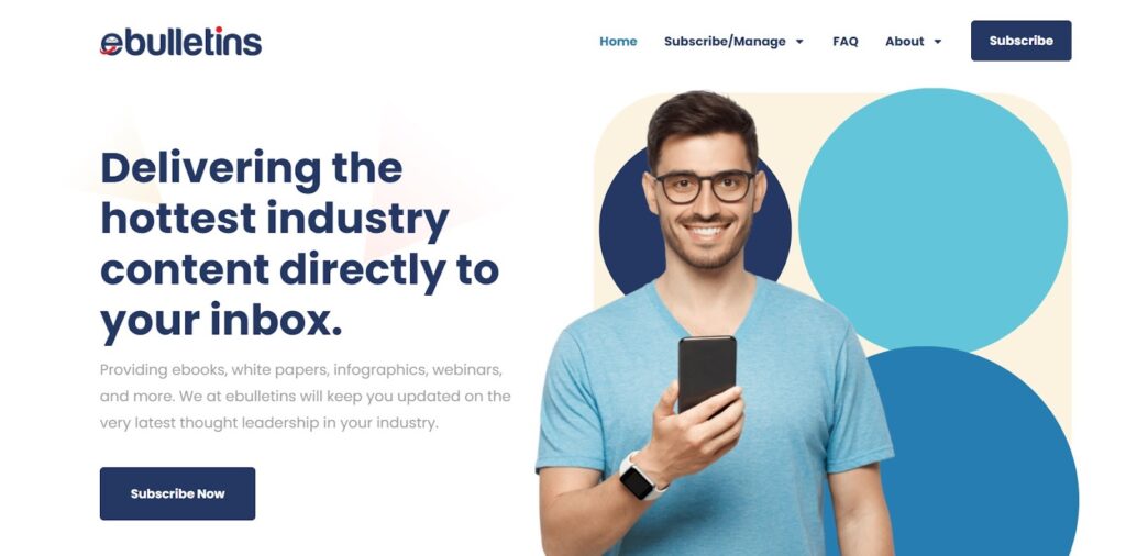
eBulletins is an all-inclusive platform for electronic newsletters and updates and its primary purpose is to facilitate their distribution. The Elementor page builder was used for its design. The website’s layout is simple and easy to use, with descriptive headings and brief text. The primary banner area, or hero part, is made to be visually appealing and catch the eye.
It has a clean, uncluttered design with plenty of white space and bold color contrasts.
A creative flourish to the design is the use of wavy lines to divide the homepage into various sections. To foster user engagement and drive conversions, the website probably makes use of calls-to-action (CTAs) like buttons or forms all over the place.
A consistent user experience across all screen sizes is assured by the overall design, which is likely responsive and optimized for mobile devices.
Key highlights:
- Clean, uncluttered design with effective use of white space
- Creative section dividers with wavy line elements
- Strategic placement of conversion-focused CTAs
- Optimized mobile responsiveness
- User-friendly navigation structure
Halley Stevenson
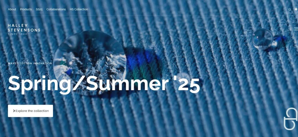
The Halley Stevensons website shows off the company’s skills in creating and improving waxed cotton fabrics. The history, products and partnerships of the business are emphasized in the website’s design and layout.
It’s one of the best websites made with Elementor. A minimalist style is used to make the website look clean and current. The layout is made up of several sections, all of which talk about a different part of the Halley Stevensons name and product line. With headers and subheaders, elements are easily distinguished, making it simple for users to move between them.
The website is easy to use, with a menu at the top that lets users quickly get to the main sections. There aren’t any big “Call to Action” buttons on the website, but it does tell people to “Explore our collaborations archive” to learn more about the brand’s different product lines and new ideas.
Key highlights:
- Sophisticated minimalist design approach
- Effective storytelling through sectioned layout
- Clear visual hierarchy with headers and subheaders
- Seamless product showcase integration
- Strategic collaboration showcase
The Vera Hotel
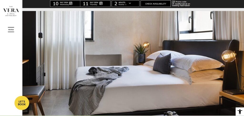
The Vera Hotel website is clean and modern and it focuses on showing off the hotel’s special services and partnerships in the area. One of the more complex websites made with Elementor page maker. The website’s style is clean and easy to use and the main sections—”Rooms,” “Amenities,” “Gallery,” “Location,” and “Contact”—are all accessible from the top navigation menu. It is easy for users to find the information they need because the content is organized into parts that are easy to understand.
The website’s color scheme is mostly grays, whites and blacks, with pops of color from the hotel pictures. This simple method lets the hotel’s design and partnerships with local businesses shine.
The website doesn’t have any big “call to action” buttons, but it does encourage people to look into what the hotel has to offer and how it works with other businesses in the area. The “Conscious” part talks about how the hotel cares about the environment and the community. This could be seen as a subtle call to action for travelers who care about these things.
Key highlights:
- Elegant grayscale design with strategic color usage
- Seamless integration of high-quality hotel imagery
- Effective showcase of local partnerships
- Clear presentation of sustainability initiatives
- Intuitive sectional navigation
R11 Solutions
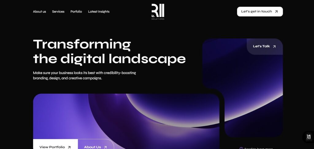
R11 Solution is another best creation using Elementor page builder. The style of the R11 Solutions website is clean, modern and nice to look at. From beginning to end, R11’s website will keep you interested with its beautiful black background and white writing on black.
The layout is made up of several sections that show off the company’s portfolio, services and areas of skill. With headers and subheaders, the parts are easily distinguished, making it simple for users to move between them.
The website is easy to use, with a menu at the top that lets people quickly get to the main parts, such as “What We Do,” “About Us,” “Portfolio,” and “Get in Touch.” Users can quickly find the information they need thanks to this clear and easy-to-understand navigation layout.
In the “Get in Touch” part of the website, there is a big button that tells people to get in touch and talk about their business needs. The CTA is put in a way that is meant to get the attention of potential customers and lead to conversions.
Key highlights:
- Bold black and white color scheme for maximum impact
- Clear sectional organization of services and portfolio
- Strategic CTA placement for lead generation
- Professional portfolio presentation
- Intuitive user journey design
WODO Agency
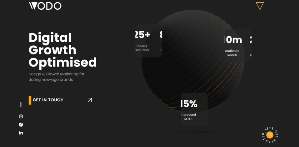
WODO is a 360-degree digital branding agency that helps businesses and startups make websites and run digital marketing campaigns. It was built using the Elementor page builder. The style of the WODO agency website is clean, modern and nice to look at.
The layout comprises several sections that show off the agency’s portfolio, services and areas of skill. With headers and subheaders, the parts are easily distinguished, making it simple for users to move between them.
The website is easy to use, with a menu at the top that lets people quickly get to the main parts, such as “Design & Development,” “Digital Branding,” and “Get in Touch.” Users can quickly find the information they need thanks to this clear and easy-to-understand navigation layout.
In a separate area on the homepage, you can see a sliding announcement feature that shows bold text in white fonts that are easy to read. Neutral colors like black, white and gray are used a lot on the WODO agency website, with blue and green used as highlights.
The website’s “Get in Touch” section prominently displays a call-to-action button, urging users to contact the company to discuss their business needs. The placement of this call to action is deliberate to attract prospective customers and increase sales.
Overall, the WODO agency website has a well-designed and user-friendly interface that effectively communicates the agency’s expertise, services and commitment to delivering innovative digital solutions.
Key highlights:
- Dynamic sliding announcement feature
- Strategic use of accent colors for visual interest
- Comprehensive service presentation
- Effective lead generation structure
- Seamless mobile responsiveness
Now you may wonder, how these famous website designs are built using Elementor.
You can use Elementor’s hundreds of features, such as tools, templates and plugins, to make unique and interesting website designs.
Element Pack Pro has more than 285 unique widgets for Elementor that can be changed in a lot of ways. It includes advanced elements like Animated Gradient Backgrounds, Flip Box, Trailer Box and more. There are particle backgrounds, gradient backgrounds, background sliders and more in this group of apps. There are many ways to change the look of each widget, so you can make it exactly how you want it.
Find out what makes Element Pack Pro your best choice for web design.
Final thoughts
We hope these famous Elementor website examples can really inspire you to create your own.
Elementor has changed the game for web creation by letting both professionals and amateurs make beautiful, high-performing websites without having to know a lot about coding. The examples in this piece show how completely flexible and useful Elementor can be for making creative ideas come to life.
Elementor lets users create unique online experiences that fit their brand’s style and the people they want to reach. Examples include WODO and R11 Solutions, which have sleek and modern designs and Snoop Dogg and The Vera Hotel, which are interactive and interesting.
The plugin’s large library of widgets, pre-built themes and advanced customization tools make it easy to get results that look like they were done by a professional.

