‘It’s very easy to grab visitors, just write an article with any header and publish it!’- If you think like this, you’re in a dream world. It’s not that easy to establish your position in the online market. When you write an article with a vague header, visitors will understand nothing about what you are trying to say and skip it.
That’s enough for your website to go down and lose visitors within a short time. If this continues, a renowned company will take a very short time to fall. In this article, we will talk about the best header design habit for Elementor for a website.

We are in a corporate world, and we all want to grow our business bigger as far as possible and try with our utmost effort to take it to the top position.
Here is a scenario you should understand- you established a company, set workers to make quality products, and tried with all your efforts to keep your business running, but published articles with any or vague header to promote your product.
What do you think the result would be? Absolutely zero!
Because having a quality product without a well-formed article for advertisement bears no fruit.

So, you have to write an article with a specific and meaningful header that will grab the eyes of the visitors who will become customers shortly, and tell others to do so. How can you do that?
Keep in touch till the end to know more about this.
let’s start!
What is an Elementor header?
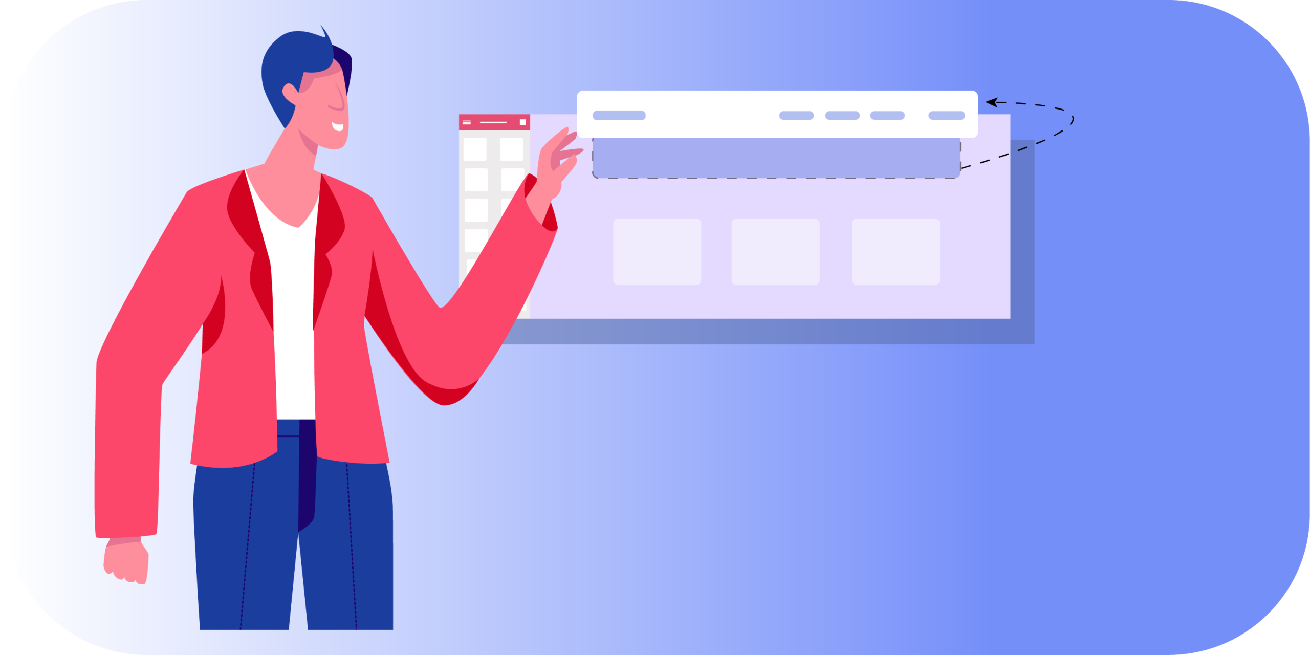
An Elementor header or a website header is the upper top part of a website where the logo, navigation, and sometimes other information i.e.: text, images, gifs; links, and buttons are found.
A header is like a face. As a person’s face expresses his personality and attitude of him, so is the header of a website or webpage. It gives the reader a clear concept at first look about what you are trying to say.
Why header is important?
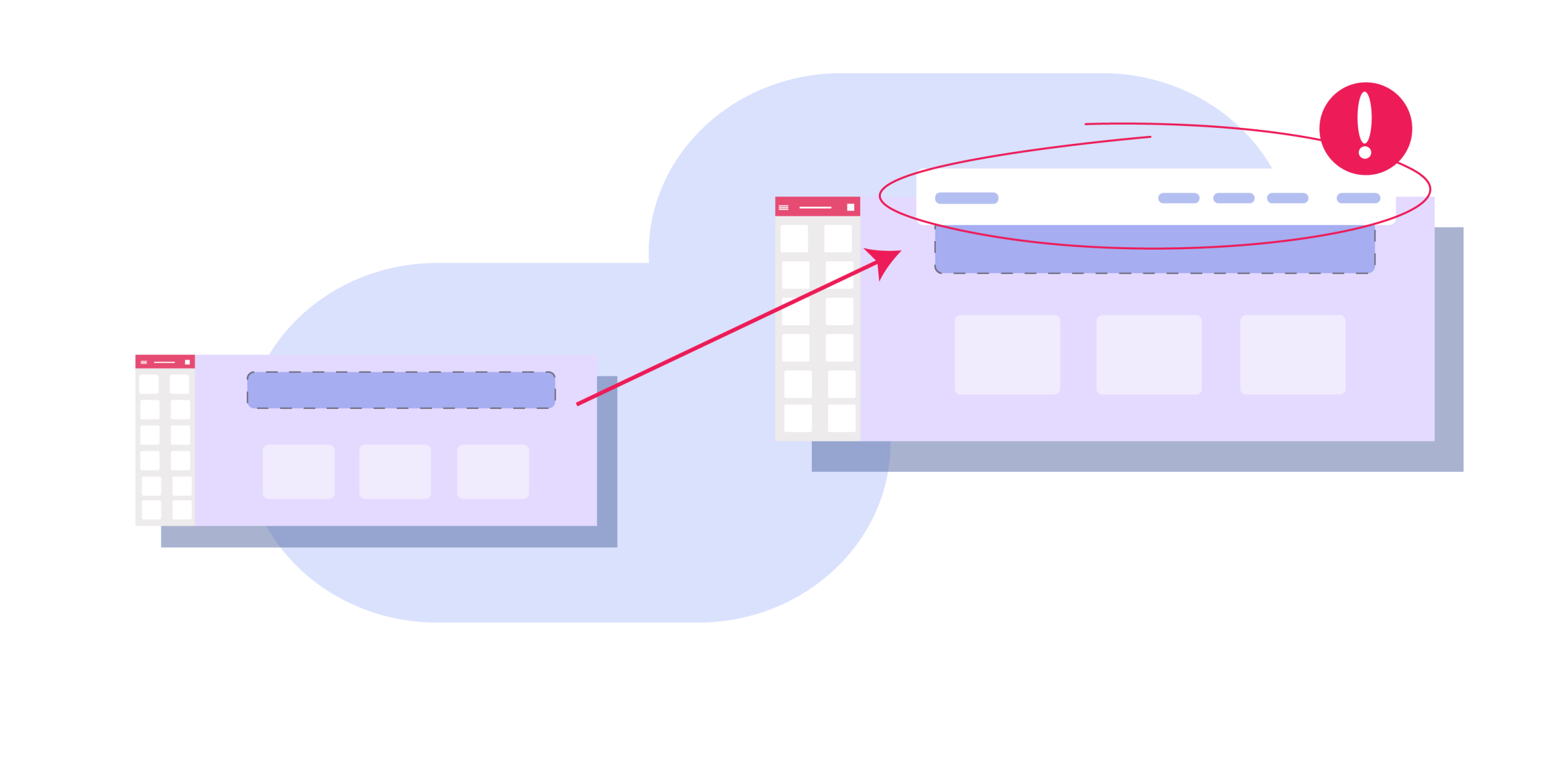
Now that you have got an idea about a header, let’s know about the importance of a header in detail. A header is a primary and of course a vital part of a website that can either grab the attention of a visitor or force him to take a u-turn from the site at once.
If a header cannot catch the eyeballs of the visitors then it is for sure that they will not be interested to read your article at all. A catchy header helps you to be known from unknown to a visitor and makes him a customer in a short time and drives more visitors towards your website.
Here are some reasons why a header is so important:
- It grabs the visitor’s attraction at the very first look at your website
- It makes visitors interested to explore the site with one click or search query
- It serves as the home for the brand’s logo where most visitors come across
- It works as a table of contents for the site
- It offers extra info related to the company, how to contact, and more
- It includes CTA buttons for people who are ready to take the next step
Generally, the header serves a similar purpose for most sites. Despite that, you have the freedom to create different types of headers depending on the type of website, brand style, and how much information you want to store there.
Why is a header design needed?
You want to make such a header that will grab the attention of most visitors in the online market that will help you grow your business bigger.
To do so, you have to have a header design. A header design enables you to make the layout of creating a good, healthy, and catchy header that will smash others and make you a way to go up to the top position in the ranking.
So, a header design is a must that helps you decorate your header more neatly and precisely.
Types of header designs we normally use in WordPress
There are some common website header designs we use in WordPress. They are given below:

-> Shrinking sticky header
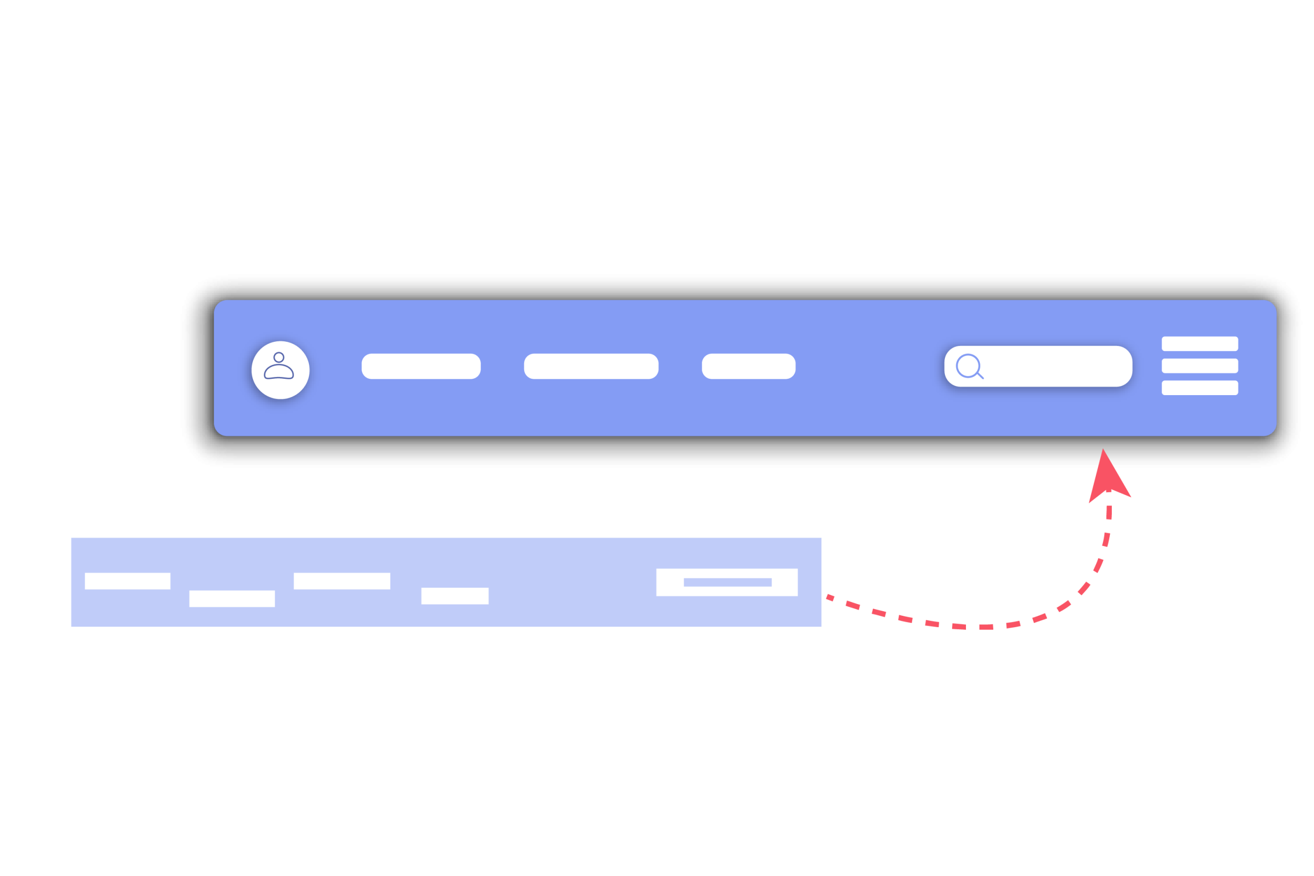
It is a website header design that starts with a regular header, and as you start scrolling down, the header becomes shorter or a bit smaller, then gets transparent.
At the same time, it holds the header in the same position on the screen as you scroll down. It has a version of a partially sticky header, when you scroll down it disappears, but when you start scrolling up, it will appear again.
-> Navigation Header/ Best Header for navigation
Websites, a part of a family of sites that are common in retail, have the option to add an extra bar above the header that links quickly to their other stores. The advantage of this is, that you don’t have to create a separate bar for them, visitors can get the links inside the same single bar.
-> Mobile Header Design
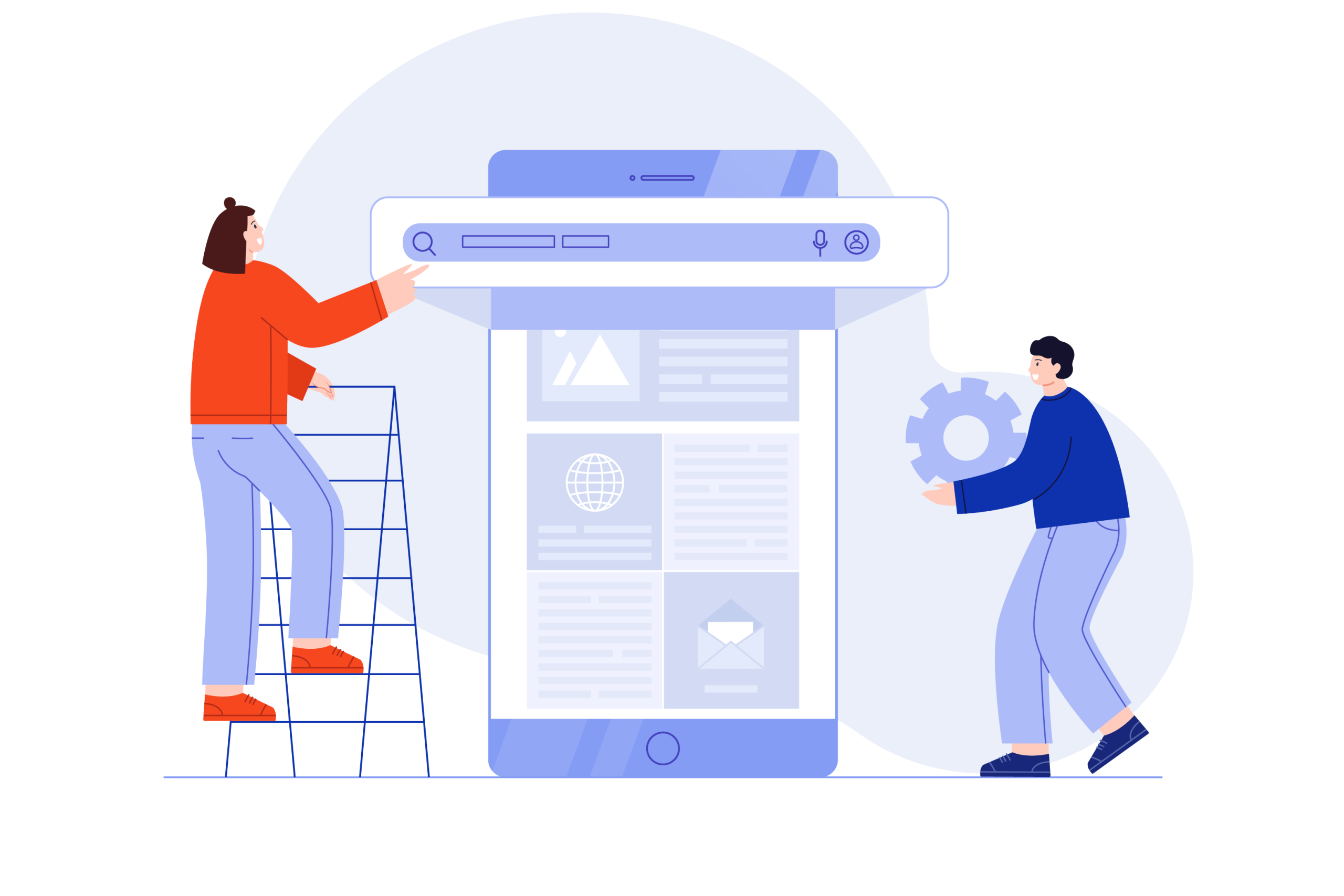
The mobile header design is appropriate for those who use mobile phones, and it is usually applied. In this design on the screen, the logo appears on the far left and beneath a hamburger icon, the navigation and other links are inserted.
-> Hybrid Header
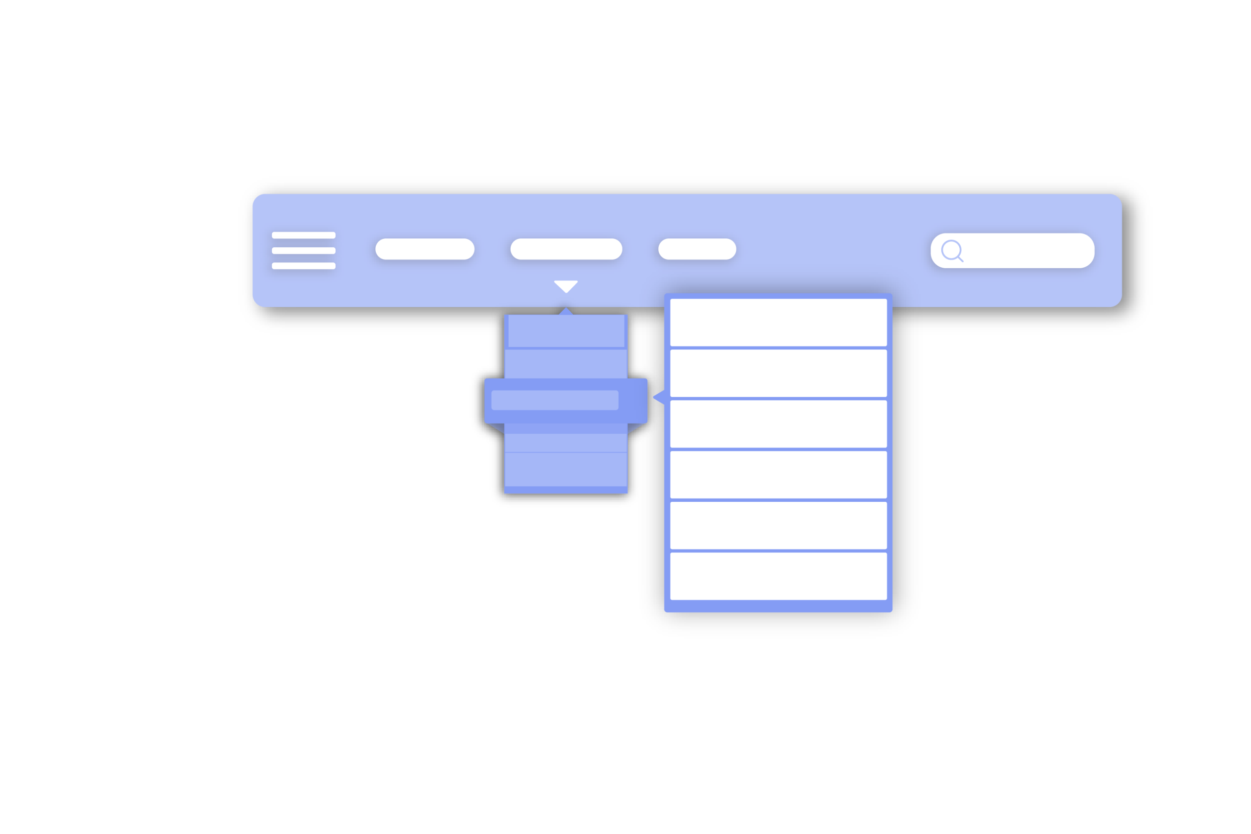
It is not surprising that websites adopt a hybrid header design as a result of blurring lines between mobile and desktop. Generally, it looks like a standard single-line header. Though, additional navigation links for desktop visitors are held in a hamburger menu icon.
-> Vertical aligned Header
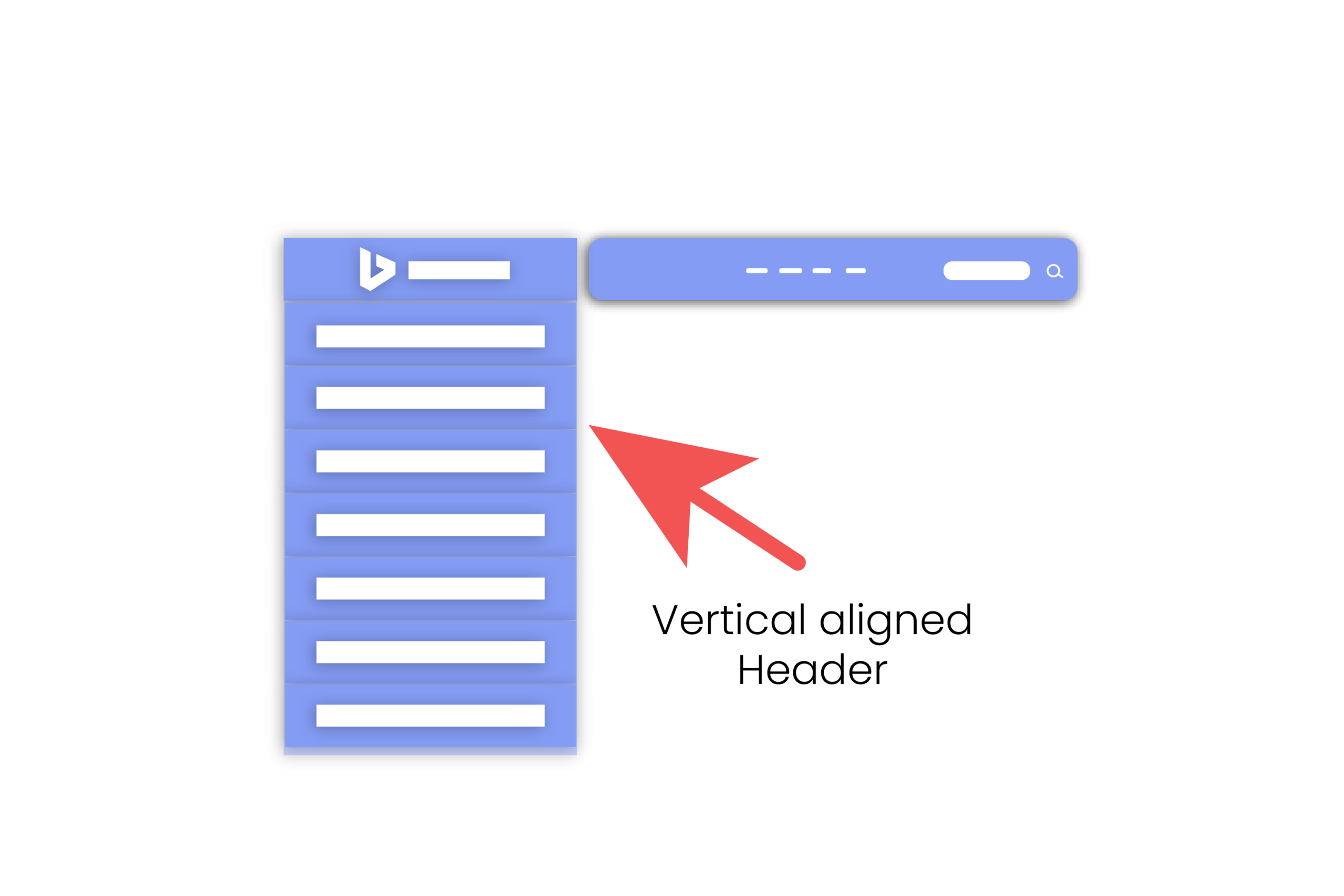
You can use a vertically aligned header to make your website view different and charming to your visitors. You can set the header position either to the left or right as you prefer which will be perfect for your business.
This header design leads people to incline to choose it as an admired option on their sites for hospitality and other service-based businesses.
Parts of an ideal header for WordPress websites
The elements in the header you see may vary from one website to another, but these options among them here are the most common. It is not necessary that you include all of them.
If you insert features more than needed in the header, it will look dense and may confuse the visitors. Instead, you have to aim to keep as much information in the heading enough for your visitors.
Let’s have a look at the most common elements you can include in the header on your website:
- A Logo
- The Navigation Menu
- Search Bars
- Social Media Icons
- Contact Information
- Call to Action
Now, for your kind information, I am going to talk about these elements deeply:
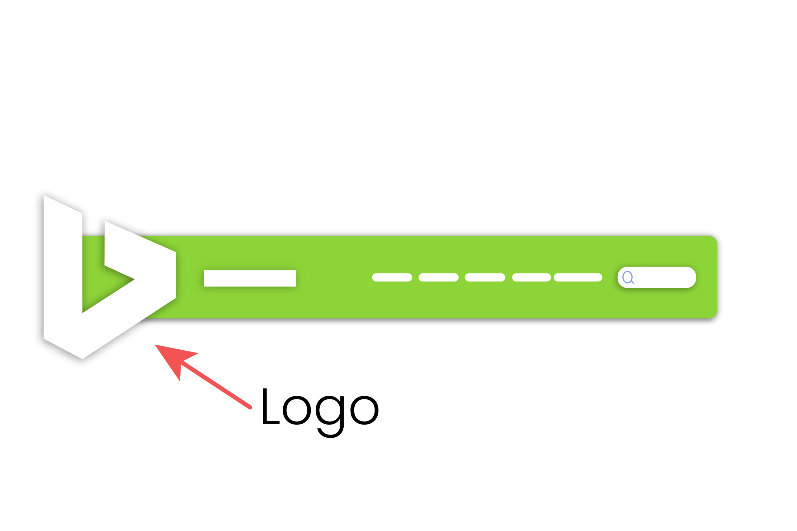
1. A Logo
If you want to take a place on the top position on the website, you must have a logo of your own for branding, because this is the first thing every visitor sees when they come to your website. This is the reason it should go in the header.
The logo design must be different and charming from the other elements of the header to catch the eyes of the visitors.
The next important thing is the location of the logo. The wrong location of the logo will make the visitors skip your site, and your site will be abandoned very quickly. The location may vary, but generally, it is located either on the left corner or in the middle on most websites.
So, positioning is a vital issue for your branding, and you have to choose wisely where to place it that will grab vast traffic to your website.
There are common and perfectly acceptable situations you may know:
- If a site has no logo, then instead, the site title takes place of the logo.
- Some sites have both a logo and a site title.
- Sometimes the site title is part of the logo image.
Your main target is to make the branding of your site and drive vast traffic towards it, so make the best use of the logo in the header that will perfectly work and fulfill your target.
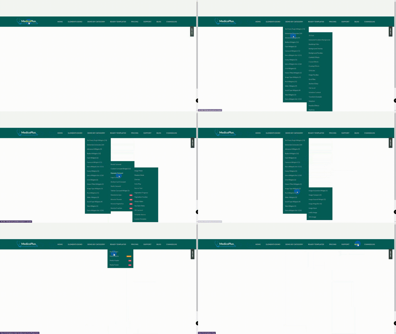
2. The Navigation Menu
The most crucial element in a header is the navigation menu. It helps to include a menu linking to all of the important pages of your site where each page relates to one another. There are four primary links i.e.: Products, Features, Resources, and Plans & Pricing on WordPress.com’s menu. It is better not to stuff all page links into the menu unless your site has very few pages, even if you think all pages are important.
If your visitors easily get a bird’s eye view, they’ll sense confidence as they explore what’s on your site. You have to keep the links in the navigation easy to read and tell visitors using the text what they can expect once they click on it.
Also, it can include buttons i.e.: Login, My Account, and Shopping Cart. The numbers and types of navigations vary on the size of your website and your need. You can use a hamburger menu on the left to make it easy for your visitors to find the options they are looking for.
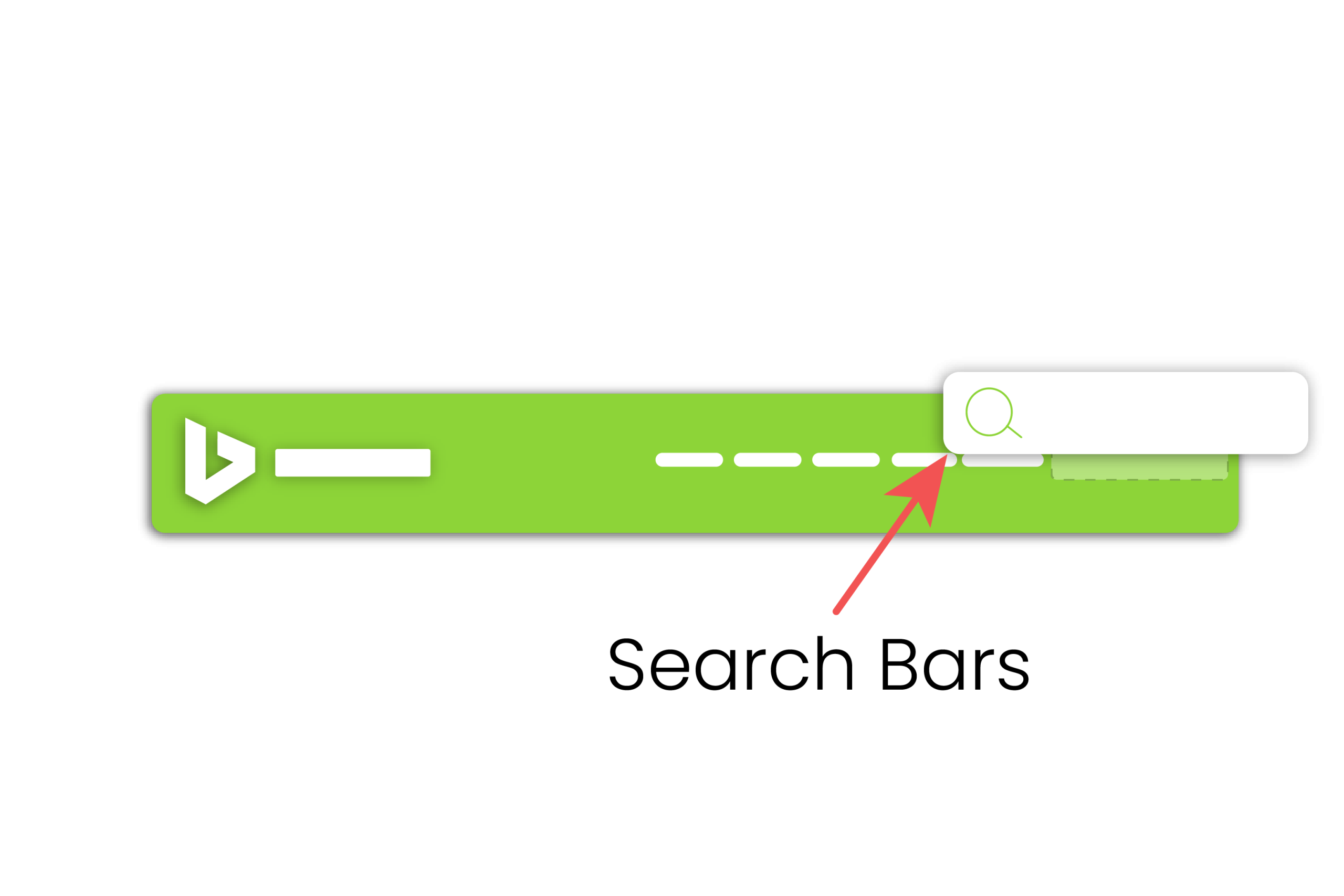
3. Search Bars
If you arrange a huge archive or library of content, you need to add a search feature normally on the right side in the header area and that is the right place for it.
You have to remember that a magnifying glass icon just doesn’t represent the search bar, it is paired with the word ‘Search’ with an icon that people can easily find.
Using this option you can prevent your users to go to a new page for their search, they can easily do their query here and give a better UX.
You can include ‘hidden’ search bars to save space that display only when you click on an icon which is a wise design approach you can do if you have many items in a congested area. That means, this procedure saves space and grows your visitors to look into your website.
4. Social Media Icons
At present, people are more active in social media online than in offline or normal life. So, you can link to social media by adding icons in the header area which will take little space but greatly help you to engage more visitors to your site.
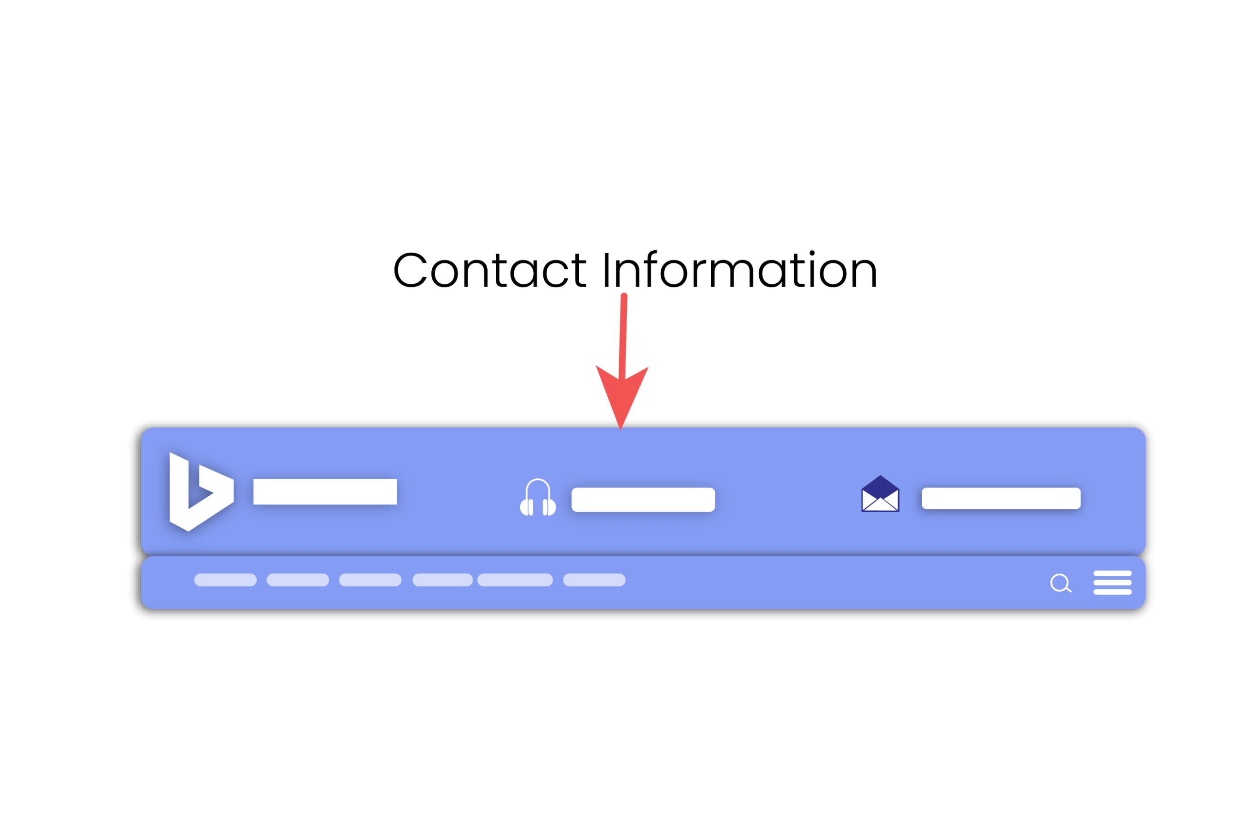
5. Contact Information
If you run a physical store or you have a customer contact center software, it’s better that you include contact information in the header. Other competitors like real estate agents, local businesses, service providers, and consultants like to ensure to show their contact information noticeably. For instance, you can receive increased leads by adding a contact number to it.
6. Call to Action
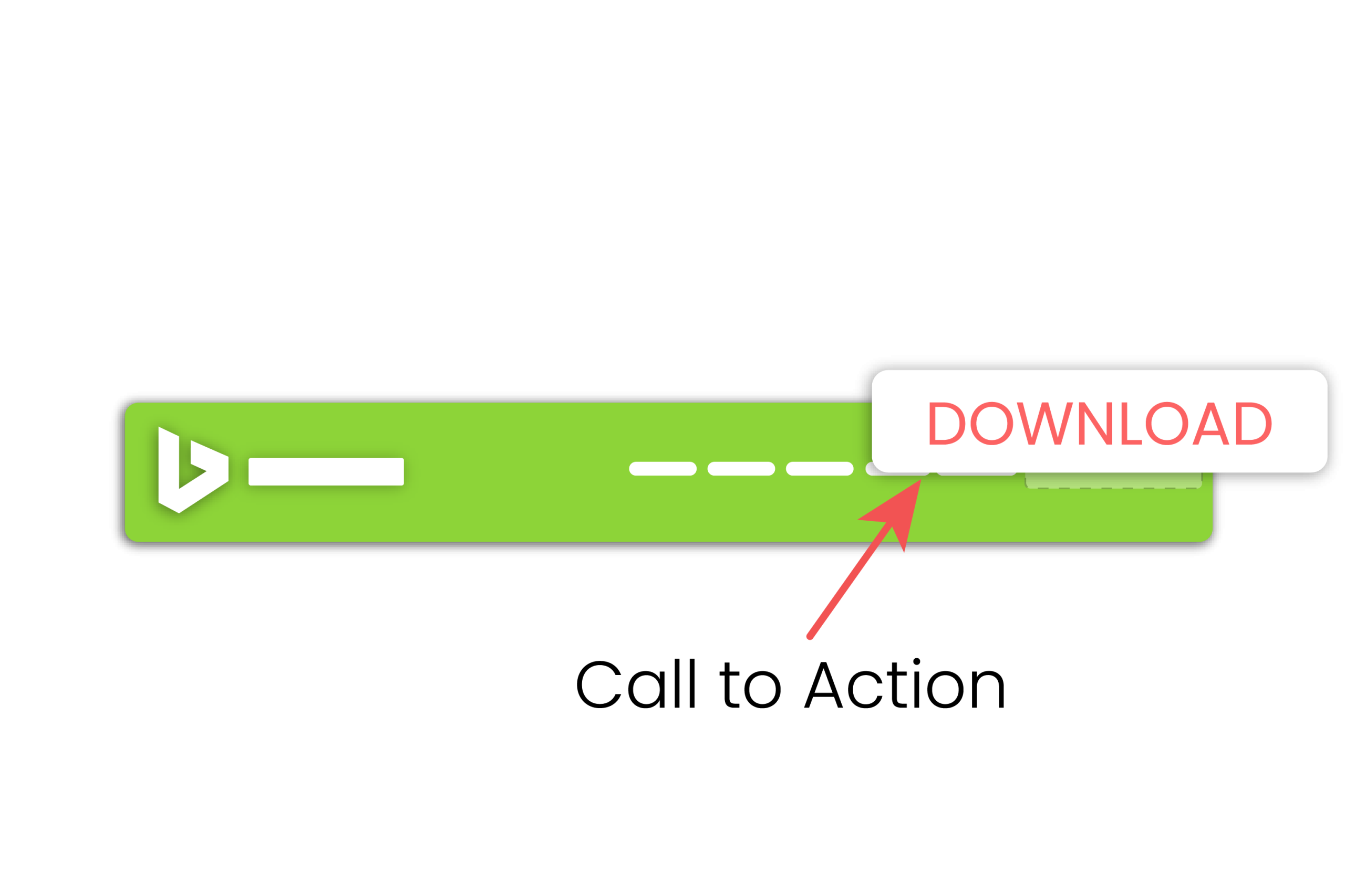
You can use the contact number in the header as a Call to Action your site needs, others may use a different call to action.
Instead of a contact number, you can use a signup option so your visitors will be engaged with your newsletter or create an account.
The header is such a place that can encourage users to act by putting a button, form, or link. You can use either of them as a call to action for your website as needed.
What is the difference between a WooCommerce Site header and a normal site header?
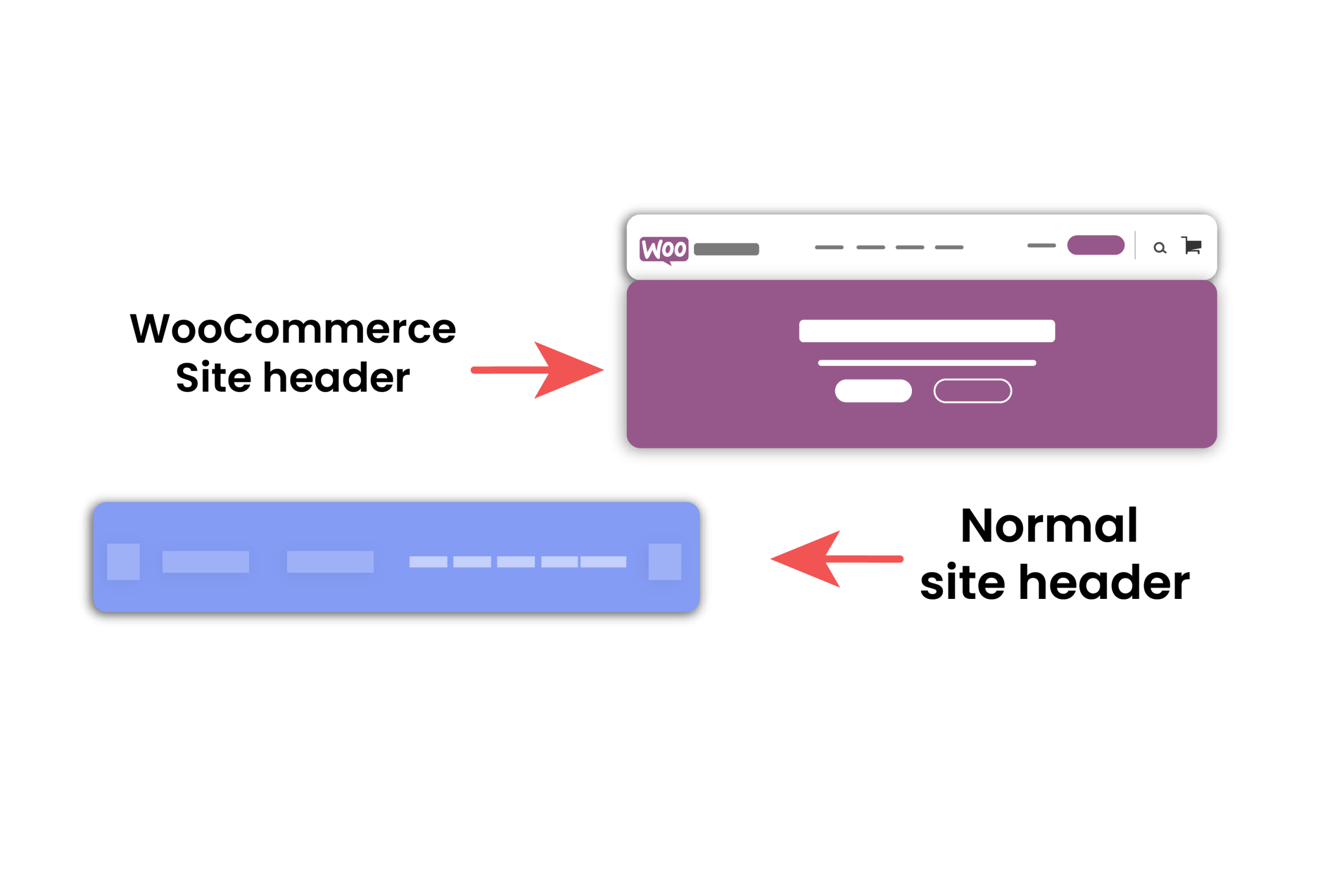
Now, a vital question arises here: is a WooCommerce site header similar to a normal site header? Is there any difference between them? Well, let’s find out that below:
A WooCommerce site header:
- It contains the policy related to the company.
- It informs visitors about the product.
- It converts the visitors into customers.
- It promotes all the products and goodwill of a company.
- It mainly covers the financial section of a company.
- It helps grow a company bigger.
- It is target-oriented.
A normal site header:
- It contains general conversation or chit-chat.
- It does not inform visitors about any product.
- It does not convert visitors into customers.
- No promotions about any product are present in it.
- It generally discusses anonymous topics.
- It is not helpful for growing a company bigger.
- It is not target-oriented.
10 killer facts you need to know
We had enough talk above! Now, allow me to inform you about the 10 killer facts. These are given below:
1. The header clarifies your message to your audience
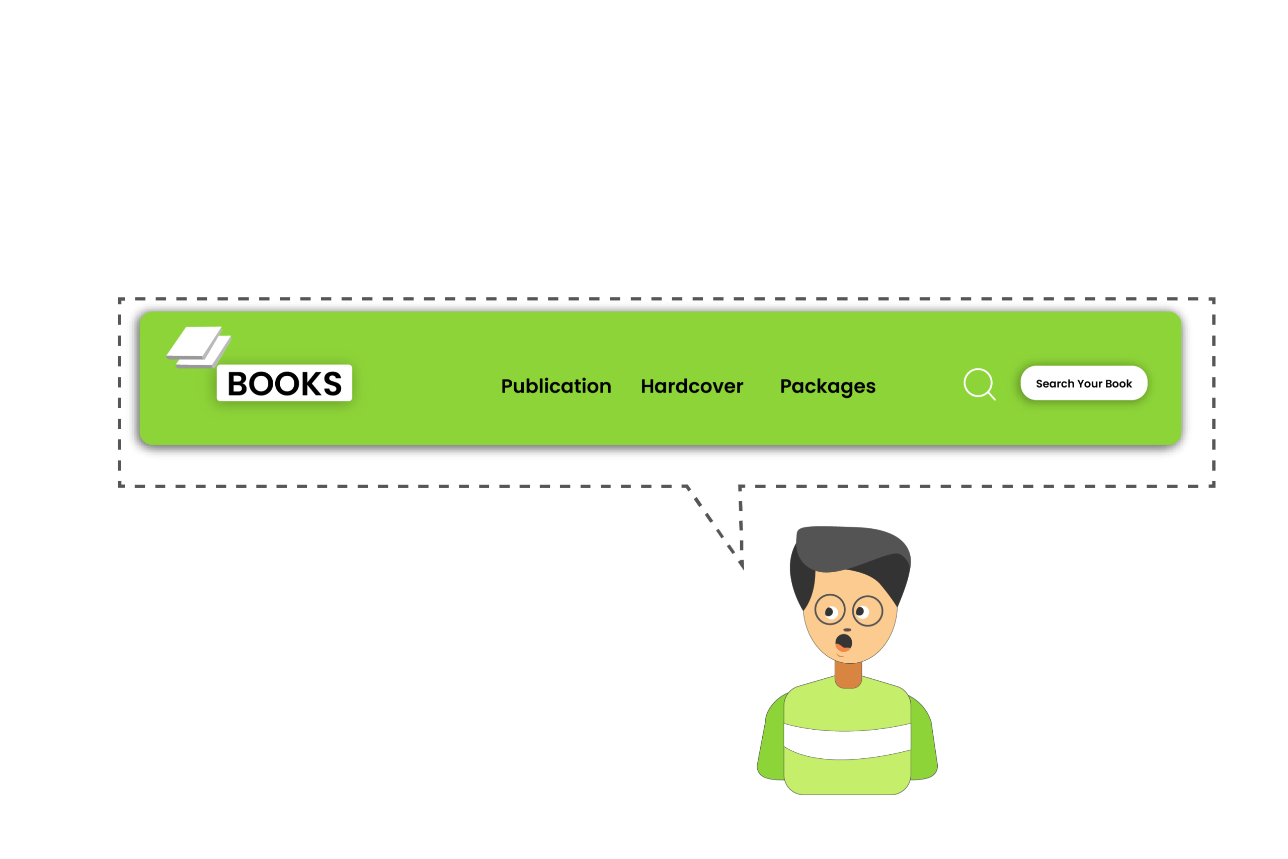
As you know, the saying goes- ‘Love at first sight’. The same applies in this field. When a visitor first sees the header, it gives him a clear message of what the article is all about.
This catches the eyeball of the visitor and creates a desire to read through the article to the end. If a header is vague to the visitor that makes him confused and oscillated will not make him interested to read the article at all, and he will make a quick u-turn.
That’s a warning signal for your website to go to the bottom in no time. So, you have to clarify your message to your visitors in the header.
2. Well-Organized and Well-Structured header attracts visitors
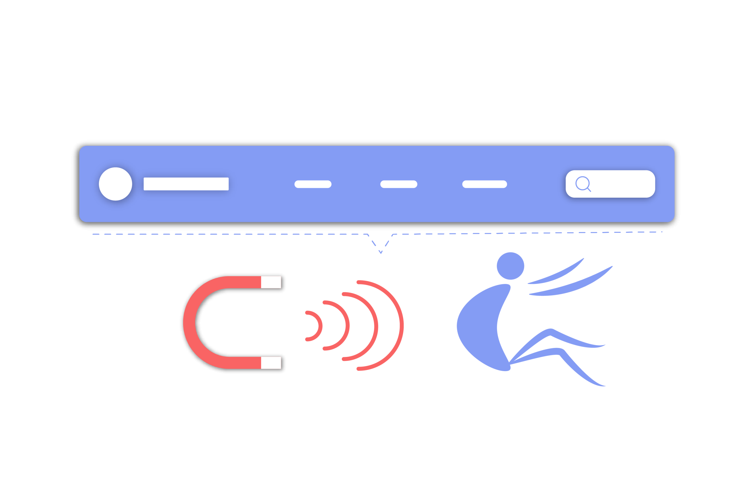
You have to keep the header well-organized and well-structured because it is the gateway for the visitors to enter the compound of your blog area. It helps them easily and quickly find what exactly they’re looking for. Let’s analyze this below:
- Design the header on the principle ‘the law of common region’- where the logo and the navigation remain on one platform keeping equidistant spacing and are considered one whole.
- Keep the CTA i.e.: Contact Sales, Login, Try for Free, on the right corner in the header that would help the visitor to proceed ahead.
- Throw questions, overview, features, and plan in sub-navigation that will make your visitors interested in your site.
- Highlight the main header by keeping it larger and brighter using thicker and larger fonts than the others. This design will make the visitors focus on the header, then they will go to additional information.
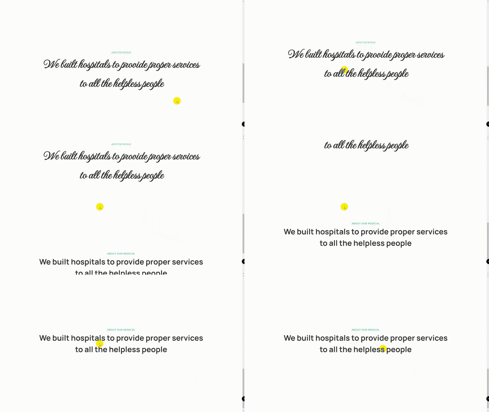
3. Simple Fonts help visitors Easy To Read
Selecting simple fonts in the header help visitors easy to read and makes the conversion rate double. So, it’s better not to make the header the place for getting creative with your font choices except for the logo for sure.
You can freely choose a handwritten or crafted font for the logo to make it unique. You have to remember these three points about the header:
- Do not use the handwritten or crafted font in the header, it will be tough for the visitors to read. Instead, it’s better to choose a serif or sans serif web font for the text and info.
- Keep the font size to a minimum of 16 pixels that will fit in the header area.
- The color contrast ratio should be at least 4.5:1 between the fonts and the background.
You can use the Style Editor in Elementor to build a completely customized header, or you can go to the Global Settings to define typography and colors to adapt as you need.
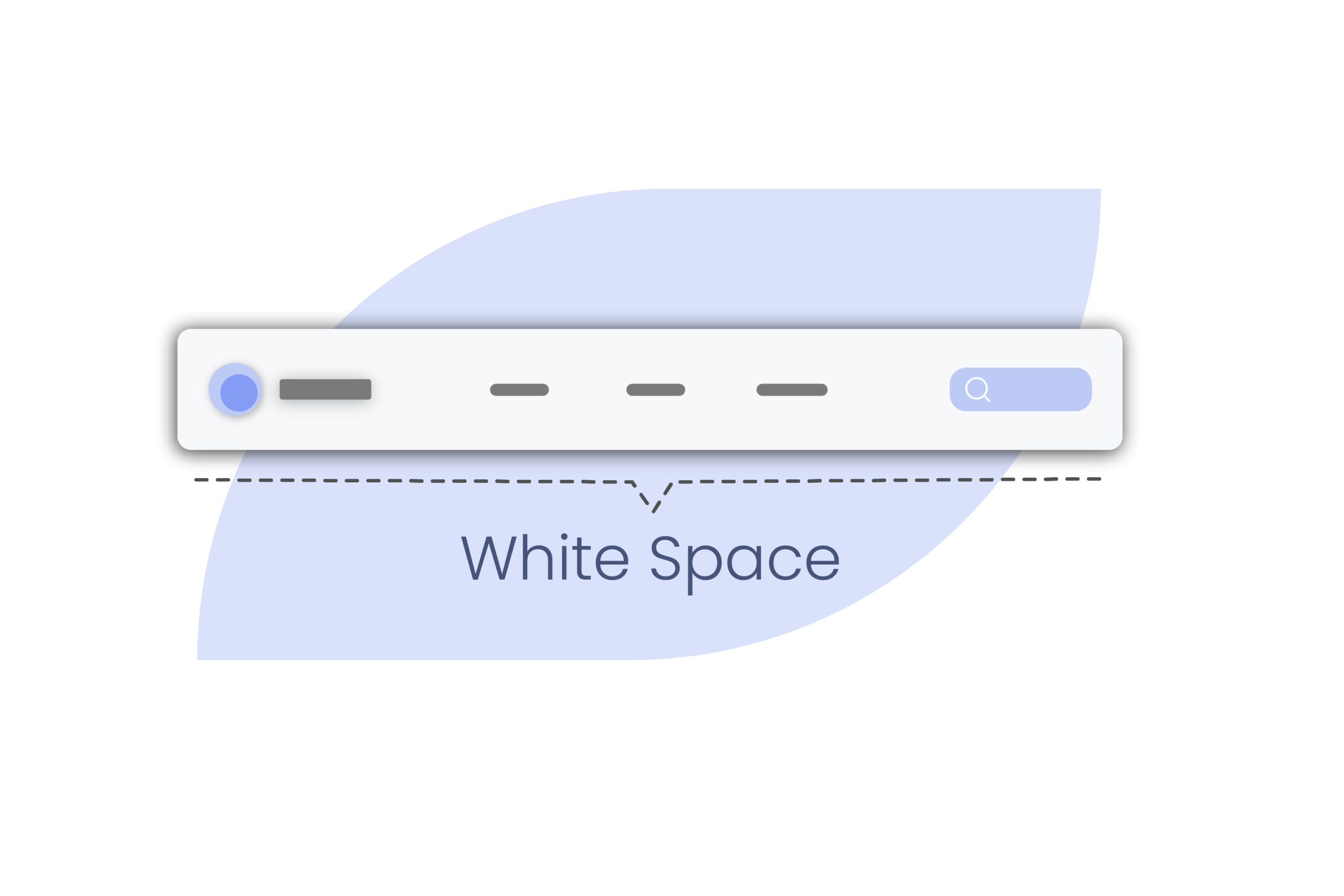
4. White Space makes reading easy
Using the necessary white space in the header makes the visitors easy to read which lures them to dive deep. You have to try to keep the white space in the header as much as possible. Keep your eyes on these points:
- Keep an essential gap between the elements that let the logo shine encouraging visitors for signing in.
- Keep equivalent room with fine dividing lines among the links, this will help visitors focus on them individually.
- Give enough space into the search bar that will practically help users find their required items using a wide area.
- You can make the header background all black colored and put a big white block at the end of it which will attract visitors and it can be the CTA.
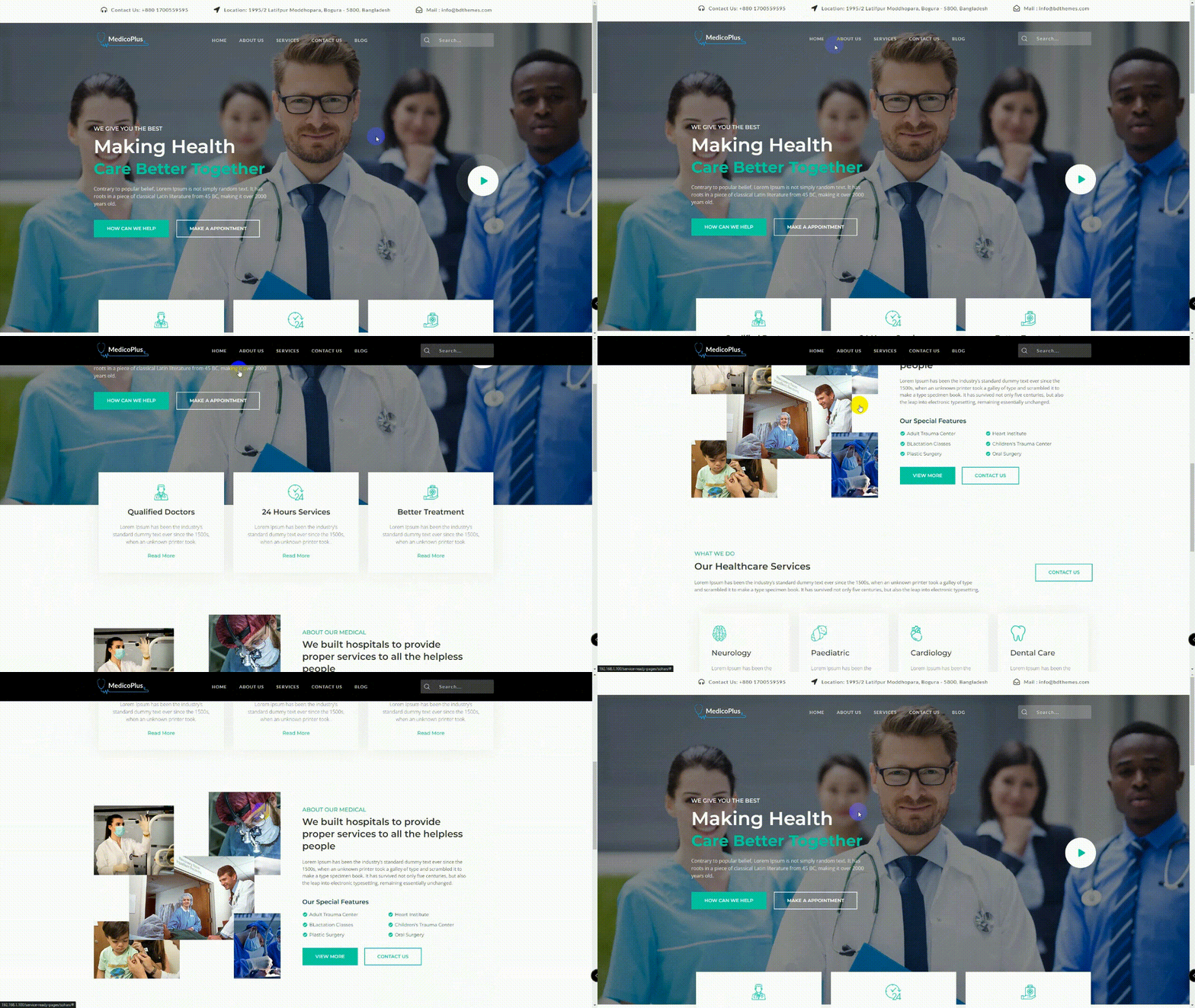
5. Sticky header hooks visitors faster
If you want to hook visitors faster, keep the header sticky for your broad article. Websites with long single-page and long feeds can get benefited from it.
Thus, visitors can always see the header near their eyesight as far down the page they go. If you want to get more visitors to your site, you can follow these tips:
- When the visitor starts scrolling, shrink them up.
- Make a visible difference between the header and content so visitors can identify them.
- Use animation but keep it small.

6. Transparent Header is good for navigation
Give your visitors a feel of easy navigation. For this, make the header transparent keeping the elements intact, this tricky design will make your site preferable to your visitors. When a header with a busy background appears on the text, visitors face difficulty to read them.
As long as the header appears on the text, it becomes unreadable when they scroll over certain parts. Here are some points to solve the problem:
- Make the logo in white color on the left and place the white hamburger menu icon on the right.
- Make the video or image rich in a color contrasting well with the white on the top of every page.
- Keep your site lightweight using necessary visuals and don’t compromise the header visibility being transparent.
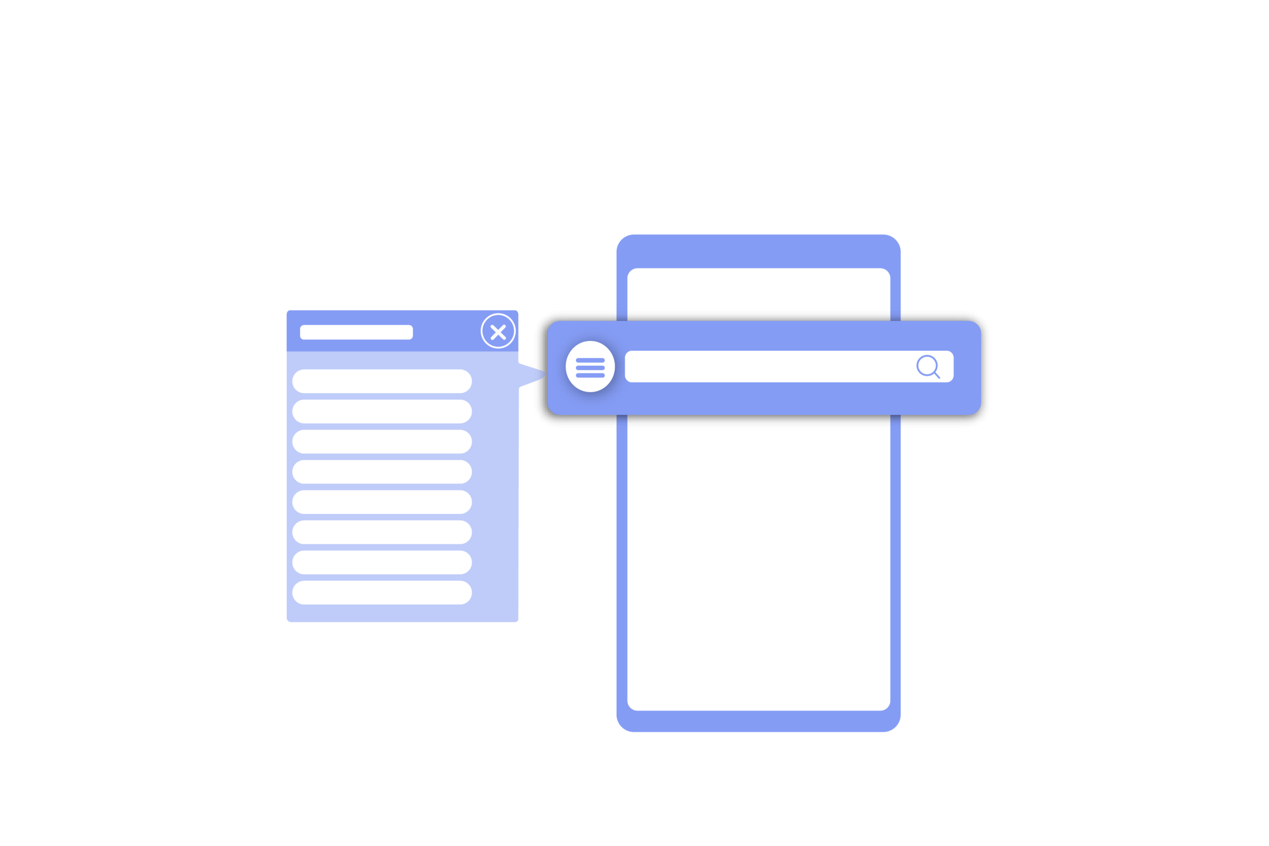
7. Custom Header Design for Mobile helps more engagement
Don’t just think about the desktop users as your visitors, think about the mobile users also. As per Google’s suggestion, the mobile and desktop version of a website contains the same content.
It’s not arguable, but the header on the desktop should have the same elements as the one on mobile, meaning the design for mobile should be different. You just have to make the header design mobile-friendly.
Let’s compare the difference:
- On the desktop- when a navigation link is opened, a sub-navigation is shown as a horizontal row below it.
- On the mobile- the navigation doesn’t fit into the header of a mobile site, so, the navigation links are embedded in the hamburger icon. When it is opened, it reveals a complete header in a vertical view, all links are shown in the same way.
You can do this using the Elementor custom header builder. To do this, switch your responsive mode to the smartphone view and customize the elements as you need.
8. Visual Elements talk more than text
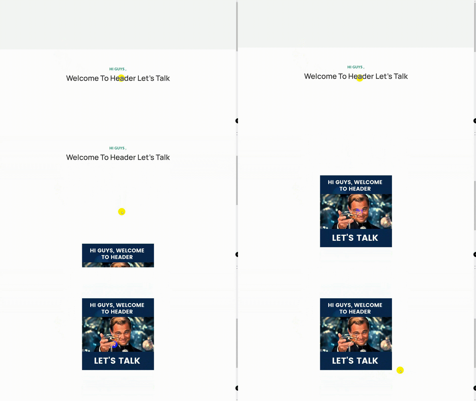
You know very well that a picture is 100 times stronger than a lump of text. You can get more traffic by including visual elements in the header.
Using icons for site header elements i.e.: shopping cart, search bar, language switcher, location finder, and so on can be useful, just remember not to use icons that are uncommon or contains unclear meaning.
Always try to add images that keep the header fresh and don’t impact the loading time. Avoid including videos in the header, as it is not the ideal place for videos.
9. Animation to the Navigation makes the content user-friendly
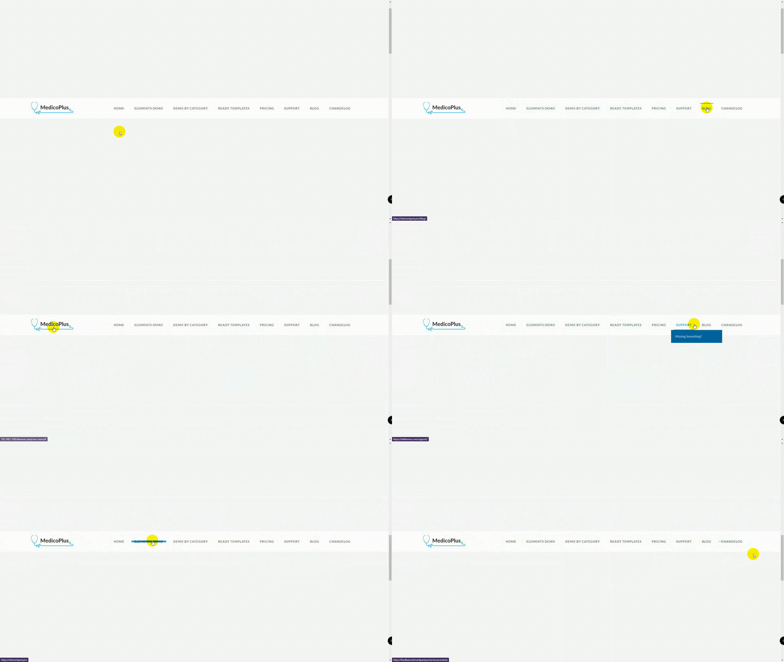
Animations over-the-top are not always effective. But, if you use it in the right way, you can attract visitors. For example, applying small animations to the navigation can grow the focus and engagement of the visitors.
Here is a sample you can make use of:
- While a visitor hovers over one of the main navigation links, the rest of them fade out. This animation effect will primarily help them focus on the available content.
- Next, he hovers over a secondary or tertiary link, the page color differs from the remaining options.
Look at this another example:
- You will see here a smooth floating animation as the second-level navigation slides open.
- Then, you get a fading effect applied to the page, not to the navigation.
Let's have a look at this example, here the Elementor widget is used:
- You can use animation in your navigation using a ready template in Elementor.
- You can insert a nav menu on the page from the Elementor addon. Elementor addons are of great use here.
- You can also use motion effects that will animate the whole navigation menu instantly, which brings the selected page to life.
10. Considering the Header-to-Content Ratio drives more traffic
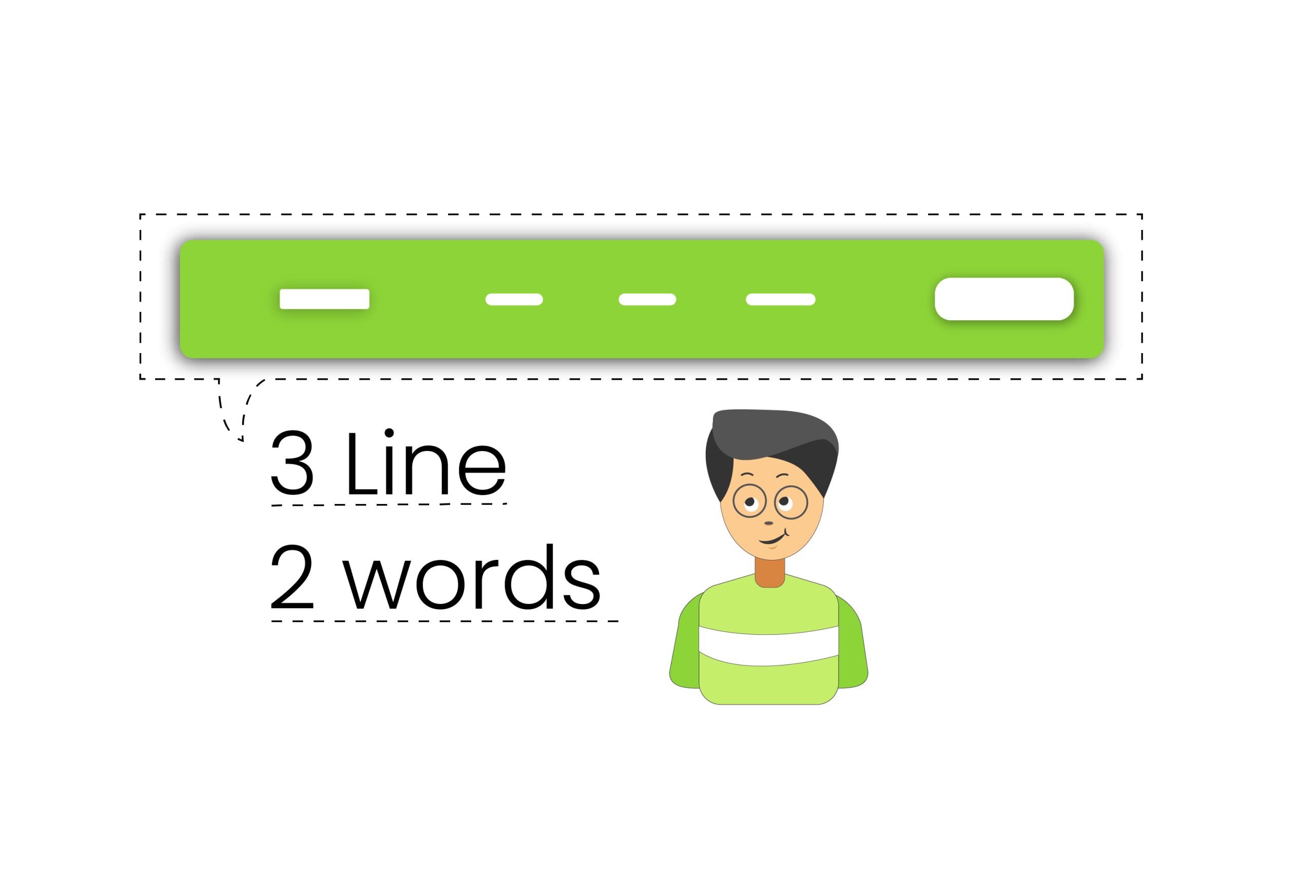
If you want to drive more traffic, you have to consider the header-to-content ratio. There are some factors to consider about this. Navigation have generally two modes i.e.: vertical and horizontal.
Let's have a look at vertical navigation:
- You can add links as many as you need without crowding the header.
- Scale your website’s pages without affecting the header design.
- Customizable and easier to scan as visitors look down the left rail of the website.
- Users are familiar with vertical navigation from the time spent on social media and web apps.
- You can experience between desktop and mobile by vertical navigation.
There is a space issue you have to take into consideration in vertical navigation.
Now, let's look at the horizontal navigation:
- The horizontal header is generally designed to be thin, regardless, allowing many shrunk sticky headers for the visitors.
- When someone clicks on the hamburger menu icon, only then he can see the sidebar navigations.
- If you keep the sticky sidebar menu compact enough i.e.: 250 px wide compared to the 1200 px on the site, it can result in a good user experience.
Bonus: Get Stunning ready-made header templates in the Element Pack Pro template library
Good news for you to create an eye-catching header!
You will be pleased to know that there are many ready-made header templates in the Element Pack Pro template library where you can find many designs for creating different charming headers. You can use these templates as you need regarding your site.
That’s not all, you can even customize these templates for your header. You can customize the template header as a sticky header to attract visitors.
You can look into the Element Pack Pro template library to create stunning headers that will drive more visitors to your site.
Choose your header, Drive your business
As you have learned about creating a stunning header, and some killer facts about it, It’s time for you to choose the header wisely and suitable for you. It will help you to strengthen your visibility, and catch more eyeballs of the visitors that will drive your business towards the target with turbo speed.
You can establish your strong position in the online market and go forward keeping your competitors way behind.
Hope this will help you a lot. Thank you for reading this article patiently. Have a nice day.

