
The Prime Slider General Widget comes with some unique features by focusing totally on visitors’ needs. The slider has a broad perspective with eye-catchy and a comfortable view having a more organized content layout.
Let’s see how this widget works!
Inserting Widget
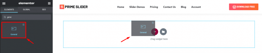
Type General in the widget search field in Elementor page builder and drag the WordPress slider inside your page. It’s super easy and fun.
Content Tab
This is the part where all the basic layout settings of the Elementor slider widget reside. You can use the sections of this tab to manipulate the layout of the slider, making your very own and unique slider for your website.
Layout
Step 1
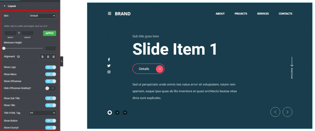
Go to Content> Layout
Once you drag and drop the widget inside the page, you will see its first appearance along with a long list of options on your left-hand side. Basically, there’s a lot of switchers with a couple of fields and drop-down options.
Step 2
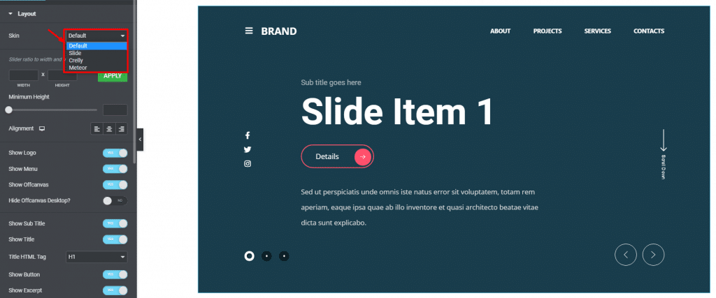
The General Slider comes with 4 skins. In this article, we will show what the default skin can do. Here, all the content is neatly arranged on the display, making the WordPress slider look more professional and outstanding due to the well-organized layout.
All the switchers below are responsible to turn on/off specific items on the slider including logo, menu, off-canvas, title, excerpt, etc.
Header
Step 1
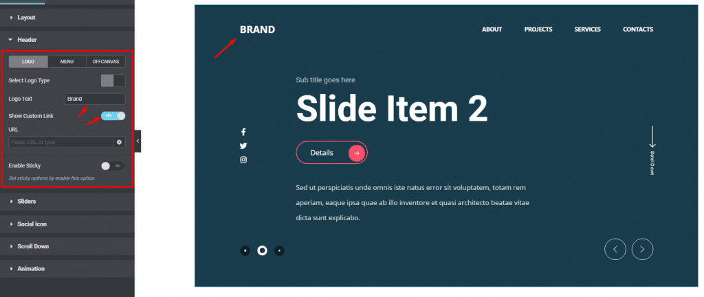
Got to Content> Header> Logo
This section contains customization options for the header part of the slider, including logo, menu, & off-canvas. For the logo, you can select either picture or plain text.
Clicking on the Show Custom Link button, you can add a custom link to the logo instead of redirecting to the current page.
Step 2
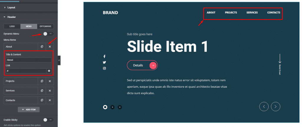
Go to Header> Menu
By clicking on the Menu sub-section, you will see the menu items and a switcher to turn on the dynamic menu. Let’s click on a menu item. There, you will see a text field and a link field. Unless providing a custom link, these menu items on the Prime Slider General Widget won’t work themselves.
With the dynamic menu switcher turned on, you can select your existing menu from WordPress and add animations to it.
Step 3
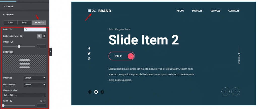
Go to Header> Offcanvas
For the offcanvas menu, you can customize it by adding a custom text beside it, changing the button icon, selecting default sidebars or Elementor templates, or even go for a fully custom menu.
There are more options like offcanvas width, content after/before, and animations to further enhance the offcanvas menu on the General slider.
Sliders
Step 1
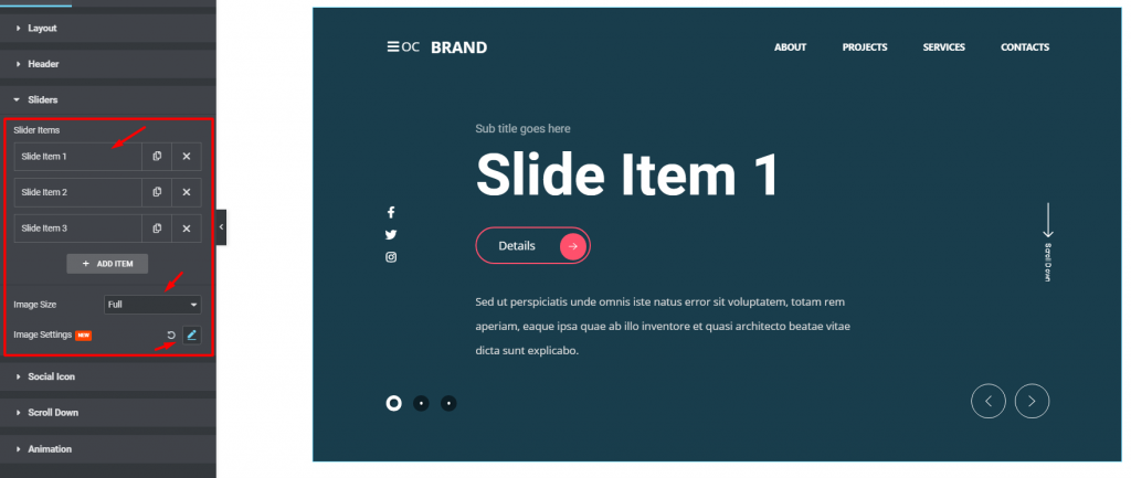
Go to Content> Sliders
This section contains the slider items. You can see them on the top, followed by two options below, Image size and Image Settings. Keeping image size to the maximum will preserve the image resolution for the WordPress slider.
Also, you can change more image properties like position, attachment, repeat, and size from the image settings option.
Step 2
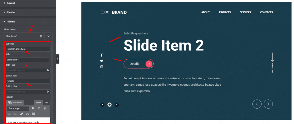
Once you click on any slider item, you will see a bunch of options unfolding for the General slider widget. Here, you can put the custom text for the subtitle, title, button, and excerpt. Also, you can add links to the button and the title.
Step 3
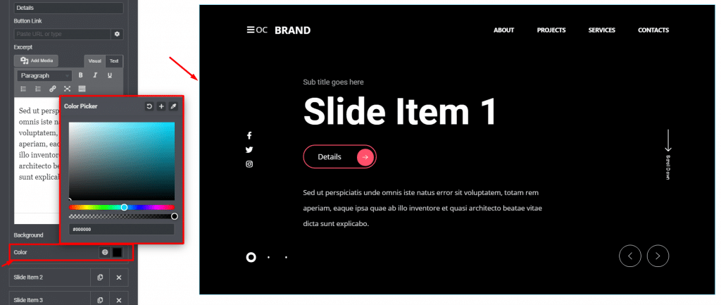
Right below the excerpt field, you can change the slider background color for the selected slider item. Note that the color change will affect the individual slider item while not affecting anything else.
Social Icon
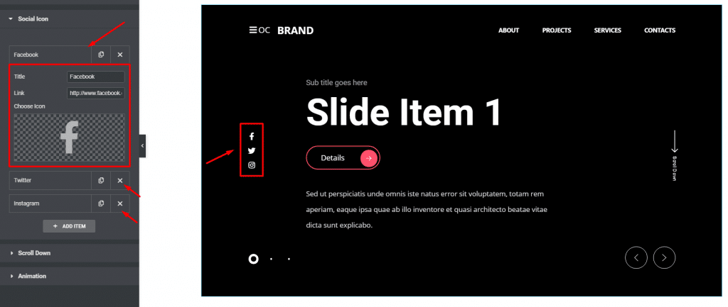
Go to Content> Social Icon
The Prime Slider General widget has social media sharing options displayed on the left side of the slider window. By default, there are 4 social links are visible. You can always increase their number by clicking on the ADD ITEM button below.
Clicking on each social media item, you will see 3 options there, a title field, a link field, and an icon selection field. You can always add custom social channels here on the General slider.
Scroll Down
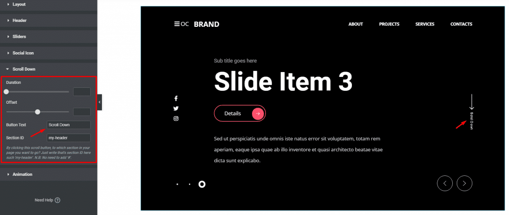
Go to Content> Scroll Down
Basically, the Prime Slider General widget is used in the hero section with a full-width dimension. To let users scroll down easily, there’s actually a button presents on the slider layout. Clicking the button, the user can go below the slider section with a smooth transition animation.
In this section, you need to insert the target section ID in the corresponding field to move the display to the next section away from the slider. You can also put custom text on for the button as well as use it anyhow you want.
Animation
Step 1
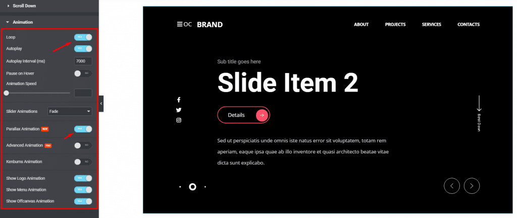
Go to Content> Animation
The last section contains all the base animation settings for the slider. There are a bunch of switchers to turn on animation loop, autoplay, parallax animation, etc. on the General Slider widget. The animation speed and autoplay interval time are also changeable.
Step 2
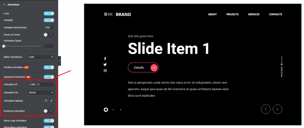
By clicking on the Advanced Animation button, you can activate a jumping animation style for the subtitle, title, and except. You need to define where to activate the animation, be it on the characters, words, or lines. Also, there are more animation effects to customize by clicking the Animation options button.
There’s another animation effect available for the Elementor slider widget that reads as Kenburns animation. This is a type of zooming effect that affects the background image. Better to add slider images and then turn on this switcher to see the effects clearly.
Once you reach this section, let’s move on to the style tab to customize the General slider appearance and make it look better.
Style tab
The style tab has customization options that directly change the appearance of the whole General slider through color, border, typography, etc. Using these sections, you can change the look step by step, making a whole new and unique slider widget for your website.
Header
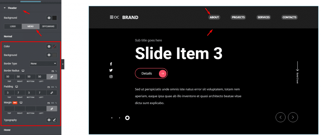
Go to Style> Header
In this section, you can pick any color for the header part from the background option on the top. Use it to make the header visible through the slider background. Right below, the section gets divided into 3 subsections to customize the logo, menu, and offcanvas.
For the menu, the bunch of options available is color, background, border, border-radius, padding, margin, and typography. Using slight padding and some border radius over a lighter background color, you can highlight the General slider menus easily.
Hence, the rest two subsections have similar options to customize the logo and the offcanvas menu. For the logo, you will get slightly different options for the text and the image.
Sliders
Step 1
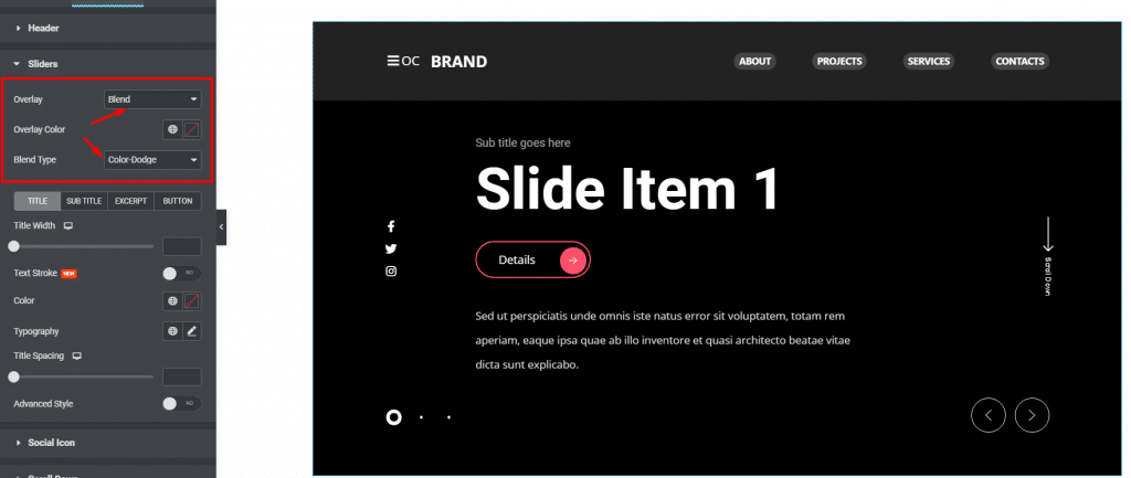
Go to Style> Sliders
The first thing you will see here is the overlay option for the slider background. The overlay option is similar to photoshop where you can manipulate a lot of variables to create a more dynamic overlay color on the General Slider.
Step 2
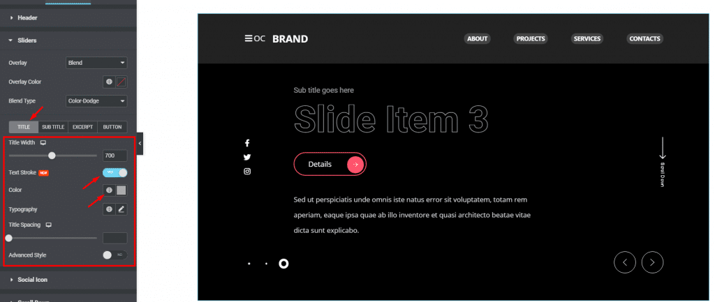
Then comes the customization options for the title, subtitle, excerpt, and button; each in a separate subsection. For example, you can customize the title by changing the color and width. Also, clicking on the Text Stroke switcher will add a stroke style to the title.
Step 3
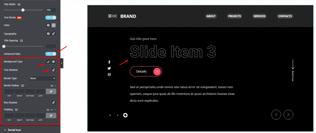
Clicking on the Advanced Style switcher will bring more options to customize the title. You can add a color background for the title, adjust the text stroke amount, use border, border-radius, and padding to the title.
Social Icon
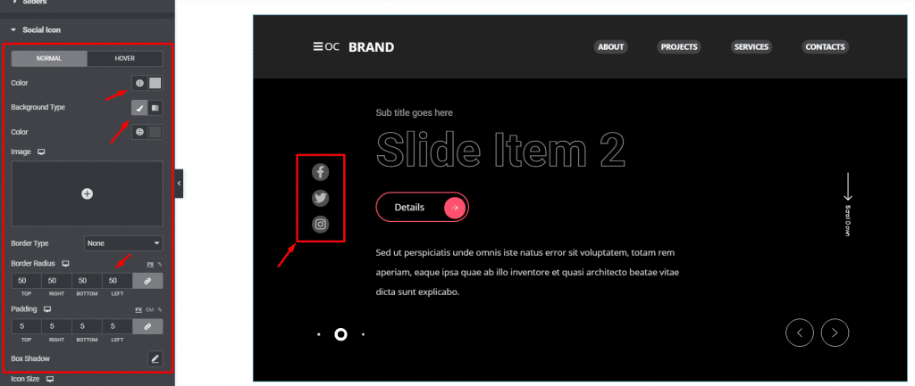
Go to Style> Social Icon
For the social icons, you can customize them by changing their colors, both icon and background. The color options work in hover mode as well.
To make the icons look like the image above, add some padding on them, increase the icon size, and then increase the border-radius to apply a circular background. Like that, your Prime Slider General widget will have rounded social share icons on the display.
Scroll Down
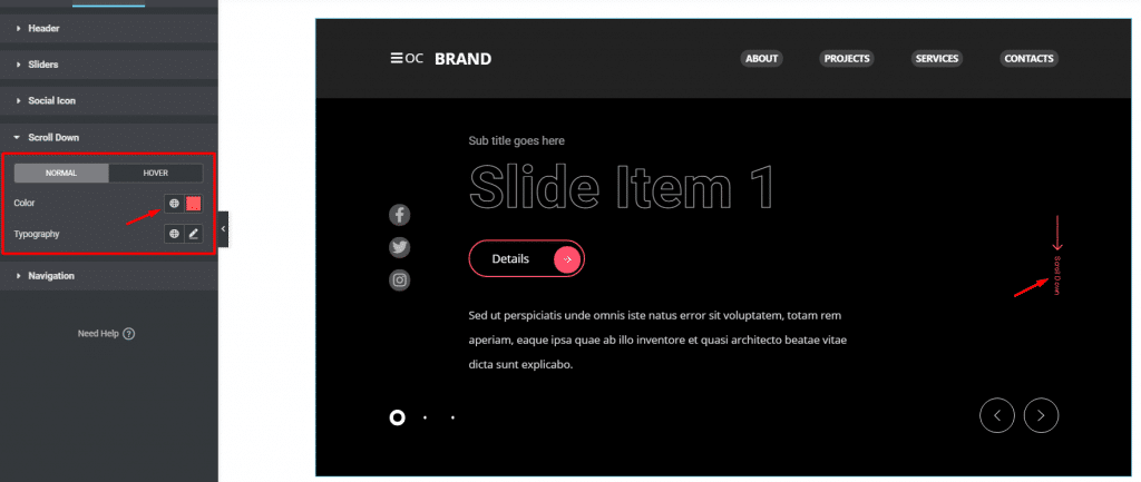
Go to Style> Scroll Down
The scroll down button is located on the right side of the General slider. Here, you get to change the color and typography of the button; the arrow, and the text combined.
Navigation
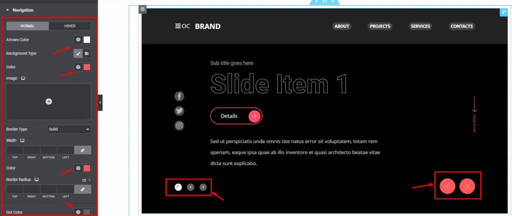
Go to Style> Navigation
There are two types of navigation systems located inside this Elementor slider widget. The arrows and the dots. With this section, you can customize the arrows navigation using color, border, border-radius, etc.
There are two color options available for the dots, one goes for normal mode and the other is for the active mode. Like that, you have seen all the currently available customizing options for the Prime Slider General widget.
Conclusion
Still, stuck? Watch this quick video on the Prime Slider General Widget and learn things visually.
This example highlights the working principle of the Isolate Widget. However, there are options for hiding certain items like- Logo, Menu, Offcanvas, Hide Offcanvas Desktop, Title, Sub Title, Button, Excerpt, Social, Icon, Scroll Button, Arrows, Dots, etc. Last but not least, you can place the select logotype, show custom link set, sticky options by enabling this header option. Also, Kenburns Animation and more options are available.
Also, see the demo page for more working examples, provided by Bdthemes.