The Rubix Slider makes it a fun experience for your blog visitors by adding a box-puzzle-type blog layout on your web page. This is the first-ever widget that is completely responsive and looks unique or modern.
Let’s get started with it.
Inserting The Rubix Slider widget
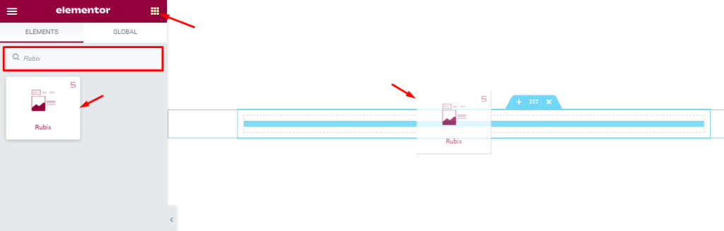
You can add the Rubix Slider addon to WordPress by opening the page you want to use it on in Elementor and then dragging and dropping the Rubix slider into that page. Please note that you need both Elementor and Prime Slider installed before you can use this widget.
Work With The Content Tab
Layout Section Customizations
Go to Content > Layout.
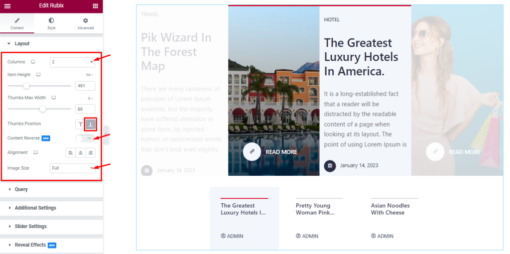
First of all, you can set the number of Columns for the Rubix slider to display the items. You can choose between 1 to 3 columns and when multiple columns are selected, it will show a part of the previous and next slides with lowered opacity.
You can set the Item Height to adjust the net height of all slides and also can set the Thumbs Max Width below or above the features slides. You can set the Thumbs Position right below the max width option.
The Alignment option works on the text content so you can easily select the best text position on the Rubix Slider. You can also change the image dimensions for all images with the Image Size option. The Content Reverse switcher lets you switch the slider image and text positions on the display.
Query Section Customizations
Go to Content > Query.
This section works for setting the source location of data that you need to display by references like Author, Categories, Tags, and Formats. The references can be different in accordance with the source location.
Step-1
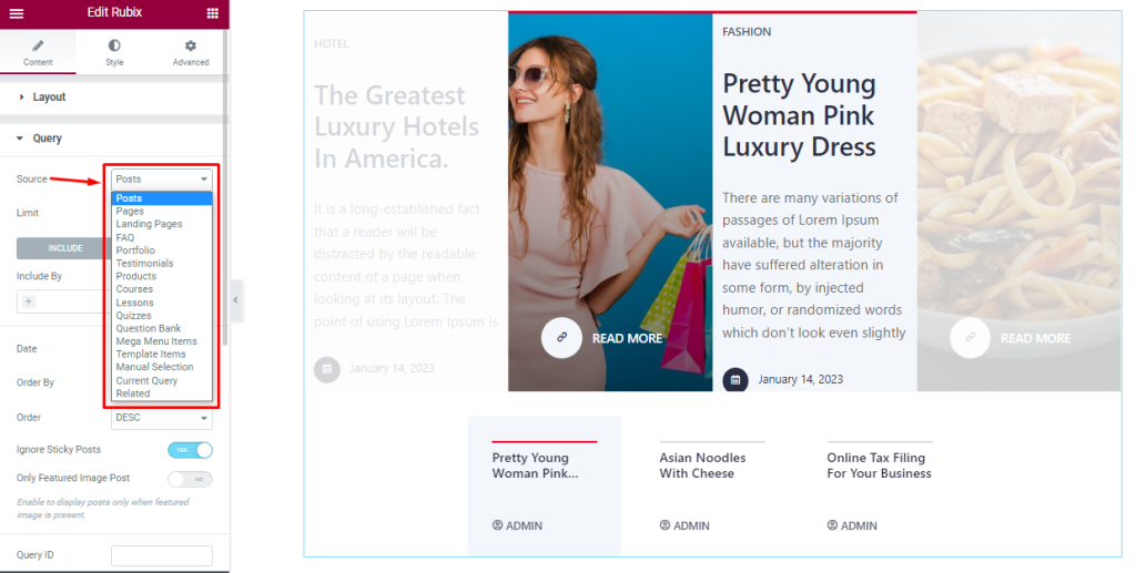
First, you can select the Source for the Rubix slider to show from the range of source items. Note that the source items shown in the screenshot are not everything and will depend on your WordPress environment.
Step-2
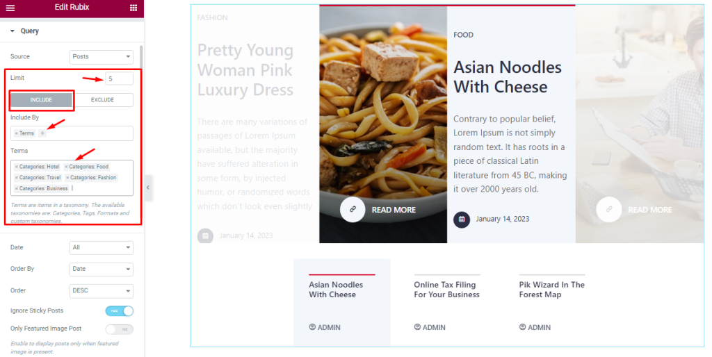
Then comes the Limit option that lets you set the number of posts in the query.
The Include / Exclude filters let you show or hide posts based on Terms (tags, categories, post names, etc.) & Authors.
While the Include field shows only the selected items and hides every other.
Step-3
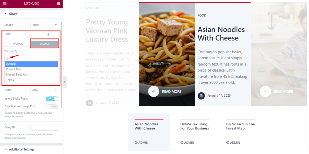
The Exclude option does the opposite as it hides the selected ones and shows the rest.
Step-4
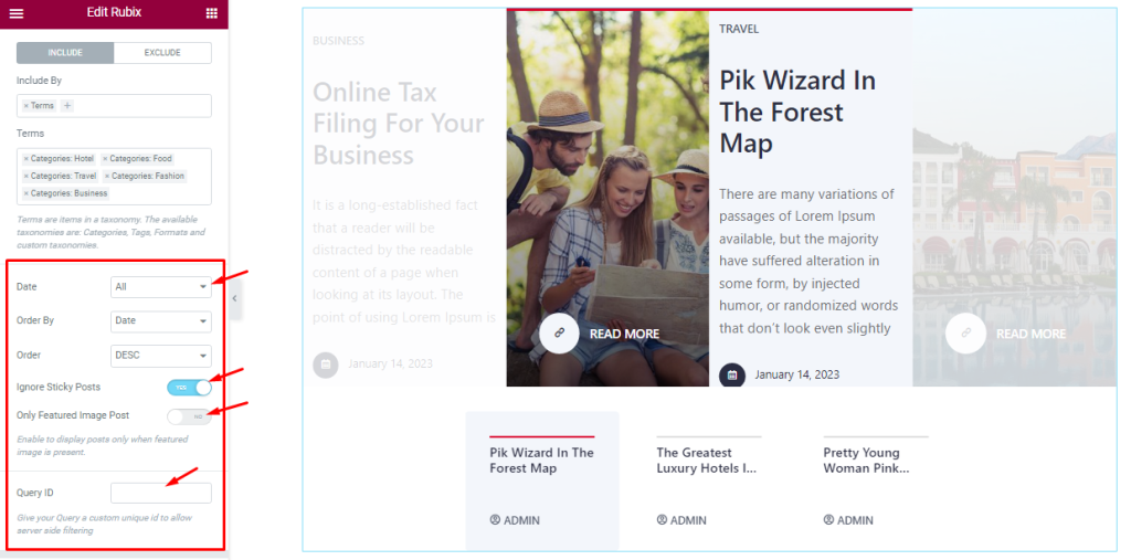
Date, Order By, and Order controls are here to arrange the data you want to display through Random, Title, Date, or Menu order wise and also with ascending or descending order.
The two switchers (Ignore Sticky Posts, Only Featured Image Posts) let you avoid sticky posts and posts without feature images from the display. Here, you can also set the Query ID that gives your Query a custom unique id to allow server-side filtering for the Rubix Slider.
Work With Additional Section
Go to Content > Additional
Step-1
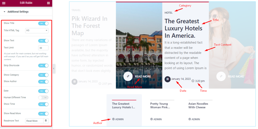
In the Additional section, you will find a bunch of switchers like Show Title, Show Text, Show Category, Show Author, Date, and Show Read More. Turning the switchers ON will make them appear on the Rubix slider widget and hides them when turned off.
Step-2
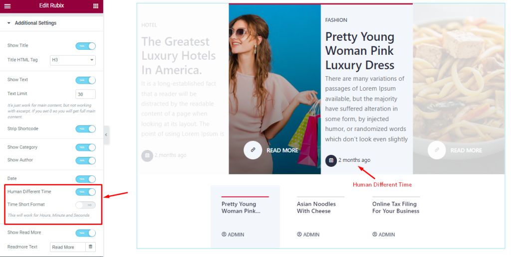
Turning on the Human Different Time switcher will show a real-time difference from the post-publishing date to the viewer’s observation date.
Customizations of Slider Settings
Go to Content > Slider Settings.
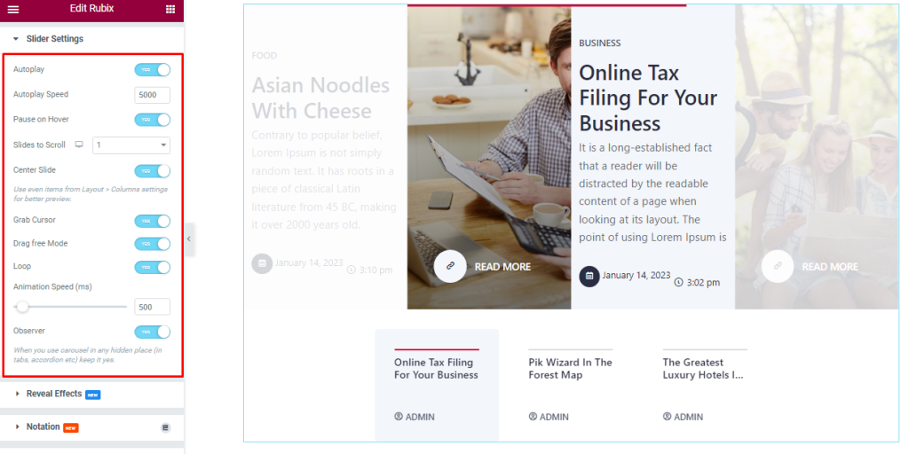
In this section, you will be able to see another bunch of Switchers and fields such as Auto Play, Auto Play speed, Pause On Hover, Slides to Scroll, Center Slide, Grab Cursor, Drag free Mode, Loop, Animation Speed, and Observer.
What they do-
Autoplay switcher: If you Enable the Autoplay switcher button, your slider will slide into Autoplay mode, and you can set the Autoplay Speed as your wish.
Pause on Hover: If you activate the pause on Hover button, when visitors Hover the mouse cursor on the slider, then your slider will Hold, otherwise your slider slide Autoplay.
Slides to scroll: It represents how many slides will slide at once.
Center Slide: If you enable the Switcher option, then your Active slider will show the center (depending on your widget style).
Grab The Cursor: Your mouse pointer icon will be changed into a grab cursor. Visitors can slide your slider manually with your mouse cursor.
Drag Free Mode: In this mode, you can easily make it visible by Dragging your slider into the slide Area.
Loop: When you activate the Loop switcher button, your slider will loop at a certain time interval. You also set up the loop animation speed here.
Observer: If you enable the option then you are able to use the slider/carousel in any hidden places (such as in tabs, Accordion, etc).
Let’s Work With The Style Tab
Items Sections Customization
Go to Style > Items
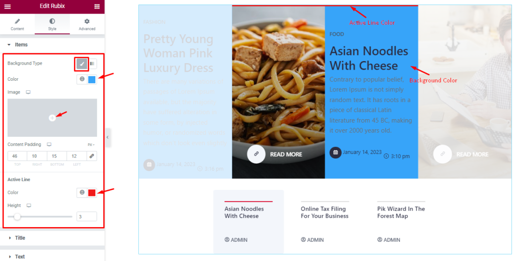
Here, you can select between a Classic and Gradient color format from the Background Type option and proceed to change the background color of the Rubix slider content part. In classic background type, you can use an Image as the background too.
Add values in the Content Padding fields to control the area of expansion of the content. The last two options here let you change the Active Line Color and Height which show at the top of the slider featured item.
Style The Title Section
Go to Style > Title
Step-1
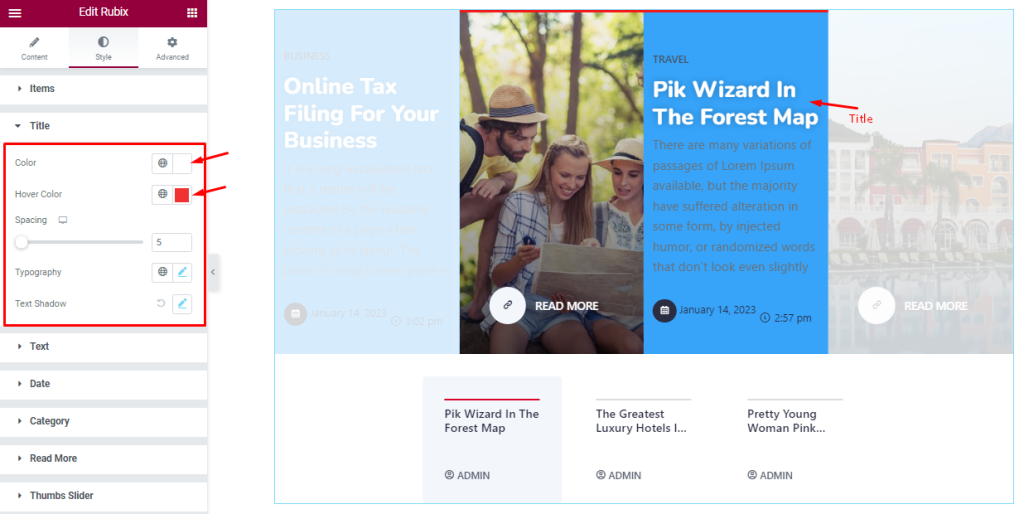
This section offers Title color, Title Hover color, Typography, Spacing, and Text Shadow customizations. You can start with the Title Color and Hover Color first and then adjust the Spacing between the title and everything below it.
Step-2
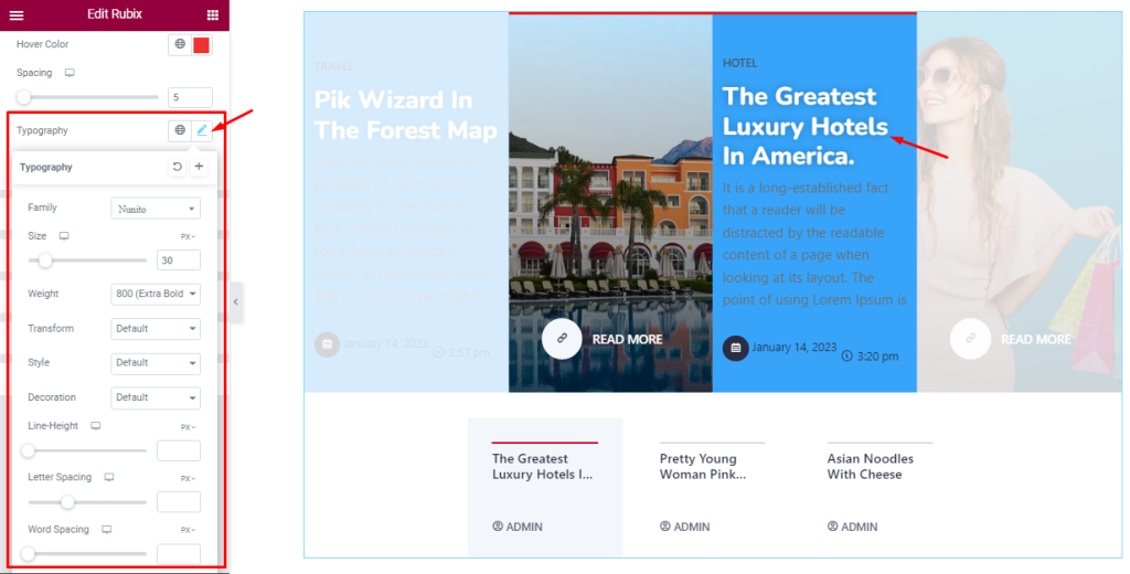
The Typography option expands into Font Family, Size, Weight, Transform, Style, decoration, Line Height, Letter Spacing, and Word Spacing. Everything here helps you stylize the title font.
Step-3
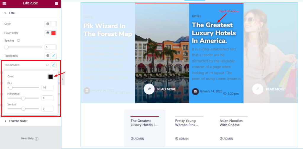
The Text Shadow (Color, Blur, Horizontal, Vertical) options let you add 3D-like text effects behind the actual title text.
Customization The Text Section
Go to Style > Text
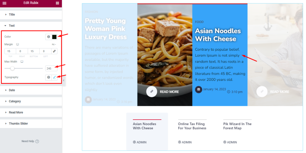
This section lets you edit the Text Color and adjust the Margin for the Rubix slider item texts. Comes with a text Max Width option to spread the text on the slide in a fixed range and Typography customizations.
Customizations Of Date Section
Go to Style > Date
Step-1
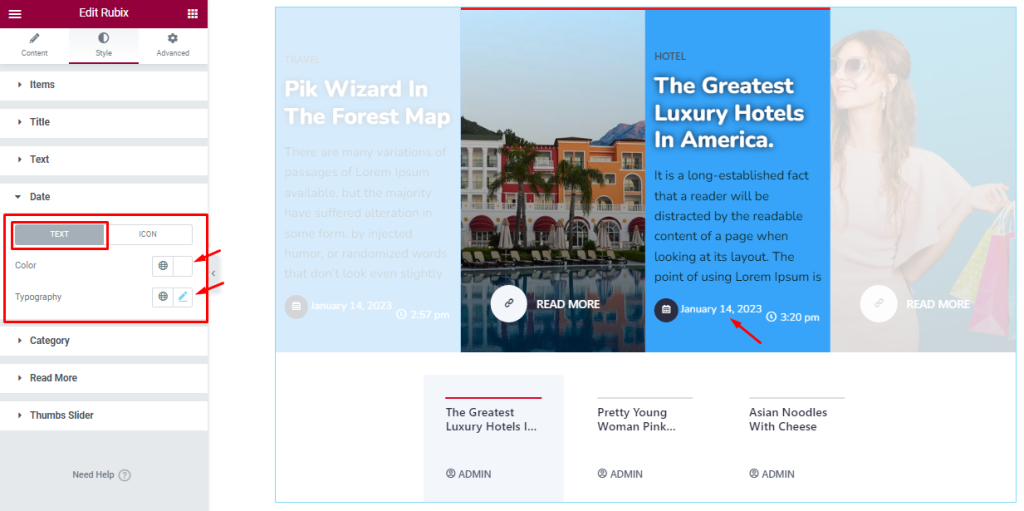
In the Date section, you can change between Text and Icon subsections and customize each one separately. In Text mode, you can change Text Color and Typography from the options.
Step-2
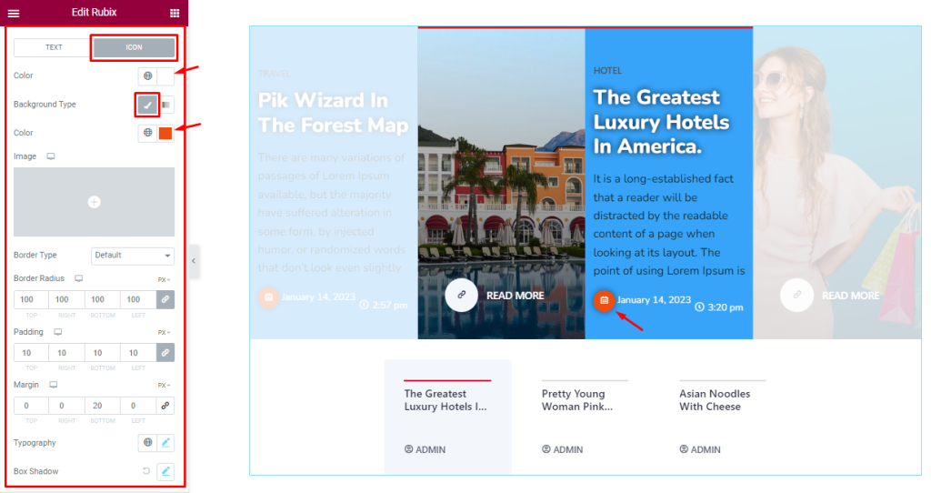
In Icon mode, you can change the Icon Color, Background Color, Border Type, Border Radius, Padding, Margin, Box Shadow, and Typography.
Category Section Customizations
Go to Style > Category
Step-1
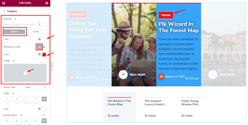
Here, the first scrollbar option lets you adjust the Spacing between the category and the rest of the content. Below, you will see two subsections (Normal and Hover).
In Normal mode, you can set the Category text color, Background color/image.
Step-2
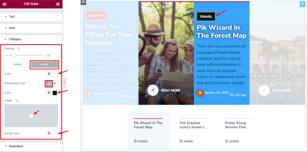
In Hover mode, you will get a similar set of controls with the additional Border Color option to set up the hover effect.
Step-3
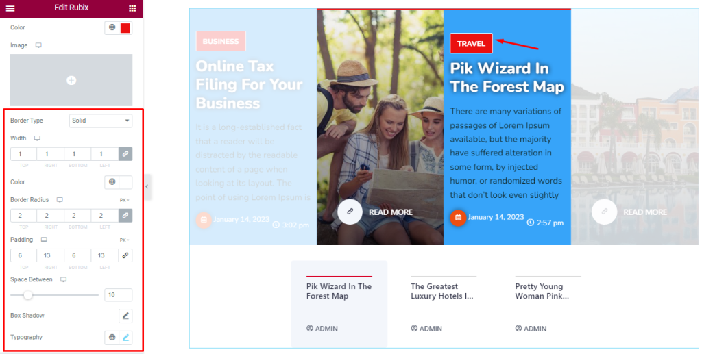
After that, you can set the Border Type, Width, Border Color, Padding, Border Radius, Space Between, Box Shadow, and Typography for the category.
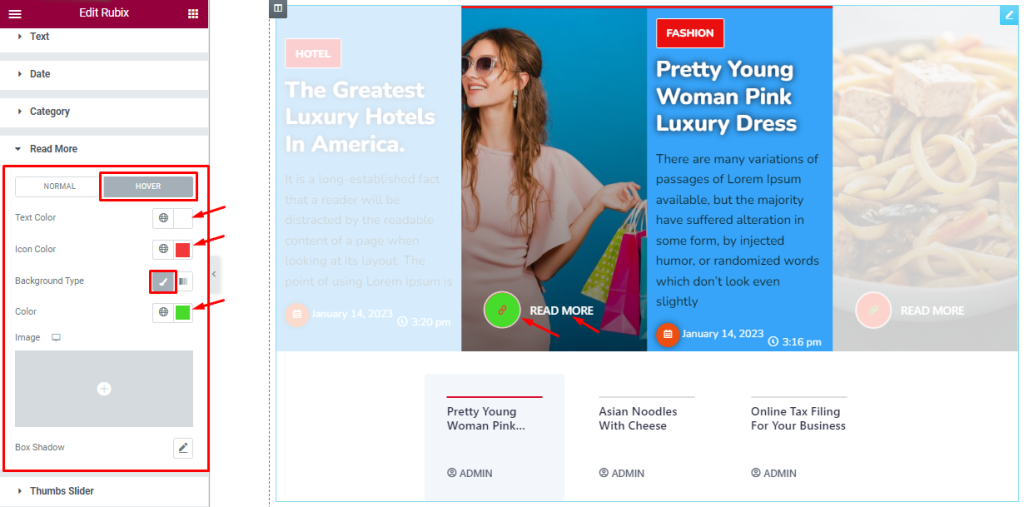
Customize Of The Read More Button
Go to Style > Read More
Step-1
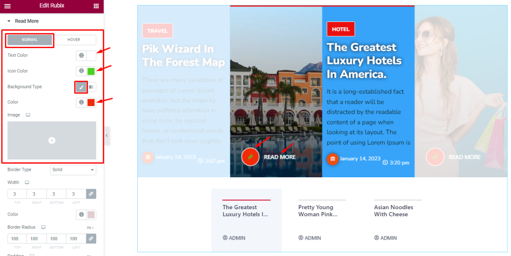
Here in Normal mode, you will get a similar set of controls to modify the appearance of the Read More Button just like how you did it with the category.
Step-2
The same goes for the Hover mode too as it offers Text color, Icon color, Background, and Box Shadow options.
Step-3
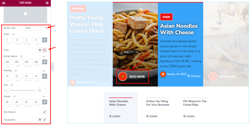
The rest of the options are Border Type, Width, Color, Border Radius, Padding, as well as icon Size, Margin, Box Shadow, and Typography.
Style With The Thumbs Slider Section
Go to Style > Thumbs Slider
Step-1
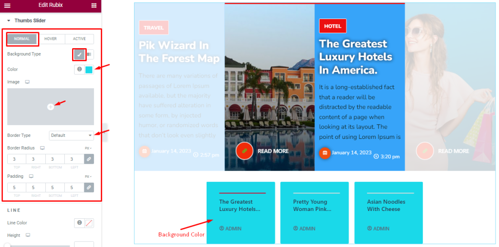
In the Thumbs Slider section, you can change between three modes; Normal, Hover, and Active, and customize the given options to modify the visuals.
In Normal mode, you can change the Rubix Slider thumbs Background Type, Background Color, Border Type, Border Radius, and Padding.
Step-2
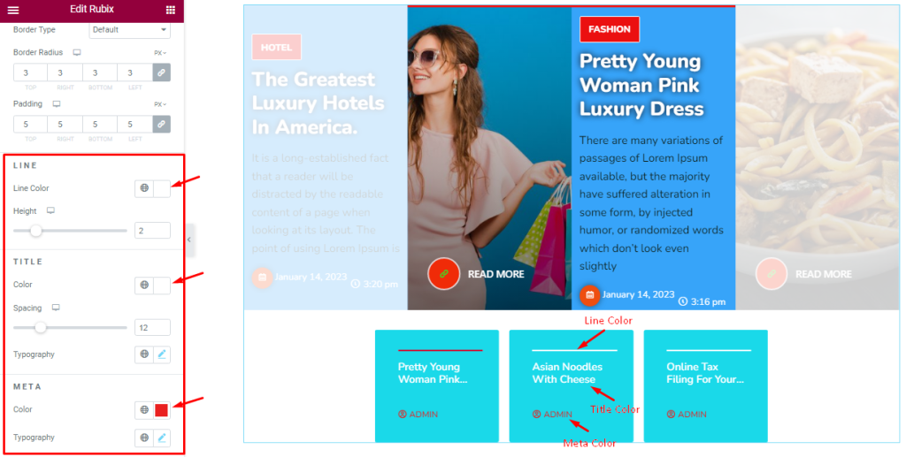
Below, you can customize the Line Color, Height, Title Color, Spacing, and Meta Color, and Typography. These options are divided into segments too.
Step-3
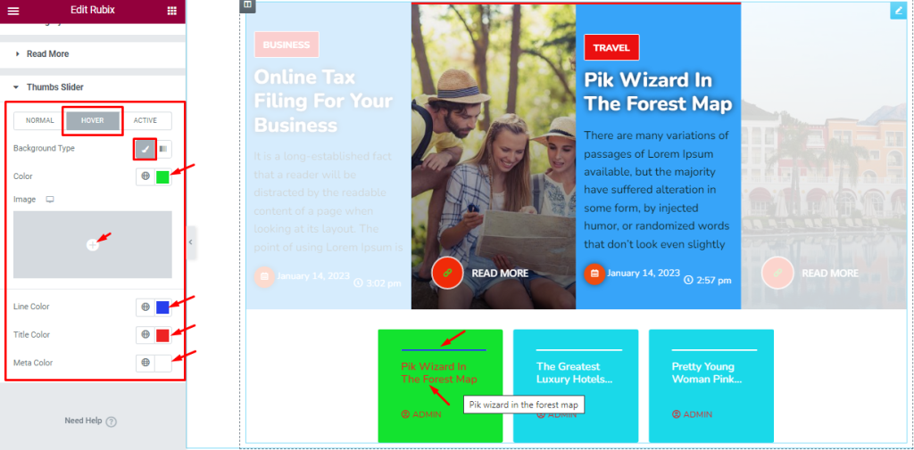
In Hover mode, you can customize the Background Color, Line Color, Title Color, and Meta Color.
Step-4
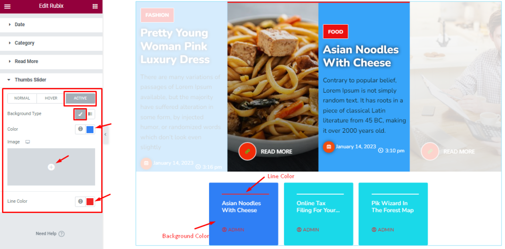
For Active Mode, the options are the Background Type and Line Color.
All done! You have successfully customized the Rubix Slider widget on your website.
Video Assist
You can watch this quick video to learn more about the Rubix Slider widget.
Thanks for staying with us.