The Fluent Slider widget and its excellent UX features like an interactive thump post gallery, animated scroll-next button, animated navigation, and side-mounted social share icons. This slider allows you to design interactive landing pages with ease.
Let’s explore the controls.
Inserting The Fluent Slider widget
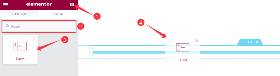
You can add this Fluent Slider addon to WordPress by opening the page you want to use it on in Elementor and then dragging and dropping the Fluent Slider widget into that page. Please note that you need both Elementor and Prime Slider installed before you can use this widget.
Work With The Content Tab
Layout Section Customizations
Go to Content > Layout
Step-1
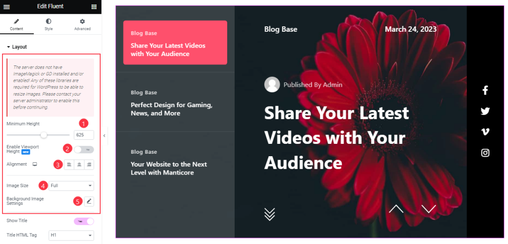
Here, you can set the Minimum Height to adjust the net height of all slides and turn On/Off Viewport Height. The viewport height of the slider is the height of the element containing the slider. The viewport height will depend on the slider that you’re using. If you have the default slider, the viewport height is calculated by adding the slider height and the slider bottom padding.
Then you can set Alignment for the best text position for your Fluent slider text content. Also, customize the Slider Image Size and Background Image settings as your working demand.
Step-2
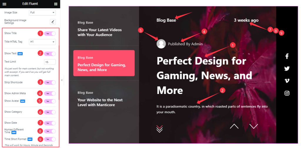
Below in this section, you will get the Show Title, Show Text, Strip Shortcode, Show Category, Show Admin Meta, Show Avatar, Show Date, Human Different Time, and Time Short Format switchers which you can turn on/off to show/hide these elements from the slider. If you enable the ‘strip shortcode‘ option, then shortcode content will be removed from your slider content.
Step-3
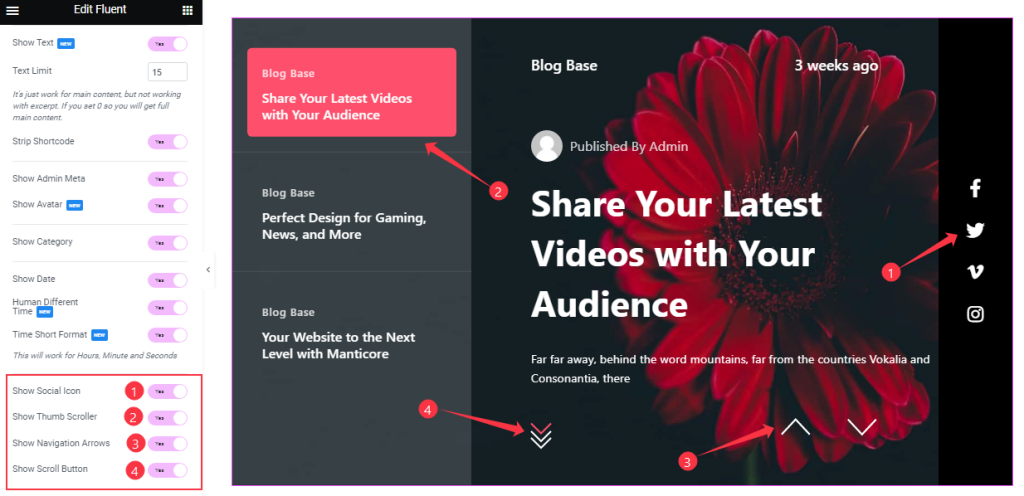
Here you also turn on/off the Show Social Icon, Show Thumbs Scroller, Show Navigation Arrows, and Show Scroll Button switchers buttons to show/ hide these elements from the slider.
Customization of the Scroll Down Section
Go to Content > Scroll Down
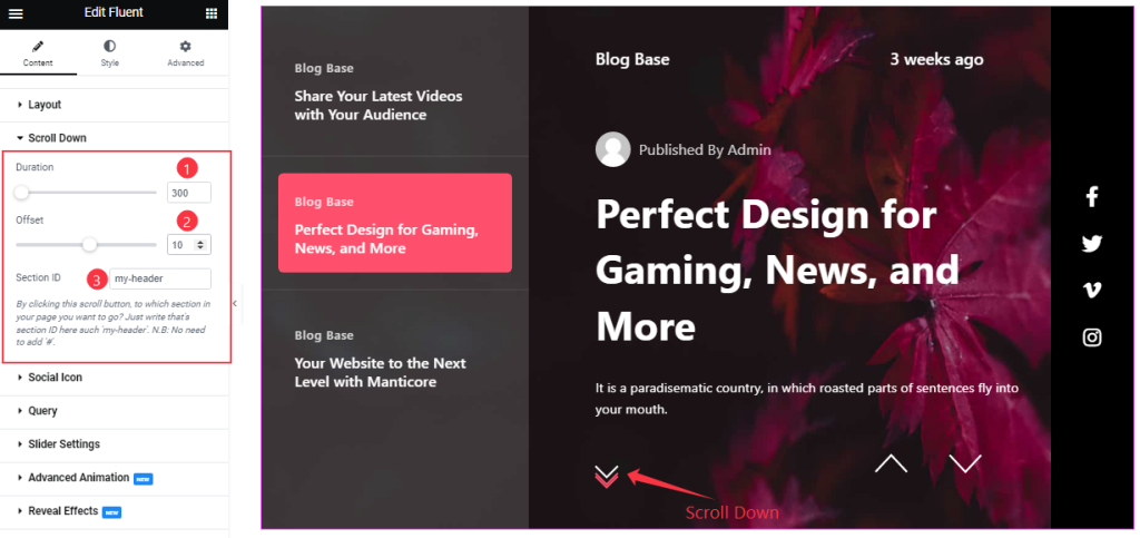
Come to the Scroll Down Section, you can set the value of Duration, and Offset, and change the Button Text like the screenshot. Here you can add a section ID. By clicking this scroll button, you can make your visitors go to any target section below the slider.
Customizations Of The Social Icon Section
Step-1
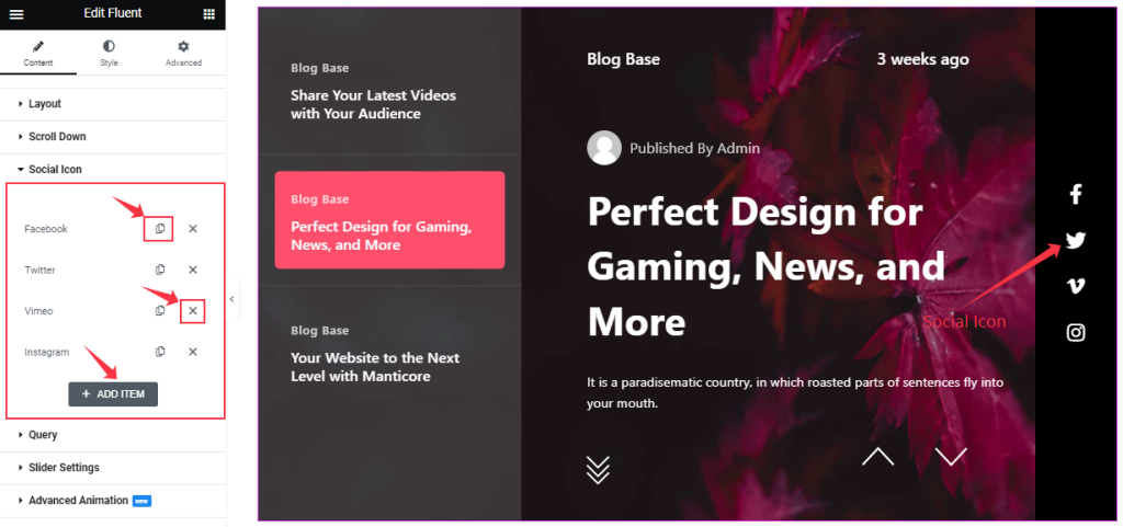
Go to Content > Social Icon
In this section, you can easily add a social icon item by clicking Add Item button. Otherwise, you can easily increase your Item by clicking the Duplicate Sign symbol, and you can also decrease/remove your item by clicking the Cross sign as shown in the screenshot above.
Step-2
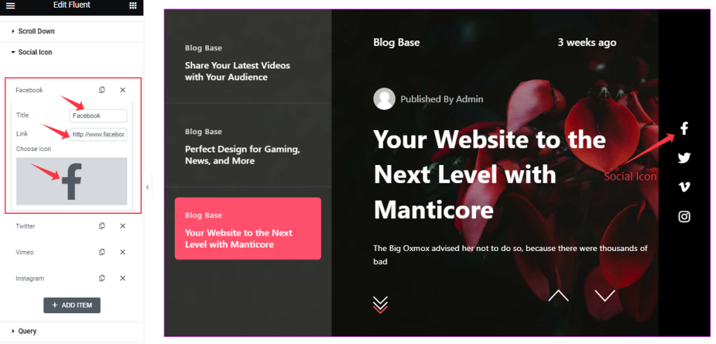
Clicking on the social item box, you are able to change The Title name, and you can set a Link under The Icon. Also, you can change the Social Icon as you wish.
In the same process, you can customize the other items like the first one. There’s no limit on the number or type.
Query Section Customizations
Go to Content > Query.
This section sets the source location of data that you need to display by references like Posts, Pages, Authors, Categories, Tags, and Formats. The references can be different in accordance with the source location.
Step-1
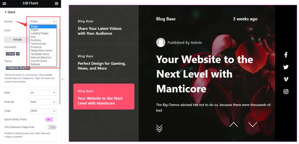
Here you can easily select the Source for your slider display. The source can be Posts, Pages, Landing pages, Portfolios, etc.
Step-2
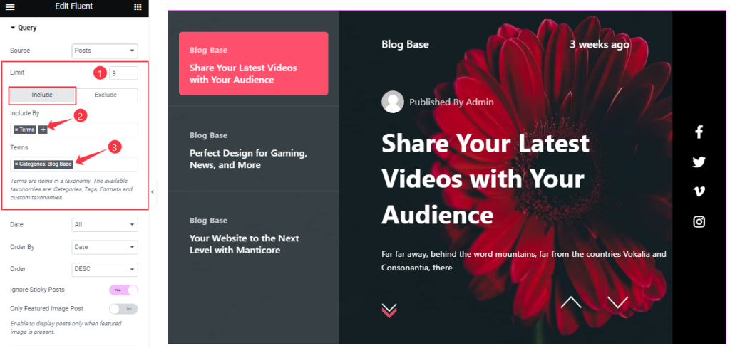
Then you can set a Post Limit to determine the number of items to display in the query. The Include / Exclude fields are filters that let you show/hide posts based on author, category, tags, or post names.
We have specified a category in the include field here and you should see posts only belonging to that category.
Step-3
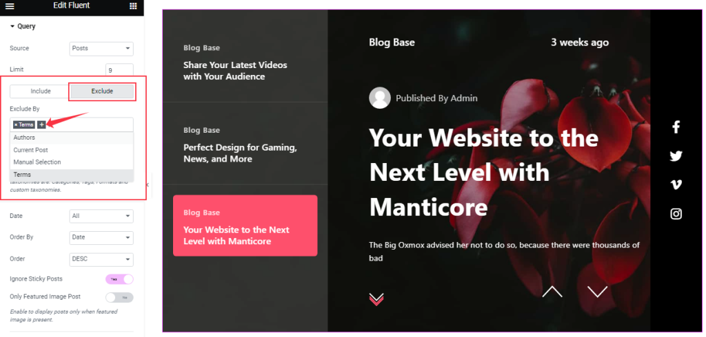
The Exclude filter works in the exact opposite way but within the same parameters.
Step-4
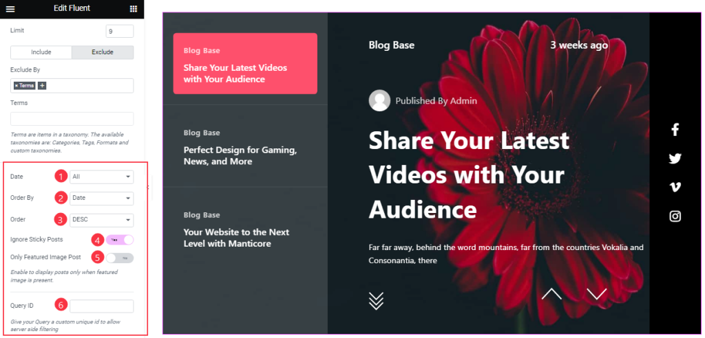
The Date, Order By, and Order controls are here to arrange the data you want to display through Random, Title, Date, or Menu order-wise and also in ascending or descending order.
Here, you can also see two switchers (Ignore Sticky Posts, Only Featured Image Posts), and turning them on will make the Sticky posts be Ignored, and only posts with featured images will appear on your slide.
Also, set a custom query yourself by the Query ID field.
Slider Settings Section Customization
Go to Content > Slider Settings
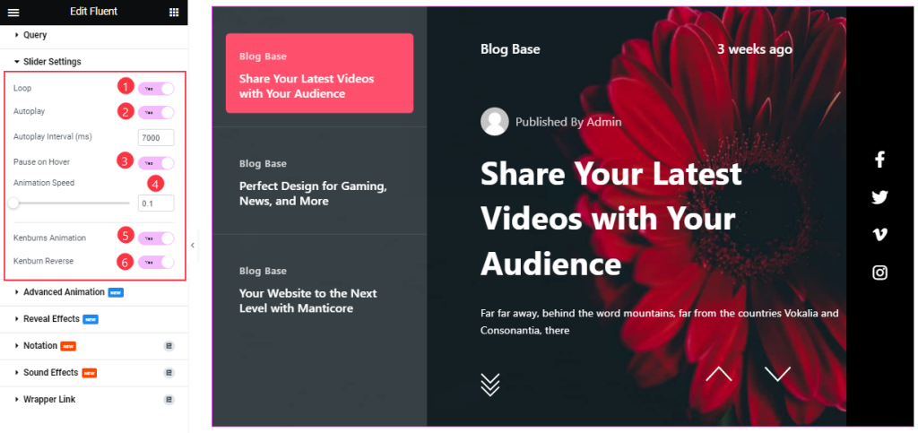
Here, you will see some Switchers that are Auto Play, Pause on Hover, Loop, Kenburns Animation, and Kenburns Animation Reverse. You can easily enable or disable those switcher buttons to apply specific effects. Also, you can customize the Autoplay Interval and Animation Speed for the slider.
Autoplay switcher: Enable the switcher to make the slider slide Automatically with a customizable Autoplay Speed control.
Pause on Hover: If turned on, when you Hover your mouse cursor on the slider, then your slider will Hold, otherwise, your slider will Autoplay.
Loop: you can easily enable or disable the switcher button. When you activate the Loop switcher button, then your slider will loop at a certain time interval. You can also set up the loop animation speed here.
Kenburns Animation: Kenburns Animation is the most attractive Animation effect for the widget. If you enable the switcher button, then your post Image will appear like a zoom-in/zoom-out animation that makes your post image Awesome.
Advanced Animation Section Customizations
Go to Content > Advanced Animation
Step-1
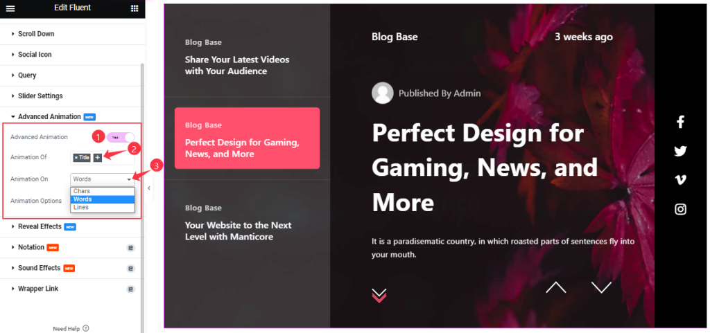
In this section, you can enable the Advanced Animation Effect to add an additional Animation to the Title and Sub Title. Select the Animation for Words, Chars, and Lines.
Step-2
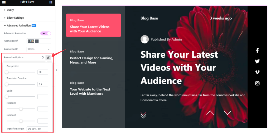
Then customize the Animation Options as your working demand.
Work With The Style Tab
Style The Sliders Section
Go to Style> Sliders
Step-1
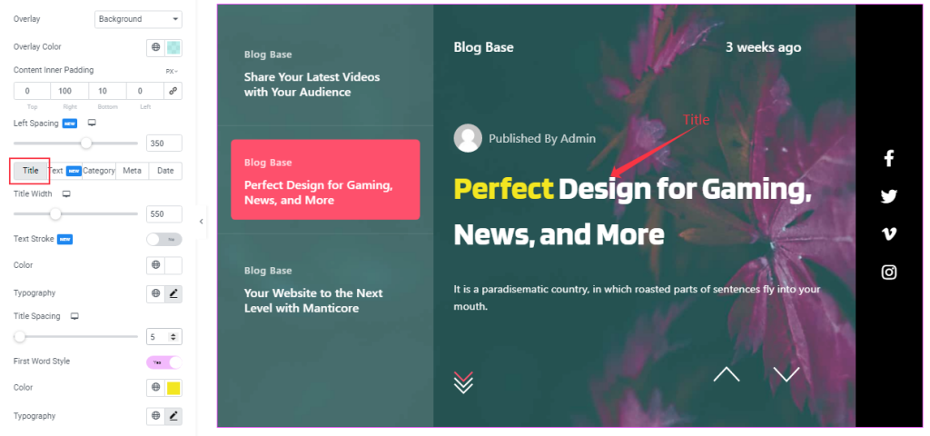
In the first section here, you can change the Overlay Type and Overlay Color over the slider background. Then you can adjust the Content Inner padding and Spacing on the Left side.
Then the options are divided into 5 subsections.
For the Title, you can change the Title Width, Text Stroke, Title Color, Typography, Title Spacing, and First-word Color. You can also separately configure Typography for the first word of the title.
Step-2
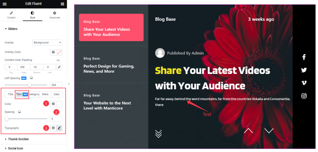
For the Text, you can change the Text Color, Typography, and Spacing over your slider.
Step-3
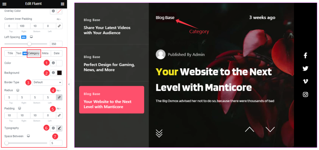
Then for the Category, you can easily change the Category Color, and Background Color, and Set the Border Type, and Typography as your wish. You can also adjust the Border Radius, Padding, and Space Between your working demand.
Step-4
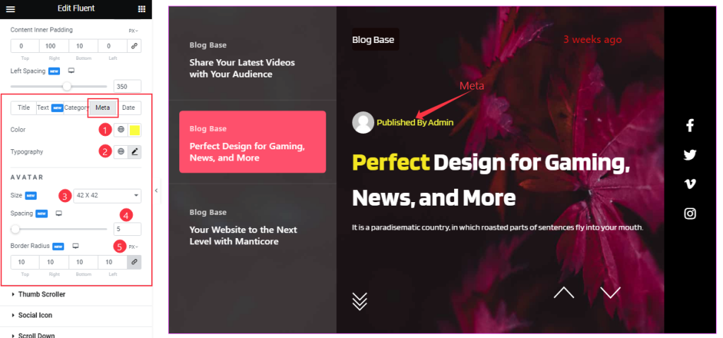
For the Meta, you will get Color and Typography settings for the text as well as Size, Spacing, and Border Radius options for the Avatar.
Step-5
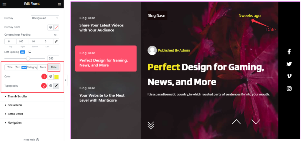
In this sub-section, you can customize Date Color and Typography.
Style The Thumb Scroller Section
Go to Style > Thumb Scroller
Step-1
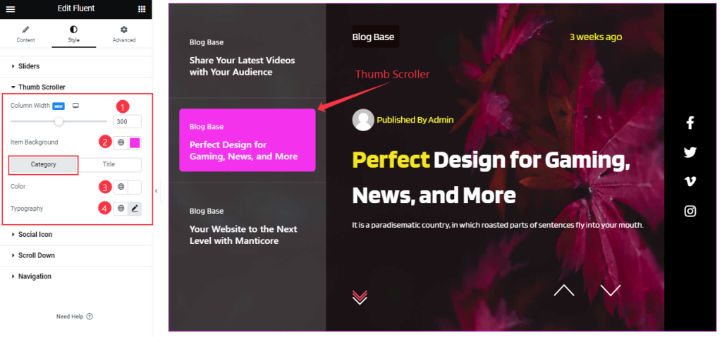
Come to the Thumb Scroller section, you will get the Customizing option of Column Width and Item Background Color.
Also, you will get two sub-sections here.
In the Category subsection, you can set the Category Color and Typography like the screenshot.
Step-2
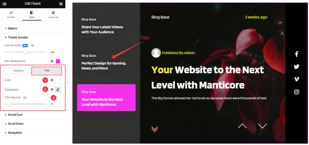
In the Title subsection, you can set the Title Color, and Typography and adjust the Title Spacing like the screenshot.
Social Icon Section Customizations
Go to Style > Social Icon
Step-1
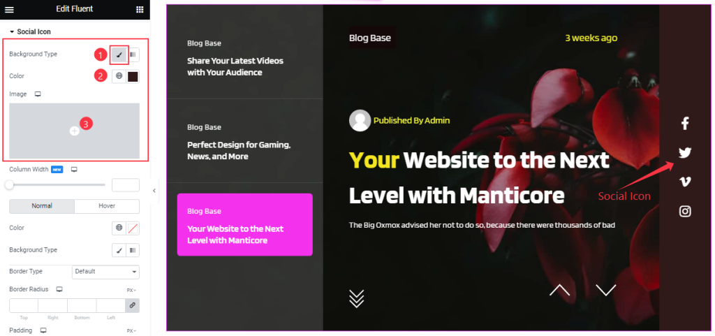
Come to the Social Icon Section, you can change the Icon Background Type, and Background Color and also set an Image as the Icon Background.
Step-2
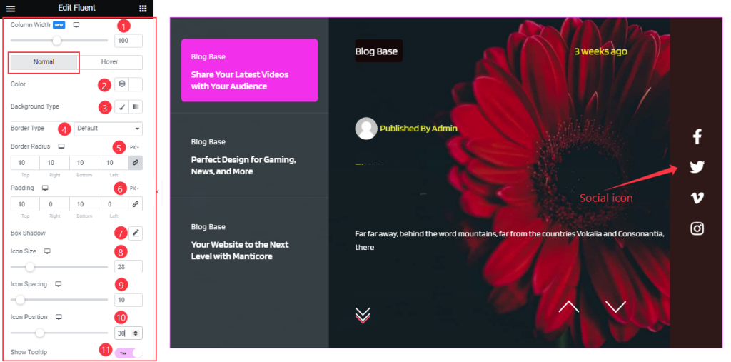
Right below, you can change the Column Width for the social icons. Then the options get divided into Normal and Hover subsections.
For Normal mode, you may customize the Icon Color, Border Type, Border Radius, and Padding as your wish and add the Box Shadow effect to your Social Icon section. You can easily turn on/off the Show Tooltip switcher button to show the Icon Tooltip and Adjust the Icon Size, Icon Spacing, and Icon Position as your working demand.
Step-3
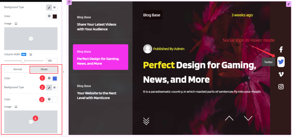
In Hover mode, you will get similar customization options as normal mode and easily customize those options.
Customization of the Scroll Down Section
Go to Style > Scroll Down
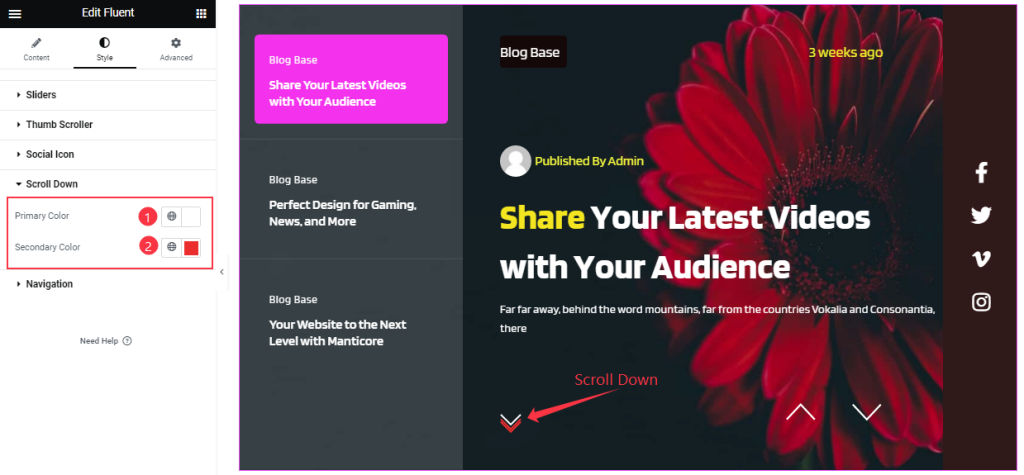
In the Scroll Down section, you can change the Primary Color and Secondary Color for a cool button effect.
Work with the Navigation Section
Go to Style > Navigation
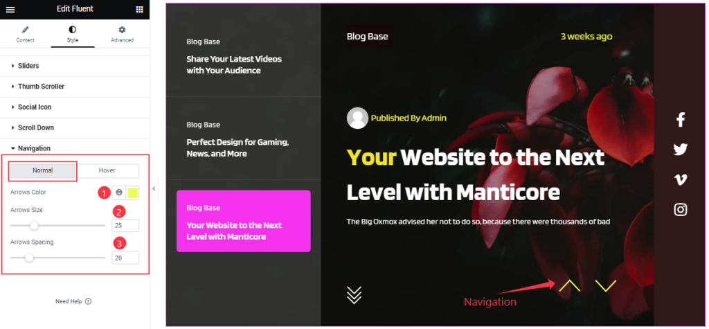
In Normal Mode, you can change the Arrow’s Color, Arrows Size, and Arrows Spacing as your working demand.
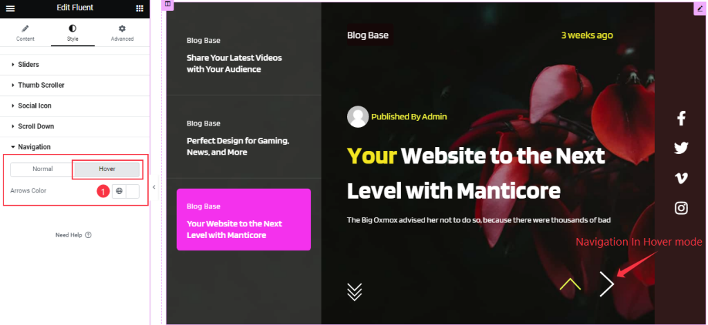
In Hover Mode, You can change the Arrows Color.
All done! You have successfully customized the Fluent Slider widget on your website.
Video Assist
You can watch this quick video to learn more about the Fluent Slider widget.
Thanks for staying with us.