The Coddle Slider widget is one of the most popular and pro widgets on the Prime Slider. It has more attractive features and I hope, Your visitors will fall in love with the Coddle slider as it presents a full-width interface while having eye-pleasing background synchronization, text-to-image alignment, animated text and slides, and an innovative navigation bar. it will make your website more attractive and awesome.
In this documentation, I’ll include some instructions and pictures to help you get started with it.
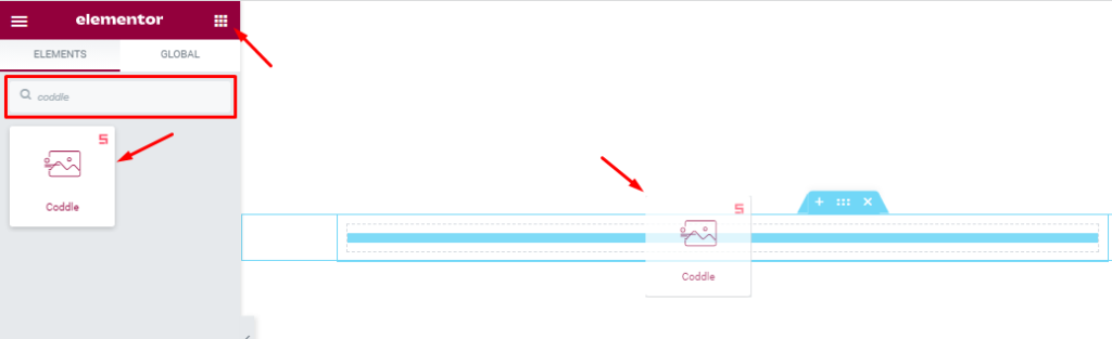
Inserting the Coddle Slider widget
You can add the slider to WordPress by opening the page you want to use it on in Elementor and then dragging and dropping the Coddle widget into that page. Please note that you need both Elementor and Prime Slider installed before you can use this widget.
Introduction of Content Tab
The content tab is the foundation for your widget, much like a frame of a house. Using the content tab, you’ll be able to make a layout of a particular part (Coddle slider) of a website. And in this regard, some handy sections in the tab will assist you a lot.
Layout Section Customizations
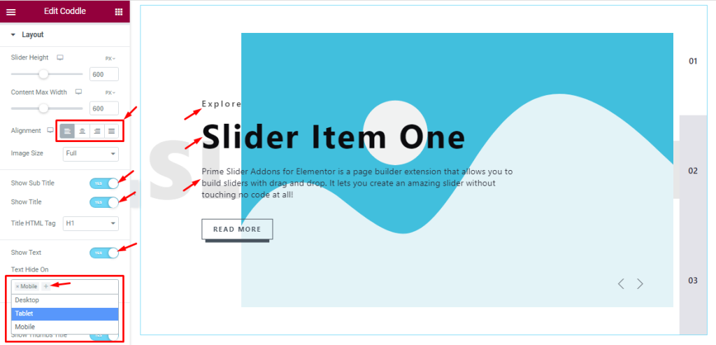
Step-1
Go to the Content tab > Layout
Here you can set the Slider Height, Content Max Width, Alignment, and Image Size. You can also see some switcher buttons like Show Sub Title, Show Title, and Show Text, and you can easily Enable or Disable those Switcher buttons to show/hide these elements from the slider.
You can hide text on Desktop, Tablet, or mobile devices from here by clicking the plus sign and selecting one if you want to hide the text from the devices. Please see the below screenshot that I have marked for you.
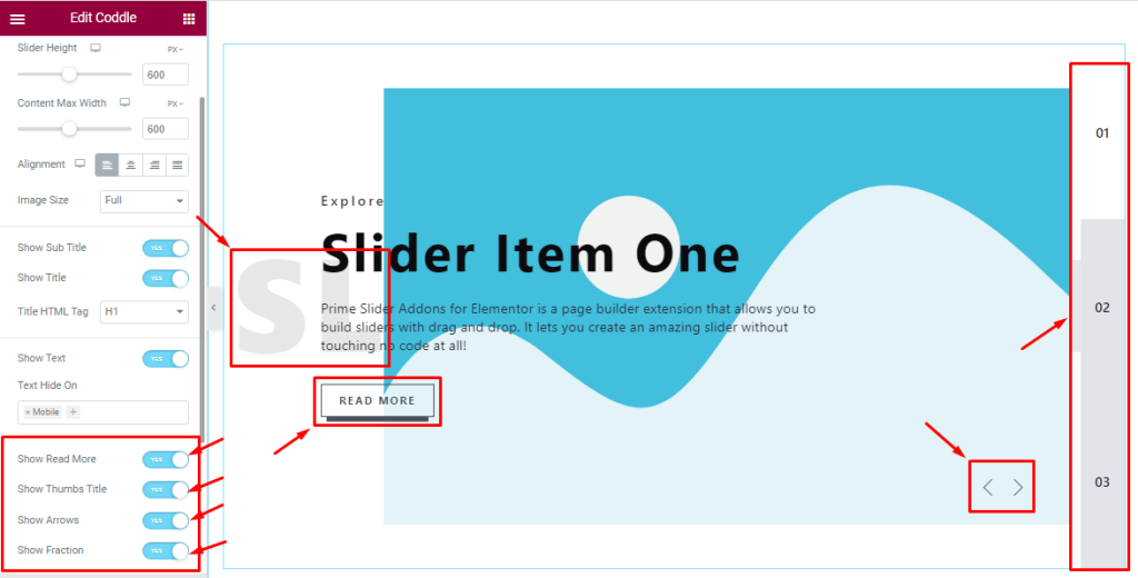
Step-2
Here, you will also see some switcher buttons like Show Read More, Show Thumbs Title, Show Arrows, and Show Fraction. You can easily Enable or Disable those Switcher buttons from here as your need.
Sliders Section Customizations
Step-1
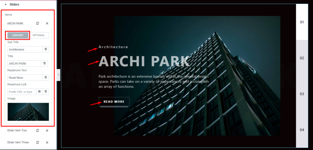
Go to the Content tab >Sliders
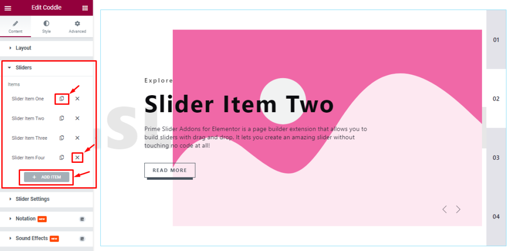
In this section, you can easily add an Item by clicking Add Item button. Otherwise, you can easily increase your Item by clicking the Duplicate Sign and you can also decrease your item by clicking the cross sign as shown in the screenshot above.
Step-2
After clicking Slider Item-One then you will see two tabs (Content, and Optional). In content mode, you can change The Sub Title name, Title name, and Read More Text and you can set a link under your Read More button. Also, you can set your slider image as your wish as shown in the screenshot.
Step-3
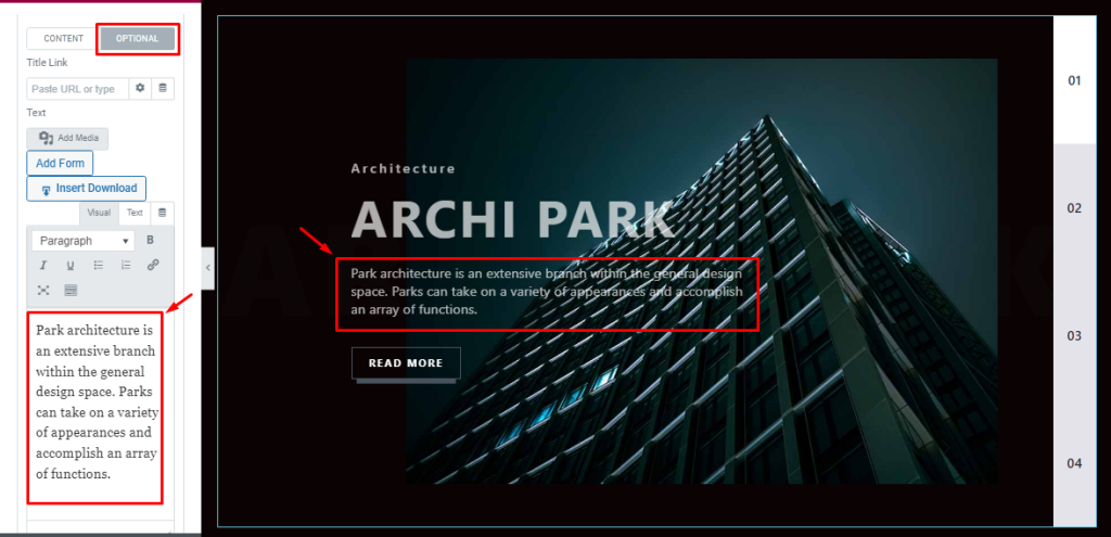
In Optional mode, you can easily write down your text from here or add a title link through a link field. In the same process, you can add all slider information.
Slider Settings Customizations
Go to the Content tab >Slider Settings.
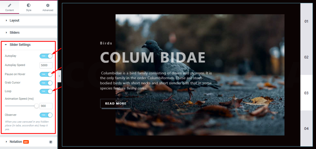
In this section, you will see some Switchers like Auto Play, Auto play speed, pause on Hover, Grab Cursor, Loop, Animation Speed, and Observer. All of them serve different purposes.
Autoplay switcher: If you Enable the Autoplay switcher button, your slider will slide Autoplay, and you can set the Autoplay Speed as your wish.
pause on Hover: If you activate the pause on Hover button, then when you Hover your mouse cursor on the slider, your slider will Hold. Otherwise, your slider will execute Autoplay.
Grab The Cursor: If you enable the option, you will be able to grab the slider with your mouse pointer, and your mouse pointer icon will be changed. You can slide your Coddle slider manually with your mouse cursor.
Loop: you can easily enable or disable the switcher button. When you activate the Loop switcher button then your slider will loop at a certain time interval. You can also set up the loop animation speed here.
Observer: If you enable the option then you can make the carousel visible if it’s used in any hidden places (such as in tabs, Accordion, etc).
Style tab for customizing widget interface Appearance
Now, let’s work with Style Tab. The tab will easily have you style the web content (text, image, video, etc.) of the page you require to design.
Styling with the tab in Elementor will always give you a wonderful experience.
Let’s have a look.
Image Section Customizations
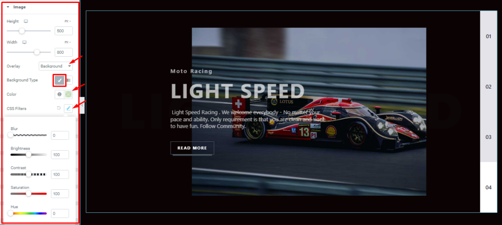
Go to the Style Tab >Image
In this section, you can easily change the Image Height, Width, Overlay Color, and Background Type, and also use the CSS Filters as I have shown in the screenshot.
Customizations of Title Section
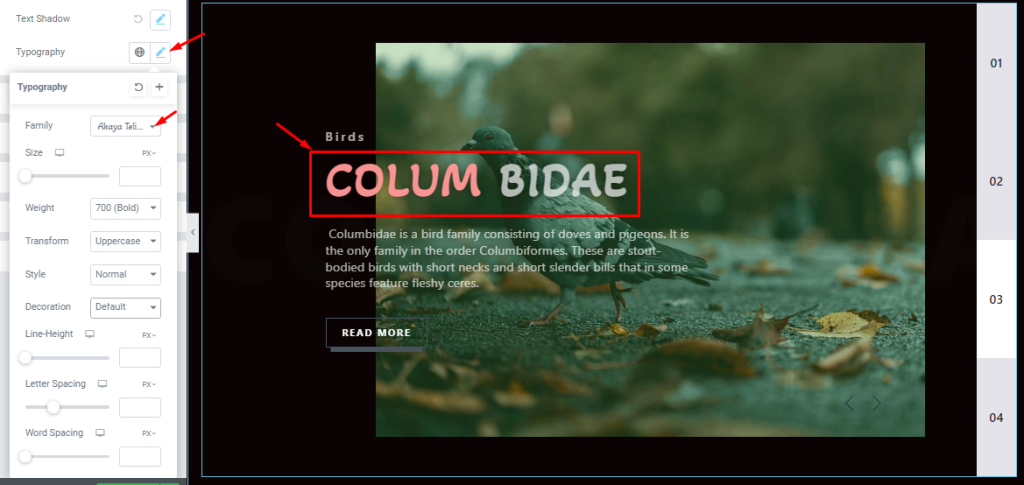
Go to the Style Tab >Title.
In this section, you will see the Title color, Title Hover color, Title Frist Word Color, Margin, Text Stroke, And Text Shadow options. you can easily change that as your wish.
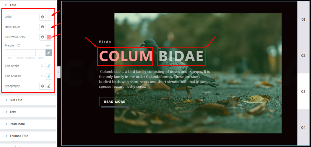
Here, you can also set Typography as your wish which I have shown you below screenshot.
Customizations of Sub-Title Section
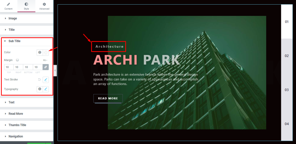
Go to the Style Tab >Sub Title.
In this section, you will see the Sub Title color, Margin, Text Stroke, And Typography options. you can easily change that as your wish.
Text Section Customizations
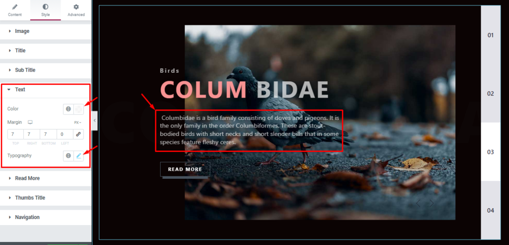
Go to the Style Tab >Text.
In this section, you can easily change the Text color, Margin, And Typography as your need.
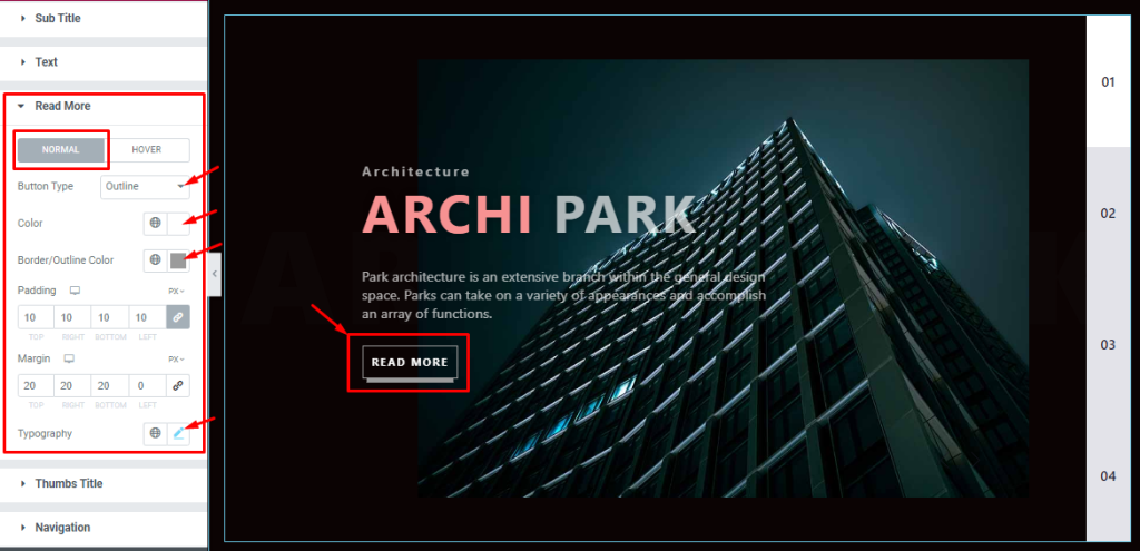
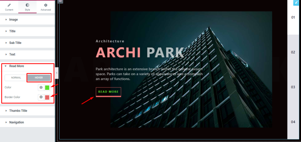
Read More Section Customizations
Go to the Style Tab >Read More.
In Normal mode, Here you can easily change the Border Type, Color, Border Color, Padding, Margin, And Typography as your need.
In Hover Mode, you can change the Read more Text color and Border color. Just like how we did it in the screenshot below.
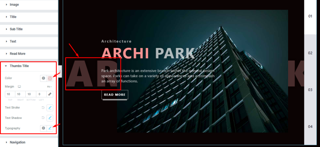
Customizations of Thumbs Title Section
Go to the Style Tab >Thumbs Title.
In this section, you can easily change the Thumbs Title color, Margin, Text Stroke, Text Shadow, and Typography to match your web interface.
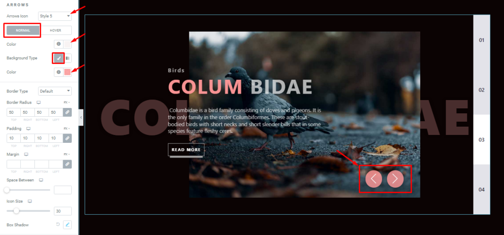
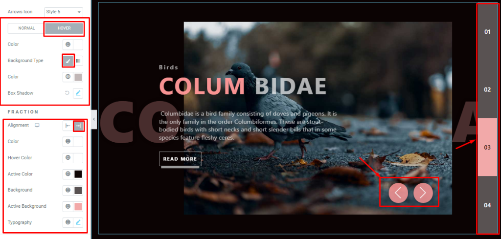
Navigation Section Customizations
Step-1
Go to the Style Tab >Navigation.
In Normal mode, you can change the Arrows icon style, Arrows Color, Background Type, Background color, Border Type, Border Radius, Margin, Space Between, Arrows icon Size, and add Box Shadow.
Step-2
In Hover mode, you can change the Arrows color, Background Type, Background color, And Box Shadow. You can easily change the Fraction Alignment, Color, Hover Color, Active color, Background color, Active Background Color, and Typography from here.
All done! You have successfully customized the Coddle Slider widget on your website.
Thanks for staying with us.