
If you’re looking for a functional and custom WordPress grid gallery for Elementor, you can choose the Doodle grid gallery widget from Pixel Gallery. This is a minimalistic yet attractive gallery with cool animation effects that boost your site’s user experience.
Keep reading to learn how to use it, as well as all the details about this widget and its features.
Inserting the Doodle Grid Gallery
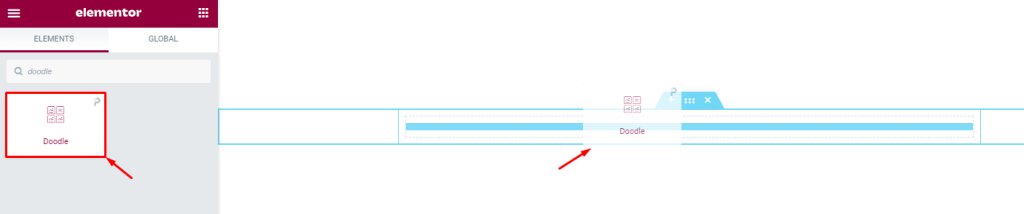
You can use this image grid gallery for Elementor by going to the page you want to use it on and opening it with Elementor. Then, simply drag and drop the Doodle widget into the page. Keep in mind that you need both Elementor and Pixel Gallery installed on your WordPress website before you can use this widget.
Introduction to Layout customizations
The content tab is where you’ll find the controls for the basic structure of your widget. Here, you can customize the dimensions, number of columns, item spacing, and individual item information to create your widget’s foundation. Let’s explore how to use these features.
Take a look at the default appearance
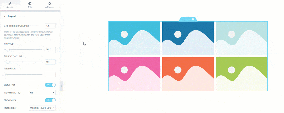
After you add the grid gallery for Elementor to your page, you’ll see that it comes with 6 images by default. You can change the number of images depending on how many you want to display. There is also a hover effect that pops up from within the background image. This displays the title and meta texts.
Customize the layout of the Doodle grid gallery

Go to Content> Layout
The Layout section of the grid gallery for Elementor is where you can select the number of columns for the grid template. Also. you can adjust the item gap, column gap, and item height to customize the look of your gallery.
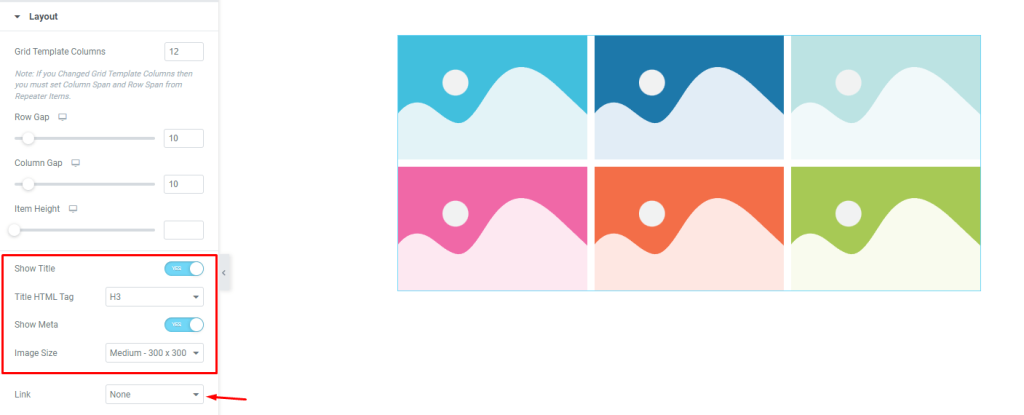
You can easily turn on or off the title and meta text elements with just a click and select a custom HTML tag for the title if you want to.
The grid gallery’s image dimensions in Elementor can be customized from the Image Size option. The ‘Link‘ field at the bottom of the page will enable you to turn on the media file linking function for the grid items. Just click on the ‘Link‘ field and choose ‘Media File’ or ‘Custom URL‘ to open the link fields on the items.
Here, you can choose a Lightbox to open the link. There is no button on the grid, instead, the whole item will act as a link button. Clicking anywhere on the individual grid item will trigger the link.
Customize Doodle grid gallery items individually
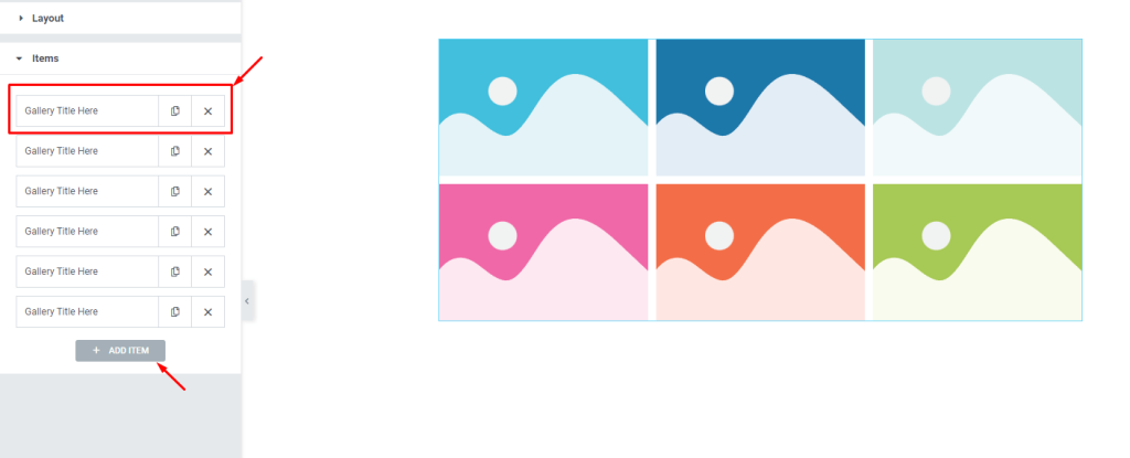
Go to Content> Items
This is where you’ll find all of your grid gallery items in one place. They’re displayed as small white boxes with a title and copy/close buttons.
You can add more items by clicking the ‘Add Item‘ button, or close any listed item by clicking the ‘X‘ button on the item box.
Content subsection controls
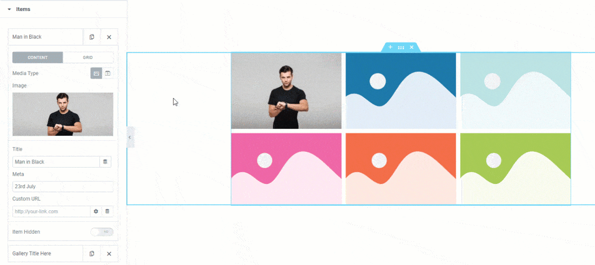
When you click on an item box, the options inside of it will be revealed to you. You can see that the Content subsection has been selected and that the Media type has been set to images. If you want, you can switch the Media type to video.
There are some fields located here that will allow you to customize the image, title, and meta description to your liking. There’s also a custom URL field along with an item hidden switcher.
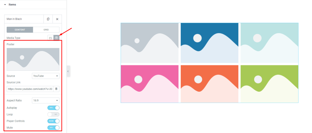
By selecting Video as the Media Type, you will change the set of controls to embed a video to the individual Elementor grid gallery item. In addition to the previous control options, you will also get a video Source option, source link, aspect ratio control, Autoplay, loop, player controls, and mute switcher.
Grid subsection controls
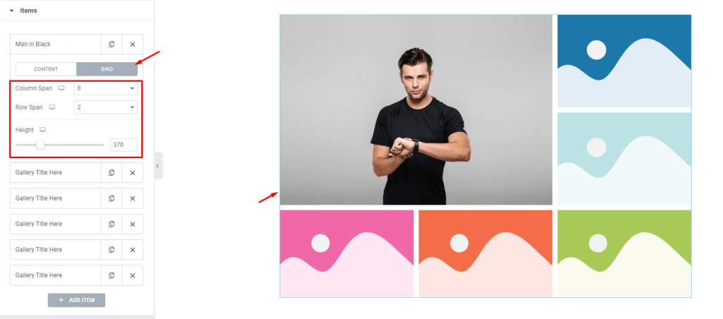
The grid controls let you choose the dimensions for each item, such as how many columns or rows it can occupy. The height option lets you change the height of each item to further adjust the size.
For example, let’s change the column span to 8 and the row span to 2. Now, the first item will occupy 8 of the 12 column bars and 2 rows. By default, the column span is set to 4 and the row span is set to 1. That’s why the next two items appear on the right side of the first grid gallery item.
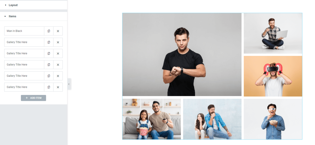
After you customize the grid items, the interface will look like this. You can easily create this layout by adjusting the grid controls for individual items in the Doodle grid gallery widget.
Style tab for customizing widget interface appearance
As Pixel Gallery is known for its smart and beginner-friendly customizing controls, you can easily make dynamic changes to the layout to create unique interfaces.
To see how this is done, follow the steps below:
Items section customizations
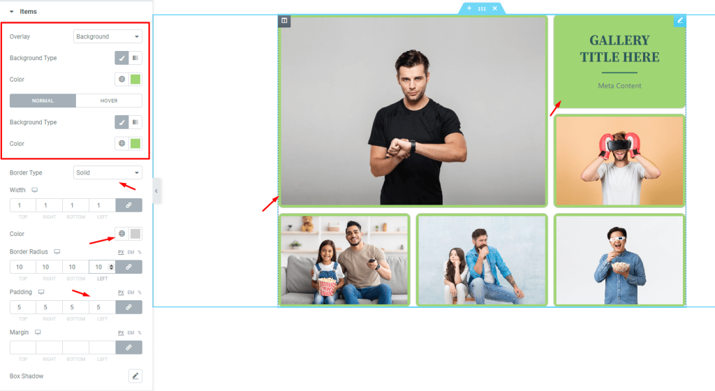
Go to Style> Items
On the top, you will see the overlay option for the grid. The overlay color becomes visible when hovered on the grid items. Then there is the background type option that lets you choose a single color or a gradient for the background of the items. As each gallery item has images occupying the whole area, you can only see the changed background color after adding some padding.
Then, we will add a thin border around the items with a semi-transparent color to match it. With some border radius value, we can curve the edges of the items of the grid gallery for Elementor starting with the border.
Grid gallery title customization

Go to Style> Title
Here, you can change the title text to better match your brand colors, add more space around the text with padding or margins, or adjust the font size, weight, and family with typography. You can also add a text shadow or stroke for extra effect.
Content area line customizations
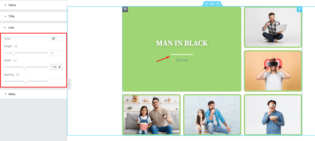
Go to Style> Line
There is a line between the title and the meta which separates the two. You can customize the line by changing its color, height, width, and spacing.
Meta description text customizations
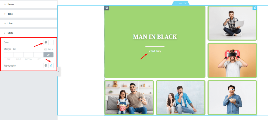
Go to Style> Meta
Here, you can change the meta text to better suit your needs. You have options for color, margin, and typography so that you can get the perfect look for your website.
After you’ve made all the necessary customizations to the Doodle grid gallery, it’s time to see the results.

The final design turned out great! Just hover over the grid items and see how awesome it looks.
Video Assist
Watch this video to see the whole tutorial with more visual details, or check out the demo page for similar examples.