The Countdown widget helps you display a time counter on your landing page, featured page, menu, or popups if you are trying to run a time-based offer or similar things. The widget makes it easy for you to quickly change the timer settings and appearance to meet your needs.
Let’s explore the content of the Countdown widget below.
Inserting widgets
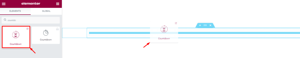
First of all, find the Countdown widget in the widget menu inside the Elementor page editor and drag it inside the page to start. Note that you need both Elementor and Element Pack installed before proceeding.
Introducing the Content Tab
The Content tab holds the fundamental settings to determine and customize the widget’s features. Basically, the base settings of a widget are found inside this tab.
The settings are broken into several sections to give you the maximum flexibility in design. Let’s start with the first section.
Layout section
Go to Content > Layout
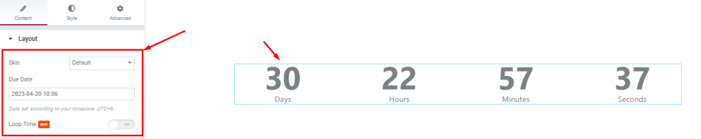
In this section, you will find a Skin option for the widget that’s set to Default. The Due Date field lets you specify a due date, so the counter will roll the timer until that specified date & time.
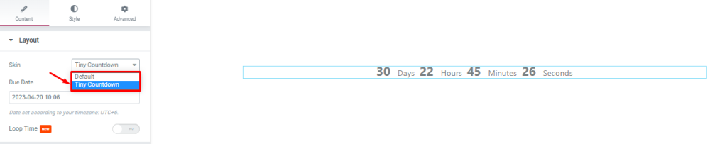
You may choose Tiny countdown from the skin option that transforms the counter into a much smaller scale.
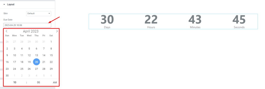
Clicking on the due date field will open a calendar-like interface where you can specify both the date and time to stop the countdown.
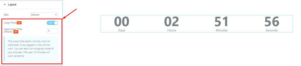
There is a Loop time switcher at the bottom. Turning on the switcher will replace the Due Date field with an Input Loop Time (Hours) field where you can adjust the time for the loop in the countdown widget.
Count Layout settings
Go to Content > Count Layout
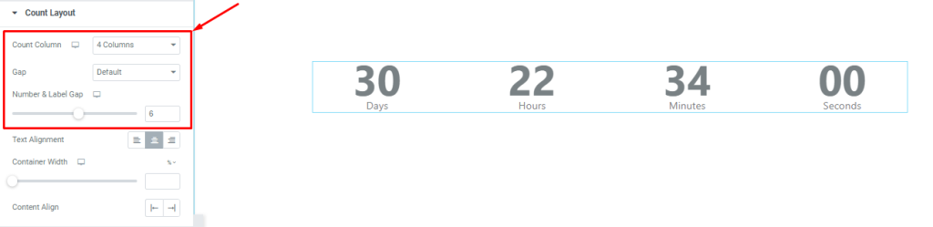
You can change the countdown lineup from this section using the count column option (from 1 to 4). Then you can change the gaps between the counters.
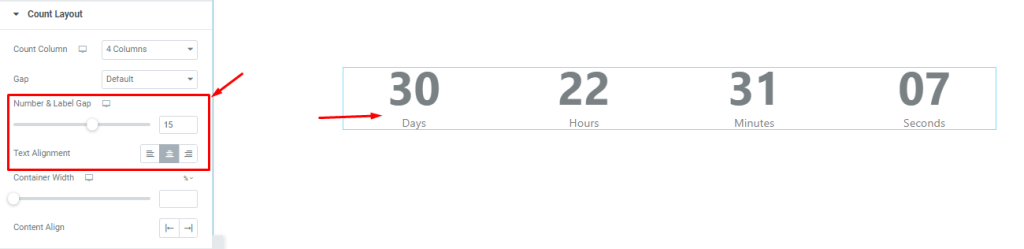
Also, you may adjust the gap between the Number and Label using the scrollbar. There is a text alignment option available.
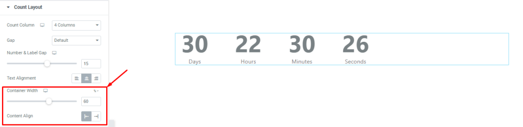
At the bottom, you can change the container width directly with a scrollbar instead of configuring it through the section settings. The last alignment option works on the whole content of the countdown widget.
Additional Options
Go to Content > Additional Options
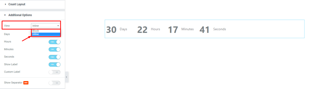
In this section, the countdown can display the counter and label in block view or inline view (currently switched to inline view) from the View setting.
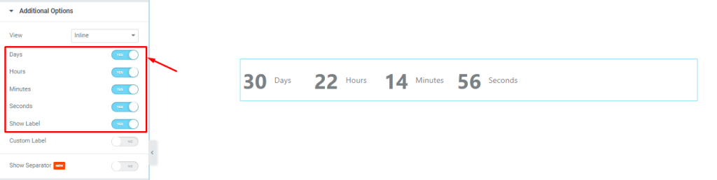
The switchers below can show or hide certain elements from the display, such as the days, hours, etc. Turning off the switchers here will hide parts of the counter with the corresponding label.
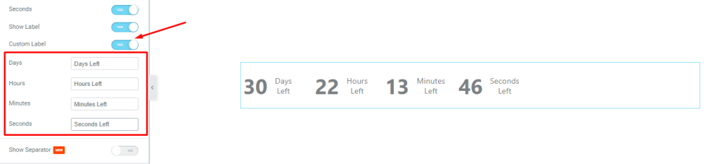
Turning on the Custom Label switcher will generate the label fields for the counters, and you can edit the labels here.
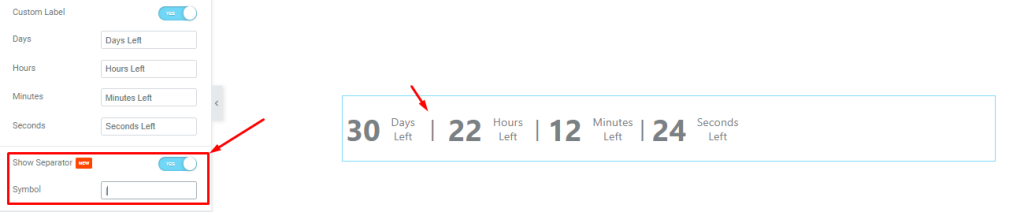
Lastly, you can add a separator between the countdown timers by turning on the Show Separator switcher and inserting a separator symbol down in the field.
End Action
Go to Content > End Action
If you want the Countdown widget to take action after the countdown ends, this section provides the options to configure the end action.
There are a total number of 5 options.
None type
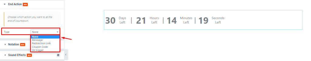
Selecting the none option will not trigger any action after the countdown ends.
Message type
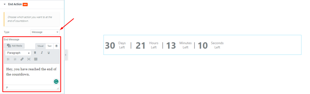
Selecting the message option will provide an additional field to insert a custom message that will show up once the countdown is finished.
Redirection link
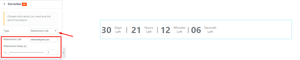
You can select the redirection link option and set a custom link in the next field, along with a delay configuration. After the countdown ends, visitors on that page will be redirected to the given link automatically.
Coupon code
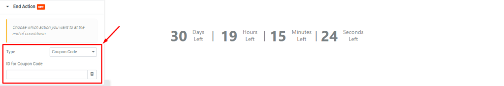
You can choose the coupon code option to integrate the countdown widget with a coupon code type widget and reveal the code when the countdown ends.
An example of this type is given below.
On trigger
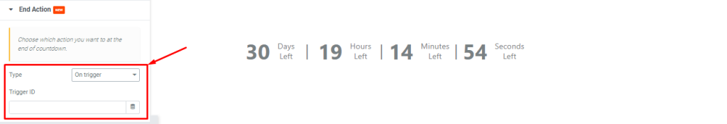
Selecting on trigger option will let you link up the countdown widget with any element on the web page and trigger a program click action once the countdown is finished (like an automatic remote).
End Action feature example – Coupon Code
Appearance customizations through the Style tab
Element Pack is known for providing so many awesome styling options for the widget, and people loved how easy and feature-rich these options are.
For the Countdown widget, we will now begin the style customizations below.
Items Style section
Go to Style > Items Style
The very first section under the Style tab lets you customize some of the aspects of all items. (considering each countdown timer part, i.e., hour, minute; as an item)
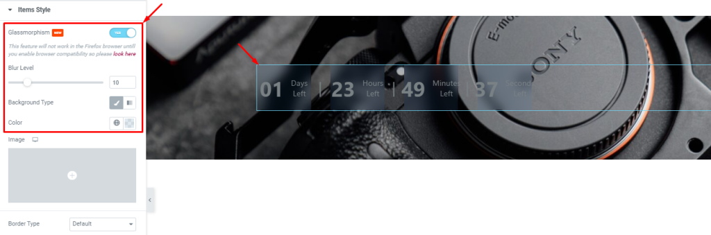
From the top, you can turn on the Glassmorphism switcher and adjust the blur level to create a glass-like texture on the countdown backgrounds.
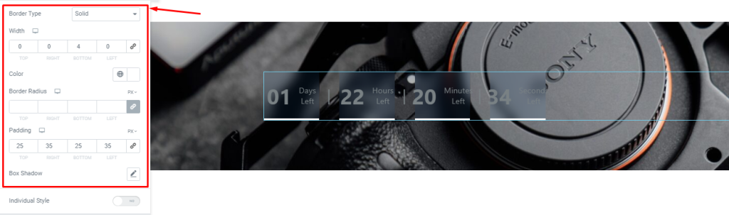
Then you can choose a border type to add a border around the counters. You can customize the border width either for all sides or for specific directions to add a nice touch. Also, the border color, border radius, padding, and box-shadow are applicable on the counters.
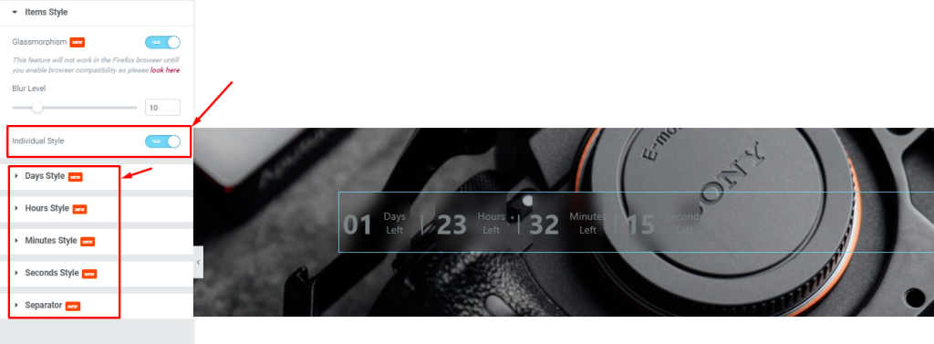
But turning on the Individual Style removes the generalized controls and creates control sets for each counter item separately.
Number section
Go to Style > Number
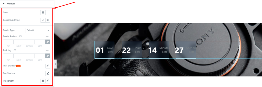
In this section, you will get color (text & background), border, padding, text shadow, and box shadow options for the numbers, along with a typography option for font customizations.
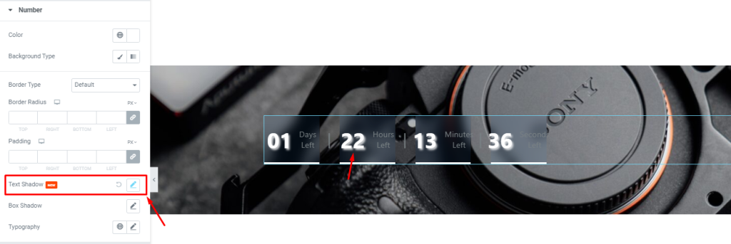
With the Text Shadow option, it is possible to create a LED digital clock-style interface for the countdown widget.
Special Note:- Numbers can be changed with a massive number of potential design factors. Check the Typography option for that.
Label section
Go to Style > Label
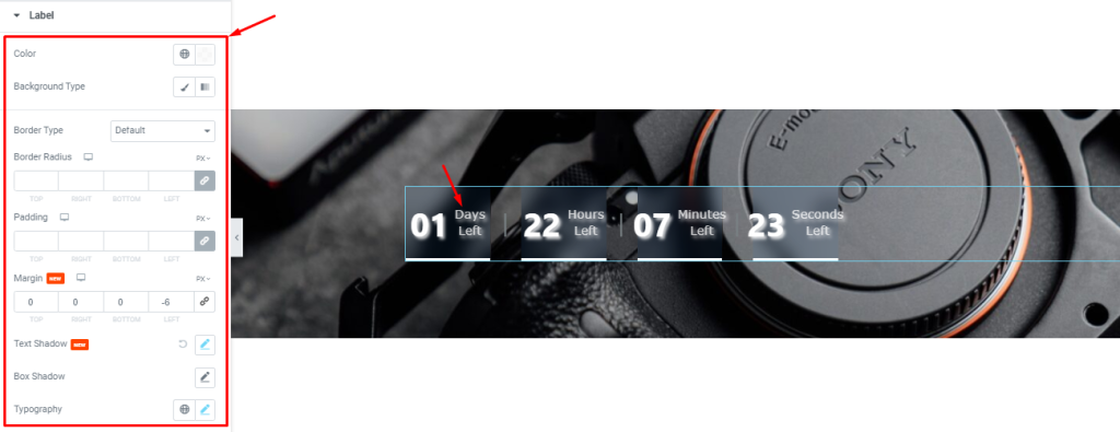
For the Label, you will get similar sets of options to customize. Like how the color, border, and padding options. There’s is an additional margin option here. You can configure the text shadows the same way as before to make the texts awesome.
Separator section
Go to Style > Separator
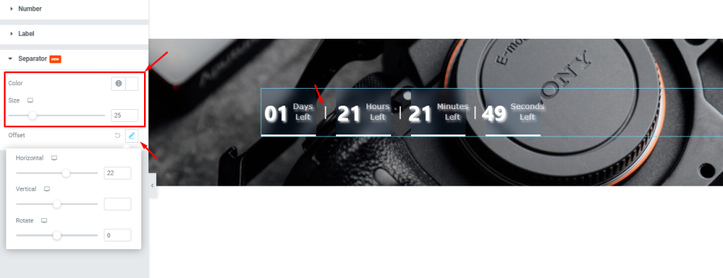
This section lets you customize the separator between the counters. You can change its color, adjust its size, and reposition the separator using the offset settings.
Video Assist
Watch the video tutorial to get a clear visual on the usage of the Countdown widget. You can also access the demo page here.
Powered by BdThemes.